Web Design in Salt Lake City, UT
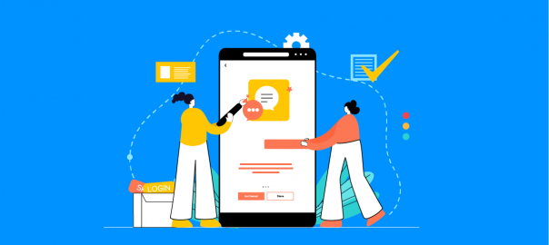
If you need a Salt Lake City web design partner that can improve your current website (or build a new one from scratch), Mystic Media designs and develops modern, user-friendly websites that build trust and convert visitors into customers.
Our approach is strategy-first: we learn your brand, goals, and audience, then create a clean, intuitive experience that supports measurable business outcomes. From marketing sites to web-based software and business tools, we build secure, scalable solutions
designed to grow with your company.
Website Development Services | Case Studies | Testimonials
What we build for Salt Lake City businesses
SEO-ready foundations
We optimize site architecture, content structure, and performance so your website is positioned to rank for the searches that drive real business—whether you’re targeting local Salt Lake City terms or broader, high-intent keywords.
Responsive web design
Every website we build uses modern responsive best practices so pages look great and load fast across mobile, tablet, and desktop.
Custom web design (not cookie-cutter templates)
We design custom websites aligned to your brand and customer journey—focused on clarity, usability, and conversion.
Ecommerce + secure integrations
Need online sales? We build ecommerce experiences with conversion-focused layouts and secure integrations that are easy to shop and simple to manage.
Website hosting + ongoing maintenance
We provide secure, high-performance hosting with monitoring and backups, and we support your site long-term with updates, security enhancements, and new feature development as your needs evolve.
CMS integration and migration
If you’re moving from a legacy system, we can migrate and modernize your content without breaking links or losing SEO value.
UI/UX + branding support
From UI/UX design to branding strategy, logos, and graphics, we help your entire digital presence feel consistent and polished.
Featured Salt Lake City case studies
WesternLine Constructors — modern, responsive website and digital presence
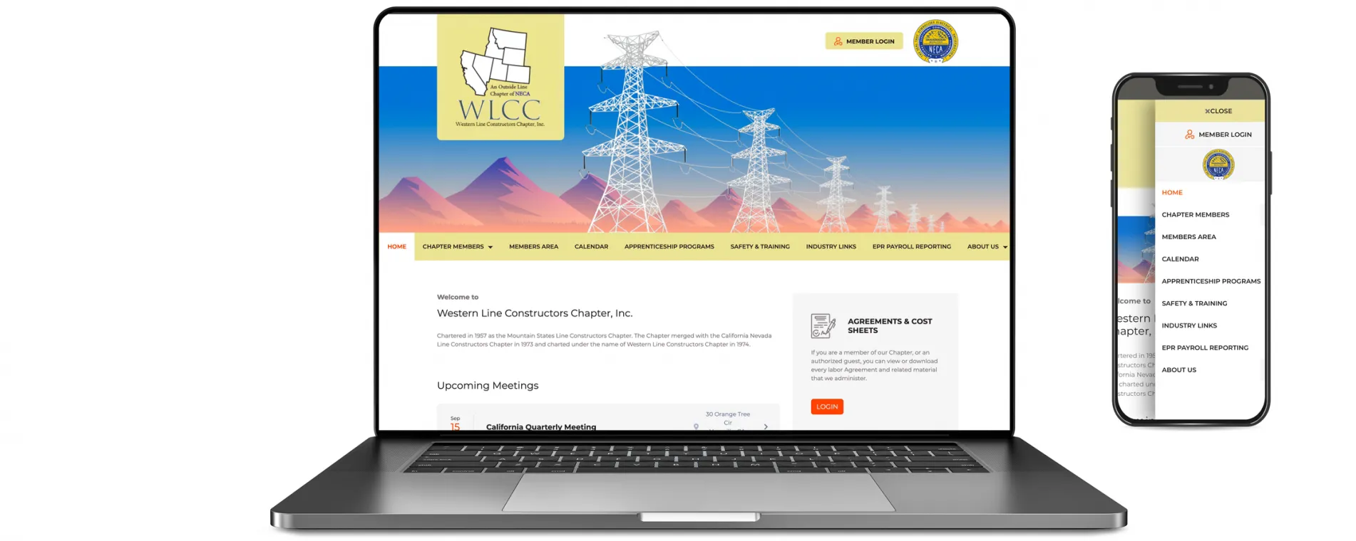
WesternLine Constructors partnered with Mystic Media to strengthen their online presence with a modern website experience designed to
communicate capabilities clearly, build trust with prospective clients, and support long-term growth.
View the WesternLine Constructors case study
Novva Data Centers — custom customer support portal for a hyperscale data center

Novva is Utah’s largest hyper-scale data center, spanning over 1.5 million square feet, and supports wholesale and multi-tenant
data center services for local, national, and international clients. Mystic Media partnered with Novva to consult and build a
customer support portal from the ground up—serving as an extension of Novva’s in-house IT team.
The result is a state-of-the-art support portal that manages core customer interactions with an intuitive experience that helps
customers monitor their information while securely communicating with Novva’s support teams. The platform also streamlines internal
employee communications to keep requests and technical issues organized and moving quickly.
View the Novva Data Centers case study
Wishing Pixies — web design and development for a brand-forward experience
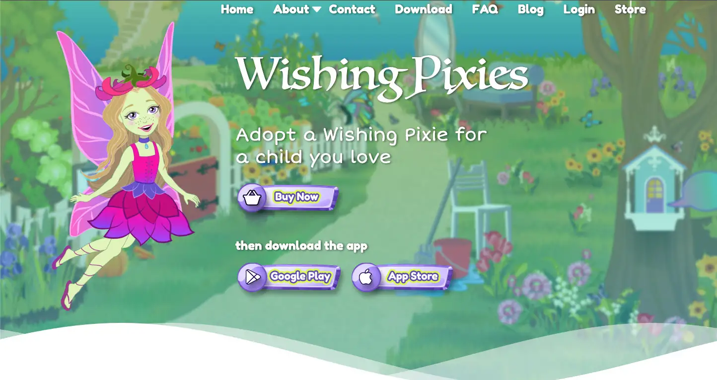
Wishing Pixies partnered with Mystic Media to build a website experience that highlights their brand and services with a clean, engaging, and easy-to-navigate design—built to perform well across devices.
View the Wishing Pixies case study
MAd Reach — platform development for a location-based advertising solution
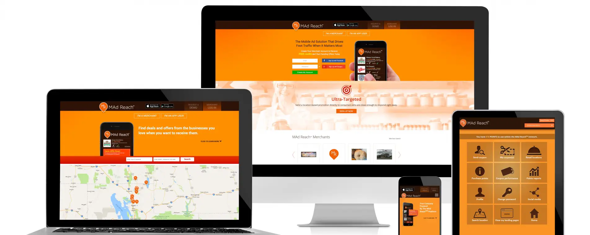
MAd Reach is a location-based mobile advertising solution built to help merchants drive foot traffic. Mystic Media developed the platform to help businesses take greater control of their digital advertising operations.
What Salt Lake City clients say
- Novva (Salt Lake City, UT):
highlighted professionalism, responsiveness, and a polished end result. - MAd Reach (Salt Lake City, UT):
highlighted professionalism and the ability to keep multiple projects on schedule. - Wishing Pixies (Salt Lake City, UT):
praised the design quality and ease of working with the Mystic Media team.
Read more customer testimonials
FAQ
How much does web design cost in Salt Lake City?
Cost depends on scope (pages, features, CMS, integrations, ecommerce, and content needs). We provide detailed estimates after aligning on goals and requirements.
Can you redesign or modernize an existing website?
Yes. We can upgrade design and UX, improve performance and SEO foundations, migrate CMS platforms, and add new features without starting over from scratch when it makes sense.
Do you offer hosting and ongoing support?
Yes. We provide hosting and long-term support, including maintenance, security enhancements, performance improvements, and feature updates.
Ready to upgrade your website in Salt Lake City?
Whether you need a modern marketing site, a custom web app, ecommerce, or a full redesign, Mystic Media can help you plan, design, build, and support a web presence that’s built to grow.
Explore website development services or browse web design case studies.