Tag Archives: User

App Store Optimization Part 6: How to Change App Titles While Minimizing Impact on ASO

In an effort to emphasize the importance of App Store Optimization, the Mystic Media Blog is applying its expertise into a six-part series on ASO. In our previous entry Key Differences in Apple Vs. Google Play App Stores, we detailed how to optimize specifically for either app store. This week, we conclude the series by exploring the effects of changing your app title after release and how to efficiently change titles while minimizing negative effects on ASO.

One of our clients recently wanted to change the title of their app on both Apple App Store and Google Play. While their previous title was okay, they came up with a new title which would potentially attract more of their target audience. They consulted us on the process of changing app titles and its effects on ASO. While it may seem like a simple fix, the process of changing titles is not seamless and can make the developer look unprofessional if improperly executed.

First and foremost, one must weigh the negative impact of changing titles. Changing the title of an app will not wipe out the number of previous downloads and ratings & reviews, but if an app has an established brand, changing titles can be highly detrimental to ASO. Whatever word-of-mouth or brand recognition an app already had will dissipate. App Store users looking for the app under its previous name will be unable to find it. So if it ain’t broke, don’t fix it.

A name change can ultimately attract more users if the name is catchy and features a keyword optimized for search. One of the most interesting findings we came across in our ASO research came from a blog in which a developer discovered a hole in the Apple App Store’s keyword search and exploited it (check out Master the Art of Writing a Catchy Title and Keywords for more info on writing keywords). The developer originally released Texties, an app which allows for users to easily send unicode artwork. Frustrated with the limited amount of downloads, the developer discovered searching “texties” in the App Store returned 2200 results and Texties wasn’t at the top. He soon realized searching “txts” yielded the same search results. It became apparent Apple was using some fuzzy auto-correcting on search strings. The developer proceeded to change their app title to “Textables”, which now comes up first in title searches.

Check out Mark Rickert’s blog for more information on this story.

If the developer elects to change app titles, the process is laborious. The developer must change the title everywhere it’s previously appeared—on their website, social media, app description, and screenshots—not to mention all the places the app title appears within the app itself.

So long as the function of the app is not different, ASO shouldn’t be affected dramatically by a title change, but one has to keep in mind the keywords must be optimized for the search terms associated with both the app’s function and title. If the title change is drastic enough that the developer thinks the keywords which would lead to it have changed, they must change the keywords to search terms more befitting of the new title. If the developer feels the keywords associated with the old title apply equally to the new title, there’s no need to change them and it should not have a noteworthy effect on ASO, assuming they are right.

When changing an app name on Google Play, it’s crucial to note that Google looks through the app description for keywords (as we detailed in Key Differences in Apple Vs. Google Play App Stores). If the keywords have changed, it’s vital the developer proceed to revise the app description appropriately.

The app name can easily be changed on the Apple App Store through iTunes Connect. On Google Play, changing the “android:label” attribute of your application tag in “AndroidManifest.xml” file will do the job. However, changing the app name on devices requires the developer to change the metadata to reflect the new title and upload the newly-titled app as an update. Users who already have the app must download the update to change the name of the app on their phone. This makes changing a name on the Apple App Store  more difficult than on Google Play since Apple must approve all updates before they go live on the app store.

Changing an app name on Google Play presents its own challenges. Apps on Google Play retain a package name, which is a URL owned by the app to prevent name collisions. Changing the title of an app does not alter the package name, any links previously used will remain unbroken despite the change in app title. However, the package name is one thing that cannot be changed unless you’re uploading a new app. If a developer is so concerned about the original title being in the package name that they decide they must change it, they would have to start from scratch, post the newly titled app in a separate package on the app store as a new app, and lose all traction and reviews they previously had earned.

Check out this article at Android Developers Blog for more information on package names.

As we explored in Master the Art of Writing a Catchy Title and Keywords, app titles are vital to ASO. Changing an app’s title can be helpful to ASO granted the new title is catchier, more functional, and it’s early enough in the release that the app does not have a big following.

This concludes our six-part series on App Store Optimization. Thank you to our readers! We hope this serves you well in your future app development adventures. In the meantime, stay tuned!

Mystic Media is, among many other things, a premier Search Engine Optimization firm. Our Marketing Strategists recognize the importance of ASO and can work with the tech side to ensure all websites and applications designed will succeed in the marketplace. Contact us today by clicking here or by phone at 801.994.6815

App Store Optimization Part 5: Key Differences in Apple Vs. Google Play App Stores

In an effort to emphasize the importance of App Store Optimization, The Mystic Media Blog is applying its expertise into a six-part series on ASO. In our previous entry Maximize Your Exposure by Getting Featured on the App Store, we detailed techniques on how to get featured on an App Store landing page. This week, we will explore the differences in ASO for Google Play and  Apple App Store.

App Store curators look to surface the most relevant content for users. Although the ultimate goal may be the same for both Google and Apple, their approach to achieving their goals are different. The exact details of Apple’s processes are shrouded in secrecy as they promote discovery through curation, while Google focuses more on analytics and prioritizes transparency in their processes. Check out their recent I/O speech on Getting Discovered on Google Play for a bevy of useful information. While our ASO series thus far has focused on the common ground, this chapter will delve into the differences between the two app stores and what techniques can be used to optimize for either store.

GENERAL THEMES

Google Play favors bigger mobile-focused enterprises, while Apple favors independent developers. A recent study at MobileDevHQ found independent developers generally rank higher in the Apple App Store, while Google Play is more favorable toward mobile focused enterprises. MobileDevHQ recorded the top apps for each store and found that 65% of the top apps for iPhone were independently developed, while 90% of top apps in Google Play store were developed by mobile-focused enterprises.

Granted, out-of-context, the above statistic can be misconstrued. Big mobile-focused enterprises do better on Google Play because they have the brainpower and workforce to analyze the statistics which factor heavily into Google Play’s search algorithm. Google Play also does its part to give independent developers an opening through regional-specific results and Google+ recommendations. Apple’s App Store, on the other hand, relies on curation. The Mystic Media Blog previously discussed  how Android is considered more developer-friendly since they feature open-source coding and skip the process of approval Apple uses to filter bad apps from making it onto their App Store (review our post on Why Android Rules the Mobile Application Market). Apps receiving approval before making the the app store filters out sub-par entries, allowing Apple to curate more effectively. Every app on the Apple App Store, big or small, starts with an evaluation.

Apple’s App Store is much more volatile and reactive to trends than Google Play. Within the same seven day study at MobileDevHQ, the top ranking apps in Apple’s App Store fluctuated—no single app stayed in the same rank through all seven days—while of the top ten ranking apps on Google Play, five failed to change position once. In addition, no new apps broke into the top ten for Google Play.

DESCRIPTION

While it’s recommended developers include keywords in their app description, the Apple App Store barely weighs the description, unlike Google Play which weighs the keywords in app descriptions heavily. For more on keywording and app descriptions, review App Store Optimization Part 2: Master the Art of Writing a Catchy Title and Effective Keywords.

VIDEO

Google Play also allows developers to post a video preview of their app. The purpose of the video is to show the app in use, to preview the graphics, the sound, the UX, the function, etc. Google Play preview videos are hosted through Youtube, which creates a new avenue for app developers to market their product through Youtube SEO. For more on the topic, check out this cool article on How Youtube Videos are Ranked.

DISPLAY

Google’s recent talk about getting discovered on Google Play yielded a lot of great information concerning Google Play’s display strategy. Ankit Jain, Google Play’s Head of Search, Discovery & Store Infrastructure, explained how Google Play attempts to create a UX which is simultaneously personalized and personal.

Personalized, as it relates to Google Play, means the results are catered to the user based on their history of searches, purchases, what device the user is on (remember, unlike iOS, Android allows third-party companies to develop  devices on its OS), and what’s popular in their geographic region. The amalgamation of user history and geographic popularity factor heavily into Google Play’s search algorithms.

Personal means results are annotated by Google Play analytics with reasons why the user should download the app. This involves linking to the user’s Google+ account to allow the Google Play store to show if anyone in a person’s Google+ circles has given an app a +1.  Apps relevant to a search which are recommended by people in a user’s Google+ circles will surface high in the search results, thus targeting Google+ for social media campaigns pays off for developers releasing through Google Play.

CONCLUDING THOUGHTS

The goal of any app store is to effectively promote the top apps for the platform. Both Google and Apple look to share the apps which will best please the user and make the most of the technology of their respective platforms. When it comes to ASO, no keyword, app title, icon, or description will change anyone’s mind about a bad app. No curator will elevate the status of a bad app because it is well-marketed. Thus, it’s fitting remind you: the first step to optimizing any app for an app store is to create a great app. By observing the rules of each app store and excelling in each of the processes of ASO with intelligent strategy and an efficient external marketing campaign, a great app can catch the attention of app curators and rise to the top of any app store search. The rest, as they say, is search history.

Mystic Media is considered among the most versatile and capable web agencies in the US. Our workforce includes experts across a variety of fields including app development, strategic marketing, social media, web design, Search Engine Optimization, radio streaming, and more. We have the resources necessary to effectively develop and market applications for any platform. Contact us today by clicking here or calling 801.994.6815

Tilting the Playing Field: iPhone 6 Technology Expands Possibilities for iOS App Developers

The release of a new iPhone is always a major event. Apple is the most innovative and well-respected tech company in the world. This year, they’ve  already  released the iOS 8 (review our recent post Bite the Apple: Maximize iOS 8 to Vanquish Your Competition). Now, they’ve taken things a step further by unveiling not one, but two models for the latest iPhone: the iPhone 6 and iPhone 6 Plus. The day Apple made the iPhone 6 and 6 Plus available, they were backordered for a month. Sales numbers aren’t in yet, but first weekend sales for the iPhone 5 were over 5 million. For iOS developers, it’s safe to say the playing field has changed. Here’s what you need to know about the new iPhones to stay ahead of your competition:

COMPARISON

For starters, the iPhone 6 and iPhone 6 Plus are separated by size and functionality. The iPhone 6 Plus is a phablet, teetering the line between smartphone and tablet with a larger screen (5.5 inch vs. 4.7 inch), more precise display (1920×1080 vs. 1334×750), better battery, and slightly higher price tag ($199 vs. $299) than the standard iPhone 6 counterpart. The iPhone 6 will satisfy the casual consumer, while the iPhone 6 Plus is a must-have for the hardcore techies and upscale buyers who need the latest and greatest.

SCREEN DISPLAY

For developers, among the biggest changes will be the screen size. Android developers have been dealing with device fragmentation for years. Unlike the transition from iPhone 4 to 5, in which the aspect ratio changed from 3:2 to 16:9, the iPhone 6 and 6 Plus increase screen size from iPhone 5 while maintaining a 16:9 aspect ratio. This means there’s no black bars at either end of the screen when viewing content optimized for iPhone 5.

iPhone 6 and 6 Plus screens are not only larger, they are also better. Screens will now boast the notorious HD Retina Display currently available on MacBooks.

Another of the major factors which may cause developers to redesign their apps the latest models is the iPhone 6 Plus’s enhanced ability to display in landscape mode. Previous models didn’t have the screen space to effectively display much in anything other than portrait mode. The 6 Plus allows for the home screen to display in landscape mode in an iPad-like split view. Developers will have to take note of the increased screen real-estate and perhaps redesign their apps to creatively utilize the landscape mode.

TECHNOLOGY SPECS

Both the iPhone 6 and 6 Plus are fully loaded with an A8 chip featuring second-generation 64-bit desktop-class architecture, enhanced by an M8 motion coprocessor designed to efficiently measure user activity using advanced sensors. This allows the user to do more for longer periods of time. The A8 boasts 50x faster CPU performance and 84x GPU performance. The increased battery life on iPhone 6 can browse the web using LTE and 3G networks for 10 hours on standard models and 12 hours on iPhone 6 Plus.

METAL

Here’s the literal game-changer developers: in order to maximize the graphics performance out of the A8 chip and iOS 8, Apple is introducing Metal, a state-of-the-art program allowing CPU and GPU to work together to deliver top-tier graphics and complex visual effects. Metal provides the lowest-overhead access to GPU, features a streamlined API, compiled shaders, and support for efficient multi-threading. We’re excited to get working in the new program.

For more info, check out Apple’s Metal developer guide and this informative article over on GameFromScratch.

CAMERA

On their website, Apple boasts “The camera that changed photos now does the same for video.” It is quite a bold statement. The iPhone 6 iSight cameras now shoot real-time 1080p HD video at 60 frames per second, in addition to slow-motion video at 240 frames per second. The larger screen and HD Retina display certainly makes for a better viewing experience. The iPhone 6 Plus offers optical image stabilization, which stabilizes recorded images by varying the optical path to the sensor, making for smoother motion in video.

The iPhone 6 camera resolution remains at 8MP with the same sensor dimensions, pixel size, and lens specs found on iPhone 5s. The larger screen makes for a more detailed viewing area, but many Android users also enjoy larger screens. Apple has also made a major improvement to the iPhone’s ability to shoot at night with higher aperture and wider focal length, making for more crisper images. Compared side-by-side with the Galaxy S5, iPhone 5s, and Moto X, iPhone 6 takes the cake with most consistent results.

TOUCH ID and APPLE PAY 

Much has been said about Apple’s attempts to utilize fingerprint scanning technology as a security measure. The iPhone 6, in conjunction with iOS 8, puts into effect Touch ID: a fingerprint scanning technology which allows the user’s unique fingerprint to be used as a passcode to enter the iPhone, as well as to approve of purchases when used in conjunction with Apple Pay.

Apple Pay, expected release coming later in October, will scan your credit and debit card information to store it in your phone,  utilize Near Field Communication to make transactions in-stores, and allow users to approve purchases through Touch ID fingerprint scanning. The efficient combination of Apple Pay and Touch ID  may revolutionize check-out lines across the world.

CONCLUDING THOUGHTS

Overall, the iPhone 6 and 6 Plus have improved in every sense over the iPhone 5. The increased screen-size and graphics capabilities provided by Metal have opened the door for developers to create high-tech graphics on a larger canvas. The camera shoots better in low-light and the optical image stabilization makes for smoother video. The slow-motion video capabilities are sure to light up the social media landscape. The combination of Touch ID and Apple Pay make the process of purchasing, both online and off, indelibly easy. Apple has once again changed the playing field for hardware. Now, the question is how iOS app developers and their competition will keep up.

Mystic Media is an app development, marketing, and web design firm providing a host of services to clients, from Android and iOS Development, Strategic Marketing, Search Engine Optimization, and more. Contact us today by clicking here or by phone at 801.994.6815

App Store Optimization Part 4: Maximize Your Exposure by Getting Featured on the App Store

In an effort to emphasize the importance of App Store Optimization, The Mystic Media Blog is applying its expertise into a six-part series on ASO. In our previous entry: “Boost Your App’s Profile, Increase Downloads and Generate Better Ratings”, we detailed the secondary factors which affect ASO, such as Ratings and Number of Downloads. This week, we will explore how to get featured on the app store landing page.

Intelligent ASO will bring you to the top of search-strings specific to your app’s functionality. However, imagine if rather than having to search, your app was presented to viewers the moment app store users go to the app store. Sounds like a dream scenario, but it’s entirely possible through clever ASO. Both Apple’s App Store and the Google Play App Store feature top-tier applications on their landing pages, as well as in several mini-categories.

The App Store curators are not looking to help developers out by featuring apps. They are looking out for the best interest of their company, which means pleasing the viewer. In order to satiate their customers, they showcase the coolest, most visually-engaging, best executed, most high-tech apps. Developers can take advantage of the curators’ needs by catering to their desires and utilizing the latest iOS and Android features in their apps. App Stores are much more likely to feature an app if it showcases the best features of their product.

Keeping up with the latest technologies is easier said than done in a constantly evolving landscape. With every OS update from both Apple and Android, the capabilities of devices are increased. Curators looking for the most high-tech apps must react to the OS updates and seek out apps which utilize the new technology to feature in the app store. Your app can fill that void. Stay up to date on the latest iOS update by reviewing our recent post Bite the Apple: Maximize iOS 8 to Vanquish Your Competition. Review our Android L Beta Preview: First Impressions of the Latest OS to plan ahead for the forthcoming Android L OS. If you’ve already designed your app, you haven’t missed out. Working the latest technology into an app update can also get the app featured. For example, Apple has been pushing the iCloud for all of their apps as of late. Finding some way of incorporating iCloud into an existing app’s software update would be beneficial for ASO.

In service of ensuring your app retains the look and feel of the most state-of-the-art technology, we recommend investing heavily in the User Interface and User Experience design. Perhaps the most important aspect of any app, poor UI/UX design will both alienate customers and guarantee your exclusion from the app store. Great UI/UX design will charm your customers and make your app look state-of-the-art. The details which go into an app’s gestures and audio make or break an app in the eyes of the critic, while retaining the potential to dazzle an audience. When directing your UX designers, be sure to take into account the branding for device-specific apps. If you’re releasing your app on iOS, review Impervious Appeal: How to Design Jaw-Dropping iOS Apps to make sure the UX design is consistent with Apple UX aesthetics, including “flat design.” The upcoming Android L OS specifically pushes Material Design aesthetics in an effort to distance the look of Android apps from those of iOS. Check out Android’s official Guide to Material Design for Developers to learn more. Impressive UX is debatably the most important aspect of any app, but it’s especially vital in the eyes of app store curators looking to show off the graphics capabilities of their devices.

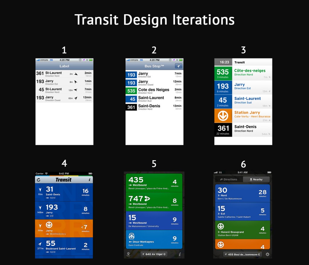
Check out the screenshots below which detail the process of how Transit, an app which aggregates public transportation information, developed their UX design through multiple drafts. In 2012, Apple announced they would develop their own Maps app to replace Google Maps on iPhones. Instead of creating public transit functionality from scratch, Apple found it cheaper to buy Transit, an already successful app, and utilize its functionality. Now under Apple, Transit’s quest to perfect UX which would seamlessly integrate with Apple’s evolving aesthetics is a great example of aesthetic adaptation and the process of developing UX.


Via blog.pickcrew.com

With over 1,000 app submissions per day, standing out in the sea of content within the app store can be a challenge; however, a great app will find its audience if properly marketed. While ASO is vital, it must be only one facet of any app’s marketing campaign. The app store curators react to trends. If an app gets external publicity, they are more likely to feature it. This works against independent developers who generally don’t have the same budget for marketing as they do for app development. Established brands stand a better chance at getting and staying featured. But independent developers can still find their niche. The app store curators are taste-makers looking to please their users by offering the best apps the exposure they need, as if they were curating a critic’s “Best of” list. The curators do not want to give the viewer the most obvious choice, but rather the best-in-class. Thus, a great app can transcend limitations.

Developing multiple native applications catering specifically to both device and OS improves your chances of success in all facets of app design, including ASO. Review Making the Most of your Tablet Design Part 2: Custom Device Design to learn more about the benefits of custom device design. App stores are more likely to feature apps which are available and optimized not just for smartphones, but also for tablets and computers as well. The more app stores on which your app is available, the more places it could get featured. Staggering your launch to start exclusively on one app store can also work toward your advantage because Apple and Google are more likely to feature apps exclusive to the Apple App Store or Google Play App Store respectively.

There are no rules the curators of the app stores must follow. They live in the shadows seeking out the best apps to showcase the full potential of iOS and Android smartphones, tablets, and computers. As we’ve stated before, ASO starts and ends with a great app.

Next week, in Part 5 of our series on ASO, we will detail the differences between the Apple and the Google Play App Stores. Stay tuned!

At Mystic Media, our teams of expert application designers and strategic marketers have the means to effectively both develop and market apps for iOS and Android. Contact us today by clicking here, or by phone at 801.994.6815

App Store Optimization Part 3: Boost Your App’s Profile, Increase Downloads and Generate Better Ratings

In an effort to emphasize the importance of App Store Optimization, the Mystic Media Blog is applying its expertise into a six-part series on the topic. In our previous entry “Master the Art of Writing a Catchy Title and Effective Keywords”, we detailed the ins and outs of the two primary factors in ASO: Title and Keywords. This week, in Part Three, we will focus on the other factors which have less of a direct impact on ASO, but nonetheless are vital to how an app store user perceives your app.

You can control the title of your app, the keywords, and the content of the app itself; however, the amount of downloads and ratings & reviews your app receives might seem out of your control. While they have less of a direct impact on ASO than what we’ve identified as the primary factors: title and keywords, downloads and ratings still retain a big impact on the viewer. A poorly reviewed app is not likely to get downloaded in a competitive environment, and an app with too few reviews and downloads is easy to dismiss. So how do you boost your app’s profile? There are a few tricks we’ll list here, but there is no easy method. Ultimately, a smart, efficient marketing campaign combined with well-executed ASO will boost the profile of your app and create a snowball effect leading to increased popularity.

If an app ranks highly in the app store AND has excellent reviews, regardless of the amount downloads, a user is likely to take a chance on it in hopes of discovering something new and unique rather than settling for the most popular incarnation of the app function they seek.  Studies also show apps with more positive ratings rank higher in the app store. Thus, it’s important for developers to harvest a wealth of positive reviews for their app as they launch an external marketing campaign. The baseline any developer needs to generate positive reviews is a good app, but assuming the app is functional, useful, and intuitive, the trouble becomes coaxing the user into rating your app without coming across as too pushy.

There are a variety of tactics to tackle the ratings problem. Any given developer likely will use social media for promotion, asking their friends and followers to download and rate the app. Many app developers choose to install a code which prompts the user to rate the app. When installing such code, one should make sure the message doesn’t prompt the user until the user has had the app installed for a sufficient amount of time (we recommend at least one week). This increases the likelihood the user enjoys the app and simultaneously eliminates users who install the app briefly.

The developer also has the choice of using either a boring, more standard prompt such as “Would you please rate [insert app name]?” or a more colorful one. Apptentive offers an intelligent ratings prompt which uses messages like “Do you love [insert app name]?” A cheeky message like this only redirects users who have positive feelings about your app to the app store ratings section (if they tap “no”, they are not redirected). Developers are also known to use incentives to boost ratings, such as free points or an alternate avatar in a game.

The app’s profile is ultimately one of the major factors in app marketing which influences the amount of downloads an app receives. The creation of an app’s profile in the app store should be directed with the goal of creating the most enticing presentation for viewers. An app’s profile includes the app icon, screenshots, description, and a video in Google Play. An app icon is worth making a solid investment. App icons should not use words, but should present a compelling image consistent with the UI design and color scheme in the app. Screenshots should demonstrate the most eye-catching visuals as well as display how the app functions. Description should be a concise, attention-grabbing detail of the app’s function and features. As we covered last week, it’s important for descriptions in Google Play to utilize keywords, while curators in Apple’s App Store don’t necessarily search for keywords in app descriptions.

Boosting an app’s number of downloads in service of ASO is tricky. ASO will increase the amount downloads you receive, and yet the amount of downloads will in turn raise your ranking in the search strings. A good marketing campaign backed up by an optimized profile with a top-tier icon and an enticing description will draw viewers in and increase their chances of downloading your app. One of the best ways to improve the profile of your app is to become featured in the app store’s landing page, a prime position which gives your app the most visibility possible. The trick to that… will be covered in the next installment of our ASO blog series. Stay tuned!

At Mystic Media, we have the cross-functional expertise and experience in marketing, mobile application design, and search engine optimization necessary to both create, optimize, and market a hit application. Contact us today by clicking here or by phone at 801.994.6815

App Store Optimization Part 2: Master the Art of Writing a Catchy Title and Effective Keywords

In an effort to emphasize the importance of App Store Optimization, the Mystic Media Blog is applying its expertise into a six-part blog series on the topic. In our previous post, we gave an introduction to ASO, giving a general overview on the basics and defining the factors which impact your app’s placement in the app store. This week’s entry, part-two, will focus on the two primary factors in ASO: Title and Keywords.

The window for users to decide whether or not to download your app is increasingly short. In a generation defined by content overload, if you don’t catch the user’s eye within a matter of seconds, chances are your app will be overlooked. Even if you have an app icon that stands-out, unless you are within the first batch of search results for the keywords associated with your app, the user will likely settle before they see your app listing. ASO is about increasing the ranking of your app in search strings, and the two most important factors in ASO are title and keywords.

The title of your app, along with the app icon, is the most visible aspect to the casual user in the App Store. The App Store favors more descriptive titles. The use of keywords within your title will raise your place in the search results. Granted, your title should first and foremost be catchy, it’s also vital users get a sense of what the app does when they read the title. While the rules are different for big brands such as Grubhub and Uber, these companies worked to establish a preexisting relationship with consumers before launching their apps. If you can balance brand catchiness with keyword functionality in your title, you’ll have a winner.

Keywords are the most important factor in ASO. The keywords attached to an app make or break its SEO. Keywords are select terms or phrases attached to an app which apply to its functionality. The app stores have developers attach keywords to their apps so that when a given term is searched, apps with the keywords attached appear. It’s vital for developers to maximize and diversify their keyword offerings. Keywords like “food” or “taxi” yield a highly competitive search string, but synonyms like “grub” or “trolly” are less frequently searched, thus providing an avenue for your app to excel. The most relevant and logically searchable terms related to your app should also be keyworded. Yelp uses not only “food” and “restaurant, but also “bars”, “reviews”, “comida”, and “local”. By keywording a diverse group of terms, an app has a much greater chance of rising to the top when any of the terms are used in combination. Apptamin got it right when they said: “[It’s] better to be in the top 5 results for an average-searched keyword than in the top 100 for a highly-searched keyword.” The best avenue for an app to stand out is in a more focused group.

Determining keywords can be tricky. It requires time spent creatively analyzing the app in question as well as research. Many sites such as Searchman and AppTweak offer ASO analytics and third party consulting. There are also a number of ways to measure keyword analytics through independent research. Developers can search for a specific keyword in the app store in order to learn how many apps are targeting the term. Sensortower allows users to search for apps and find the keywords associated with each in the app store for free.

Keyword volatility is a crucial metric which measures how keyword rankings fluctuate over time. Some keyword searches yield consistent results while other results fluctuate over time. Although it takes mass amounts of data to get a truly accurate read on volatility, a simple way for developers to measure the volatility of a given keyword search is to search the term everyday for a couple of weeks and record the top ten, watching to see if the results and rankings change. While this simple method yields somewhat accurate results, a developer’s best bet is to outsource volatility tracking to a third-party SEO specialist.

Be on the look out next week for the third part of our ASO series focusing on the secondary factors in ASO, including app description, icon design, garnering better reviews and boosting your number of downloads

Finding the right title and keywords is likely the most difficult part of ASO, but also the most rewarding. If you want to save yourself some time and maximize your investment, Mystic Media’s experts are happy to assist you in your ASO, Strategic Marketing, and App Development needs. Contact us today by clicking here or by phone at 801.994.6815

Android L Beta Preview: First Impressions of the Latest OS

As the year winds down, the developer community can look forward to new operating systems from Apple, Android, and Microsoft. We’ve covered the forthcoming IOS 8 upgrade and Windows has taken a different approach, updating their Windows 8.1 consistently without renaming the OS. This leaves the upcoming Android L. Android recently released the Android L Developer preview, a sneak peak at the latest version of the OS, available for the Nexus 5 and the 2013 Wi-Fi Nexus 7. We took a look to assess the ins and outs of the platform.

The biggest development in the Android L is an aesthetic: the shift from the recommended Holo visual theme to Material Design. Like flat design, Material Design involves a simple, vibrant, non-skeuomorphic visual scheme. Unlike flat design, Material Design is about creating a realistic cyber universe. Material is a metaphor. The idea of space within the user interface which is “inspired by the study of paper and ink yet technology advanced and open to imagination and magic.” (via Google) In other words, it’s an interface which is realistic and has intuitive rules within its own world, but still makes things easier when it can with creative gestures and transitions. The key to creating a realistic digital-space is to have consistent, fundamental rules of light, surface and movement. For more on Material Design, check out Google’s introduction to the concept.

The notification tray received a major renovation. Rather than keeping two trays for alerts and quick settings, the two are now presented in one unified notification tray. Dragging down from the top of the screen pulls out notifications, then dragging down on the notifications screen reveals a layer of quick settings.

The lock screen also received an update, displaying notifications front and center, allowing easy access directly from the lock screen. The updated lock screen also makes access to functions easier through gesture:  a swipe up unlocks the device, a swipe left opens the camera, a swipe right (on phones) opens the dialer.

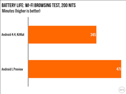
Android’s Project Volta was designed to optimize the OS’s performance on smartphones to improve battery life. Project Volta follows a pattern of projects run by Google focused on addressing weaknesses of the previous platform, such as Project Butter, which aimed to make Android’s UI animations run at 60 fps, and Project Svelte, an effort to get the OS to run on 512MB of RAM. In previous versions, when the OS is engaged in a process for one second, it burns two minutes of standby time. To address this, Project Volta includes the development of a “JobScheduler” API which allows the OS to batch unimportant app requests, and gives developers the option to delay housekeeping functions on their apps until the device is plugged in. ArsTechnica did a study of the Android L Preview battery life versus Android 4.4 KitKat and found that Android L Preview had 36% more battery life.

 androidL

Via Ars Technica

Another major move in the Android L Preview is the transition of the default run-time from Dalvik to ART, which aims to save battery life and yield a faster, more efficient performance. Animations and scrolling felt both faster and smoother, but there were some bugs with the multitasking view and notification tray which one can imagine will be fixed in the final version of the OS.

App compatibility with the new OS fluctuates, some work fine in the Android L Beta, while others don’t work at all, including Twitter, Dropbox, and Google Docs. Of course, we expect much of this to be ironed out in the final version of the OS. The bottom line for Android developers is that Android L represents a major improvement in battery life, aesthetics and performance, which is good for business.

At Mystic Media, we’re highly experienced in the Android app development field, with a thorough and continually evolving perspective on the ins and outs of the platform. Contact us today by clicking here or by phone at 801.994.6815

Game Up: Employ Top Gaming App Design Trends for a Killer End User Experience

Mobile gaming is one of the most widely utilized functions of a smartphone. Studies show the average user spends 7.8 hours in the average month on mobile gaming. iPhone owners account for 14.7 hours per month, while Andro

Making the Most of Your Tablet Design Part 2: Custom Device Design

In Part One of our two part series on tablets, we explored the top tablets on the market in 2014 and what they offer to both consumers and developers. This article, explores the perks & advantages of custom device application design and optimization.

Companies design applications to connect with their consumers–to attract eyes to their company or product. As developers, we don’t focus on what device the consumer uses, the goal is to hold the user’s attention and potentially engrain our client’s brand in the consumer’s day. When developing an application, one must remember that each device has its advantages and disadvantages, and one cross-device layout doesn’t always get the job done. By optimizing a mobile application separately for phones and tablets, it portrays your company in the best light and engages the end user with the best possible user experience.

As discussed in the previous article, tablets vary in numerous factors, most notably operating system, processing power and screen size. When optimizing a mobile application, there are a few options. Developing an application optimized for smartphones creates an app which can be used to its fullest potential on any smartphone, but the app’s functionality could suffer on a tablet. Developing a tablet-only application optimizes the app for tablets, but again, it will not work nearly as well on a smartphone.

The third and best option is to optimize the app separately for both phones and tablets. Although creating a phone or tablet-only optimized application is cheaper, when the design is optimized for each screen size and device type, your app always looks great, sacrificing neither functionality nor usability on any given platform and ultimately providing the best possible user experience. At Mystic Media, we recommend investing in both phone and tablet versions of your application to maximize the quality of the app, and vicariously the perception of your company.

Phone only applications can be fixed to have multiple viewing options. We all have seen and experienced the 1x & 2x buttons on iPads, which allow you to adjust the size of the application based on what device you are using. While this seems a reasonable solution in theory, in practice, it appears shoddy and cheap. When one application attempts to optimize only for a phone and utilizes the same general framework for tablets, it often ends up mediocre on the tablet. For big companies, it’s not up for debate–they recognize the importance of appearing on the cutting edge so they invest in multiple device applications

Take a look at the Youtube mobile app. Their iPhone & Android apps limit the app to display vertical orientation on phones, but on tablets they optimize the design to display both vertical and horizontal orientations based on the angle at which one holds the device. By optimizing the design of the app to change based upon the screen size and device orientation, Youtube allows for a customized feel and content placement on all devices, ensuring the end user will spend more time on their app increasing the quality of the user experience.

Device optimization is worth the time and money because it allows the mobile application to live up to its fullest potential functionally and is aesthetically pleasing on every screen. In addition, marketing your app in both the phone and tablet categories within the app store gives your app a major boost in visibility.

When developing an application, the number one goal is to avoid looking amateur. If the application looks amateur, it turns off the user, consequently causing less downloads, uses, and of course,money. In the spirit of app store optimization and attracting downloads, it is critical to maximize the exposure to your mobile application. Having a bad application is worse than having no application—it can degrade the business in the eyes of your customers and potential users. Rather than squander your time and money on a cheap app, satisfy and impress your customers by developing a multiple device optimized application.

At Mystic Media, our team is equipped with all the tools to develop your app, optimize it to devices, and even develop market strategies. We have the knowledge, the work force, and the work ethic to design your mobile app to its fullest potential. Contact us today by clicking here or give us a call at 801.994.6815