Tag Archives: Developer

App Store Optimization Part 4: Maximize Your Exposure by Getting Featured on the App Store

In an effort to emphasize the importance of App Store Optimization, The Mystic Media Blog is applying its expertise into a six-part series on ASO. In our previous entry: “Boost Your App’s Profile, Increase Downloads and Generate Better Ratings”, we detailed the secondary factors which affect ASO, such as Ratings and Number of Downloads. This week, we will explore how to get featured on the app store landing page.

Intelligent ASO will bring you to the top of search-strings specific to your app’s functionality. However, imagine if rather than having to search, your app was presented to viewers the moment app store users go to the app store. Sounds like a dream scenario, but it’s entirely possible through clever ASO. Both Apple’s App Store and the Google Play App Store feature top-tier applications on their landing pages, as well as in several mini-categories.

The App Store curators are not looking to help developers out by featuring apps. They are looking out for the best interest of their company, which means pleasing the viewer. In order to satiate their customers, they showcase the coolest, most visually-engaging, best executed, most high-tech apps. Developers can take advantage of the curators’ needs by catering to their desires and utilizing the latest iOS and Android features in their apps. App Stores are much more likely to feature an app if it showcases the best features of their product.

Keeping up with the latest technologies is easier said than done in a constantly evolving landscape. With every OS update from both Apple and Android, the capabilities of devices are increased. Curators looking for the most high-tech apps must react to the OS updates and seek out apps which utilize the new technology to feature in the app store. Your app can fill that void. Stay up to date on the latest iOS update by reviewing our recent post Bite the Apple: Maximize iOS 8 to Vanquish Your Competition. Review our Android L Beta Preview: First Impressions of the Latest OS to plan ahead for the forthcoming Android L OS. If you’ve already designed your app, you haven’t missed out. Working the latest technology into an app update can also get the app featured. For example, Apple has been pushing the iCloud for all of their apps as of late. Finding some way of incorporating iCloud into an existing app’s software update would be beneficial for ASO.

In service of ensuring your app retains the look and feel of the most state-of-the-art technology, we recommend investing heavily in the User Interface and User Experience design. Perhaps the most important aspect of any app, poor UI/UX design will both alienate customers and guarantee your exclusion from the app store. Great UI/UX design will charm your customers and make your app look state-of-the-art. The details which go into an app’s gestures and audio make or break an app in the eyes of the critic, while retaining the potential to dazzle an audience. When directing your UX designers, be sure to take into account the branding for device-specific apps. If you’re releasing your app on iOS, review Impervious Appeal: How to Design Jaw-Dropping iOS Apps to make sure the UX design is consistent with Apple UX aesthetics, including “flat design.” The upcoming Android L OS specifically pushes Material Design aesthetics in an effort to distance the look of Android apps from those of iOS. Check out Android’s official Guide to Material Design for Developers to learn more. Impressive UX is debatably the most important aspect of any app, but it’s especially vital in the eyes of app store curators looking to show off the graphics capabilities of their devices.

Check out the screenshots below which detail the process of how Transit, an app which aggregates public transportation information, developed their UX design through multiple drafts. In 2012, Apple announced they would develop their own Maps app to replace Google Maps on iPhones. Instead of creating public transit functionality from scratch, Apple found it cheaper to buy Transit, an already successful app, and utilize its functionality. Now under Apple, Transit’s quest to perfect UX which would seamlessly integrate with Apple’s evolving aesthetics is a great example of aesthetic adaptation and the process of developing UX.
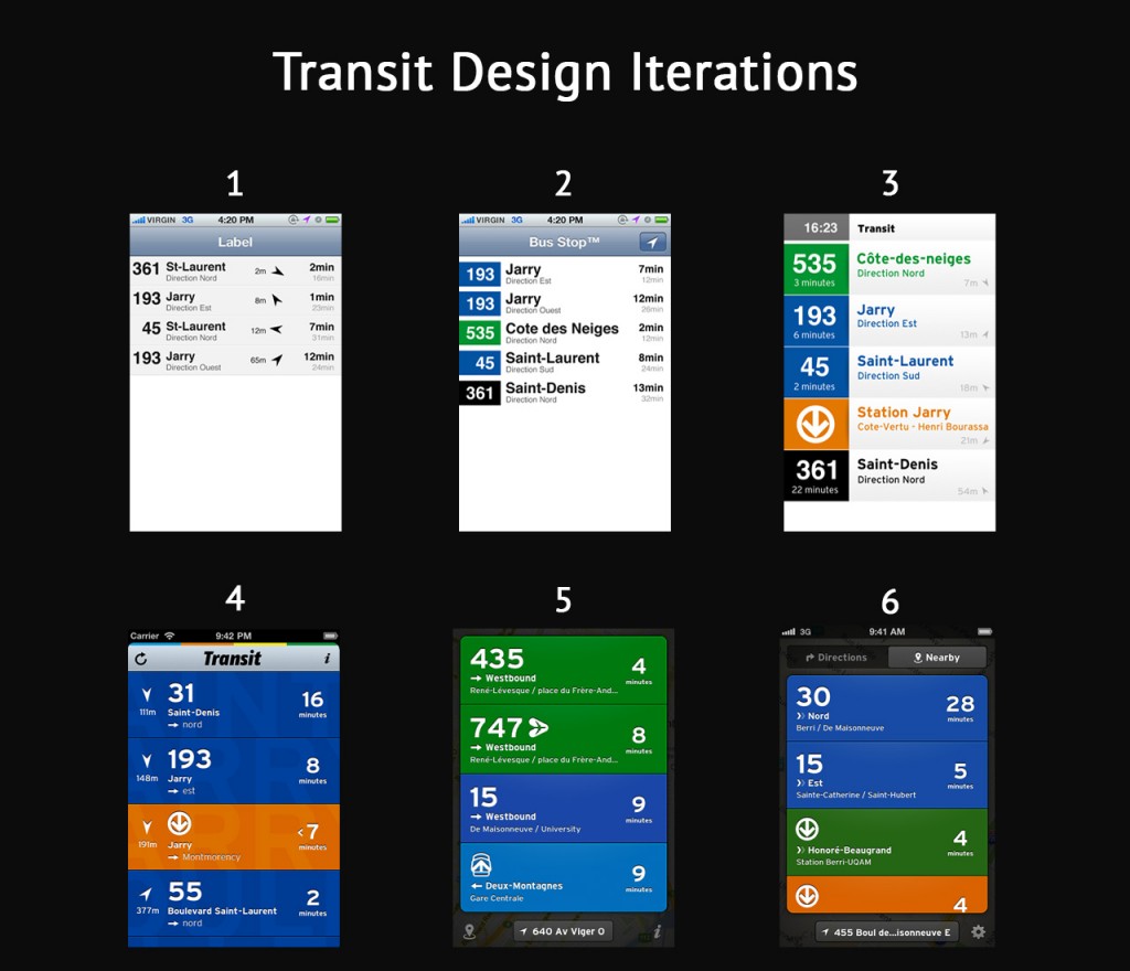
 

Via blog.pickcrew.com

With over 1,000 app submissions per day, standing out in the sea of content within the app store can be a challenge; however, a great app will find its audience if properly marketed. While ASO is vital, it must be only one facet of any app’s marketing campaign. The app store curators react to trends. If an app gets external publicity, they are more likely to feature it. This works against independent developers who generally don’t have the same budget for marketing as they do for app development. Established brands stand a better chance at getting and staying featured. But independent developers can still find their niche. The app store curators are taste-makers looking to please their users by offering the best apps the exposure they need, as if they were curating a critic’s “Best of” list. The curators do not want to give the viewer the most obvious choice, but rather the best-in-class. Thus, a great app can transcend limitations.

Developing multiple native applications catering specifically to both device and OS improves your chances of success in all facets of app design, including ASO. Review Making the Most of your Tablet Design Part 2: Custom Device Design to learn more about the benefits of custom device design. App stores are more likely to feature apps which are available and optimized not just for smartphones, but also for tablets and computers as well. The more app stores on which your app is available, the more places it could get featured. Staggering your launch to start exclusively on one app store can also work toward your advantage because Apple and Google are more likely to feature apps exclusive to the Apple App Store or Google Play App Store respectively.

There are no rules the curators of the app stores must follow. They live in the shadows seeking out the best apps to showcase the full potential of iOS and Android smartphones, tablets, and computers. As we’ve stated before, ASO starts and ends with a great app.

Next week, in Part 5 of our series on ASO, we will detail the differences between the Apple and the Google Play App Stores. Stay tuned!

At Mystic Media, our teams of expert application designers and strategic marketers have the means to effectively both develop and market apps for iOS and Android. Contact us today by clicking here, or by phone at 801.994.6815

Bite the Apple: Maximize iOS 8 to Vanquish Your Competition

Apple touts iOS 8 as their biggest iOS release ever. Coming from the biggest, most innovative technology giant in the world, that’s a major statement. In our ASO series, we found the apps which exploit the latest technology are much more likely to get featured in the Apple App Store. iOS 8 represents a major opportunity for app developers to get ahead of their competition by both creating new apps, as well as revamping current apps to take full advantage of the latest technology. In order to do this, one needs to understand the ins and outs of the new platform. Thus, we’ve compiled a list of the latest features and what they mean to developers.

Device Continuity

Device Continuity is the future of Apple products, and Android will likely to follow suit. The idea is to allow users to seamlessly transition between devices without interrupting their current task. Imagine writing an email on your iPhone, putting it down, going into another room, and finishing it on your Macbook. Or playing a game on your iPhone, pausing it, going to the  bathroom and continuing on your iPad. The possibilities are endless.

The concept of Device Continuity has been planted in iOS 8 and the device compatibility will be expanded in the upcoming release of OS X Yosemite. MacBooks and iPads will have all the functions of iPhones in the future: the ability to make receive calls and FaceTime in addition to the functions they already retain. Devices will be so seamlessly integrated, MacBooks will be able to connect to your  iPhone’s personal hotspot for internet. When MacBooks are in use, iPhones will automatically shut off to conserve power.

App developers who are able to utilize device continuity both effectively and creatively will have a great chance at getting featured across the App Stores for iPhone, iPad, and Macbook.

iCloud Drive

While iCloud was used in iOS 7, Apple is now pushing the iCloud Drive (as it’s now titled) as it’s own cloud storage service like Box and Dropbox with data plans available for purchase. iCloud Drive allows for any type of file stored on computers and phones to be accessible from any device. iCloud Drive plays into Apple’s major conceptual push for device continuity and will be further explored with the release of OS X Yosemite this Fall.

Health App

In our previous article on iOS 8 rumors, one of the most talked about reports concerning iOS 8 was the “Healthbook App”. Sure enough, one of the major innovations in iOS 8 is the Health app, which can interact with other health-related apps on iPhone to create a one-stop dashboard of health data. The Health app can track the amount of steps you take, the distance you run, the amount of calories you consume, and more in conjunction with apps such as Fitbit and Jawbone. Unfortunately, many apps are currently unable to connect with Health due to a bug at the launch which Apple claims it will fix later this month. Despite the temporary road-block, the Health app is built to be compatible with other health-related apps and thus represents a great opportunity for iOS developers to find opportunities to capitalize with Health-compatible apps for iPhone and iPad users.

Family Sharing

Another major feature of iOS 8 is Family Sharing. Family Sharing allows for families of up to six people to share their digital purchases from iTunes, iBooks and the App Store without having to share one account on one credit card. When kids attempt to buy things in the App store, a notification goes to the parent and the purchase can only be complete pending the parent’s approval. Family Sharing could potentially make in-app purchases for kids games much more profitable.

Credit Card Scanning

Safari can now use the iPhone camera to scan credit card numbers when making online purchases, speeding up iPhone-based eCommerce. A savvy developer could certainly find a way to integrate this into their in-app purchases to simultaneously exploit the latest technology and make it easy for customers to spend more money on their apps.

Minor Improvements

The host of other minor improvements includes a Siri equipped with Shazam, allowing her to recognize songs when asked. Apple also followed Android’s lead in employing QuickType, which gives shortcuts to the words users may be writing based on their texting history and what’s being typed.

Another minor innovation is the ability to send mini-voice messages as texts. As we’ve previously explored, communications apps are big business. Developers could potentially ingrain themselves in these voice messages by finding an innovative way to make voice messaging more fun, perhaps through audio filters.

Concluding Thoughts

The Verge got it right when they said “We won’t see the full potential of iOS 8 for weeks or months after its release”. While Apple’s announcement and subsequent release of iOS 8 is big news for developers, until OS X Yosemite releases later this year, we won’t know its full potential. In the meantime, developers start your engines, the race to exploit the latest technology in iOS 8 has begun.

Mystic Media is one of the most versatile and elite software design agencies in the United States. With experts in iOS and Android software development and marketing, Mystic excels in all processes involved in both app and web development. Learn more by clicking here or call us at 801.994.6815

App Store Optimization Part 2: Master the Art of Writing a Catchy Title and Effective Keywords

In an effort to emphasize the importance of App Store Optimization, the Mystic Media Blog is applying its expertise into a six-part blog series on the topic. In our previous post, we gave an introduction to ASO, giving a general overview on the basics and defining the factors which impact your app’s placement in the app store. This week’s entry, part-two, will focus on the two primary factors in ASO: Title and Keywords.

The window for users to decide whether or not to download your app is increasingly short. In a generation defined by content overload, if you don’t catch the user’s eye within a matter of seconds, chances are your app will be overlooked. Even if you have an app icon that stands-out, unless you are within the first batch of search results for the keywords associated with your app, the user will likely settle before they see your app listing. ASO is about increasing the ranking of your app in search strings, and the two most important factors in ASO are title and keywords.

The title of your app, along with the app icon, is the most visible aspect to the casual user in the App Store. The App Store favors more descriptive titles. The use of keywords within your title will raise your place in the search results. Granted, your title should first and foremost be catchy, it’s also vital users get a sense of what the app does when they read the title. While the rules are different for big brands such as Grubhub and Uber, these companies worked to establish a preexisting relationship with consumers before launching their apps. If you can balance brand catchiness with keyword functionality in your title, you’ll have a winner.

Keywords are the most important factor in ASO. The keywords attached to an app make or break its SEO. Keywords are select terms or phrases attached to an app which apply to its functionality. The app stores have developers attach keywords to their apps so that when a given term is searched, apps with the keywords attached appear. It’s vital for developers to maximize and diversify their keyword offerings. Keywords like “food” or “taxi” yield a highly competitive search string, but synonyms like “grub” or “trolly” are less frequently searched, thus providing an avenue for your app to excel. The most relevant and logically searchable terms related to your app should also be keyworded. Yelp uses not only “food” and “restaurant, but also “bars”, “reviews”, “comida”, and “local”. By keywording a diverse group of terms, an app has a much greater chance of rising to the top when any of the terms are used in combination. Apptamin got it right when they said: “[It’s] better to be in the top 5 results for an average-searched keyword than in the top 100 for a highly-searched keyword.” The best avenue for an app to stand out is in a more focused group.

Determining keywords can be tricky. It requires time spent creatively analyzing the app in question as well as research. Many sites such as Searchman and AppTweak offer ASO analytics and third party consulting. There are also a number of ways to measure keyword analytics through independent research. Developers can search for a specific keyword in the app store in order to learn how many apps are targeting the term. Sensortower allows users to search for apps and find the keywords associated with each in the app store for free.

Keyword volatility is a crucial metric which measures how keyword rankings fluctuate over time. Some keyword searches yield consistent results while other results fluctuate over time. Although it takes mass amounts of data to get a truly accurate read on volatility, a simple way for developers to measure the volatility of a given keyword search is to search the term everyday for a couple of weeks and record the top ten, watching to see if the results and rankings change. While this simple method yields somewhat accurate results, a developer’s best bet is to outsource volatility tracking to a third-party SEO specialist.

Be on the look out next week for the third part of our ASO series focusing on the secondary factors in ASO, including app description, icon design, garnering better reviews and boosting your number of downloads

Finding the right title and keywords is likely the most difficult part of ASO, but also the most rewarding. If you want to save yourself some time and maximize your investment, Mystic Media’s experts are happy to assist you in your ASO, Strategic Marketing, and App Development needs. Contact us today by clicking here or by phone at 801.994.6815

Android L Beta Preview: First Impressions of the Latest OS

As the year winds down, the developer community can look forward to new operating systems from Apple, Android, and Microsoft. We’ve covered the forthcoming IOS 8 upgrade and Windows has taken a different approach, updating their Windows 8.1 consistently without renaming the OS. This leaves the upcoming Android L. Android recently released the Android L Developer preview, a sneak peak at the latest version of the OS, available for the Nexus 5 and the 2013 Wi-Fi Nexus 7. We took a look to assess the ins and outs of the platform.

The biggest development in the Android L is an aesthetic: the shift from the recommended Holo visual theme to Material Design. Like flat design, Material Design involves a simple, vibrant, non-skeuomorphic visual scheme. Unlike flat design, Material Design is about creating a realistic cyber universe. Material is a metaphor. The idea of space within the user interface which is “inspired by the study of paper and ink yet technology advanced and open to imagination and magic.” (via Google) In other words, it’s an interface which is realistic and has intuitive rules within its own world, but still makes things easier when it can with creative gestures and transitions. The key to creating a realistic digital-space is to have consistent, fundamental rules of light, surface and movement. For more on Material Design, check out Google’s introduction to the concept.

The notification tray received a major renovation. Rather than keeping two trays for alerts and quick settings, the two are now presented in one unified notification tray. Dragging down from the top of the screen pulls out notifications, then dragging down on the notifications screen reveals a layer of quick settings.

The lock screen also received an update, displaying notifications front and center, allowing easy access directly from the lock screen. The updated lock screen also makes access to functions easier through gesture:  a swipe up unlocks the device, a swipe left opens the camera, a swipe right (on phones) opens the dialer.

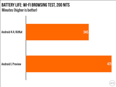
Android’s Project Volta was designed to optimize the OS’s performance on smartphones to improve battery life. Project Volta follows a pattern of projects run by Google focused on addressing weaknesses of the previous platform, such as Project Butter, which aimed to make Android’s UI animations run at 60 fps, and Project Svelte, an effort to get the OS to run on 512MB of RAM. In previous versions, when the OS is engaged in a process for one second, it burns two minutes of standby time. To address this, Project Volta includes the development of a “JobScheduler” API which allows the OS to batch unimportant app requests, and gives developers the option to delay housekeeping functions on their apps until the device is plugged in. ArsTechnica did a study of the Android L Preview battery life versus Android 4.4 KitKat and found that Android L Preview had 36% more battery life.

 androidL

Via Ars Technica

Another major move in the Android L Preview is the transition of the default run-time from Dalvik to ART, which aims to save battery life and yield a faster, more efficient performance. Animations and scrolling felt both faster and smoother, but there were some bugs with the multitasking view and notification tray which one can imagine will be fixed in the final version of the OS.

App compatibility with the new OS fluctuates, some work fine in the Android L Beta, while others don’t work at all, including Twitter, Dropbox, and Google Docs. Of course, we expect much of this to be ironed out in the final version of the OS. The bottom line for Android developers is that Android L represents a major improvement in battery life, aesthetics and performance, which is good for business.

At Mystic Media, we’re highly experienced in the Android app development field, with a thorough and continually evolving perspective on the ins and outs of the platform. Contact us today by clicking here or by phone at 801.994.6815

Making the Most of Your Tablet Design Part 2: Custom Device Design

In Part One of our two part series on tablets, we explored the top tablets on the market in 2014 and what they offer to both consumers and developers. This article, explores the perks & advantages of custom device application design and optimization.

Companies design applications to connect with their consumers–to attract eyes to their company or product. As developers, we don’t focus on what device the consumer uses, the goal is to hold the user’s attention and potentially engrain our client’s brand in the consumer’s day. When developing an application, one must remember that each device has its advantages and disadvantages, and one cross-device layout doesn’t always get the job done. By optimizing a mobile application separately for phones and tablets, it portrays your company in the best light and engages the end user with the best possible user experience.

As discussed in the previous article, tablets vary in numerous factors, most notably operating system, processing power and screen size. When optimizing a mobile application, there are a few options. Developing an application optimized for smartphones creates an app which can be used to its fullest potential on any smartphone, but the app’s functionality could suffer on a tablet. Developing a tablet-only application optimizes the app for tablets, but again, it will not work nearly as well on a smartphone.

The third and best option is to optimize the app separately for both phones and tablets. Although creating a phone or tablet-only optimized application is cheaper, when the design is optimized for each screen size and device type, your app always looks great, sacrificing neither functionality nor usability on any given platform and ultimately providing the best possible user experience. At Mystic Media, we recommend investing in both phone and tablet versions of your application to maximize the quality of the app, and vicariously the perception of your company.

Phone only applications can be fixed to have multiple viewing options. We all have seen and experienced the 1x & 2x buttons on iPads, which allow you to adjust the size of the application based on what device you are using. While this seems a reasonable solution in theory, in practice, it appears shoddy and cheap. When one application attempts to optimize only for a phone and utilizes the same general framework for tablets, it often ends up mediocre on the tablet. For big companies, it’s not up for debate–they recognize the importance of appearing on the cutting edge so they invest in multiple device applications

Take a look at the Youtube mobile app. Their iPhone & Android apps limit the app to display vertical orientation on phones, but on tablets they optimize the design to display both vertical and horizontal orientations based on the angle at which one holds the device. By optimizing the design of the app to change based upon the screen size and device orientation, Youtube allows for a customized feel and content placement on all devices, ensuring the end user will spend more time on their app increasing the quality of the user experience.

Device optimization is worth the time and money because it allows the mobile application to live up to its fullest potential functionally and is aesthetically pleasing on every screen. In addition, marketing your app in both the phone and tablet categories within the app store gives your app a major boost in visibility.

When developing an application, the number one goal is to avoid looking amateur. If the application looks amateur, it turns off the user, consequently causing less downloads, uses, and of course,money. In the spirit of app store optimization and attracting downloads, it is critical to maximize the exposure to your mobile application. Having a bad application is worse than having no application—it can degrade the business in the eyes of your customers and potential users. Rather than squander your time and money on a cheap app, satisfy and impress your customers by developing a multiple device optimized application.

At Mystic Media, our team is equipped with all the tools to develop your app, optimize it to devices, and even develop market strategies. We have the knowledge, the work force, and the work ethic to design your mobile app to its fullest potential. Contact us today by clicking here or give us a call at 801.994.6815


Making the Most of Your Tablet Design Part 1: The Top Tablets in 2014

In Part One of our two part series on tablets, we’ll explore the top tablets on the market in 2014 and what they have to offer both consumers and developers. Part Two will intensively explore the perks of cross-platform tablet application design and optimization.

The tablet market has experienced unprecedented growth with sales growing by over 50% in 2013. Although tablets have existed for over 20 years, the iPad revolutionized the industry when Steve Jobs suggested that a tablet was not simply a personal computer, but a game machine, music player and movie player as well. Rather than a laptop in a different shape, the iPad represented a portable media consumption device with a longer battery life and seemingly endless possibilities for applications. The top tablets for 2014 indicate the future of a business already in an upswing.

iPads are the gold standard when it comes to tablets. They represent the combination of mainstream consumer satisfaction with high-class IOS design and delivery. The top two iPads on the market are the iPad Air and the iPad Mini with Retina display. Retina display entails that the graphics on iPad Minis are so clear, one cannot decipher the pixels at a typical viewing distance. iPad Air has been widely praised as the best tablet on the market. It’s sleek and fast with a 1.4 GHz processor and Apple A7 chip, and while it is on the pricey side, you get what you pay for. IOS designed apps generally yield the most pleasant user experience, although, at Mystic Media, our experienced design team are highly capable of designing aesthetically impeccable cross-platform apps in  IOS, Android, Windows & Blackberry.

The top Android tablets include the Amazon Kindle Fire HDX, Samsung Galaxy Note 10.1, and the Google Nexus. Android’s open-source programming code allows for a greater variety of devices, as well as a more crowded app store. Developers love the Android OS because their apps are more easily approved and reach a broader audience. Many hail Samsung’s Galaxy Note 10.1 as the premier Android tablet on the market. With a 10.1 inch screen, 1.9 GHz processor speed, and 2560 x 1600 pixels, the Galaxy Note 10.1 is bigger, faster, and also more crisp than both iPads currently on the market. It’s also $100 cheaper than the iPad Air. Its main competitor within the Android tablet sphere is the Amazon Kindle Fire, which has the fastest processor speed among mainstream tablets with 2.2 GHz. Its graphics are also on par with the Galaxy Note, and it offers 24/7 video tech support. What sets the Amazon Kindle Fire apart is its compatibility with Amazon, which led cnet.com to label it a must-have tablet for Amazon Prime members.

The Microsoft Windows 8.1 OS is the middle child of Operating Systems, ignored but gifted in its own right. Microsoft’s Surface 2 is generally regarded as THE Windows tablet. The Surface 2 sets itself apart by offering a full contractible keyboard, making it a practical device for getting work done. The Asus Transformer Book T100 also offers a contractible keyboard, along with a 10.1 inch screen and the longest battery life of a mainstream tablet with almost 11 hours. While Windows tablets have major processing power and practicality, they are much less popular, and thus have fewer applications, which also works to the advantage of developers who will have less competition in the App store.

In deciding upon your tablet, you must evaluate the size of the screen, the processor speed, screen resolution, operating system, storage capacity, and battery life. You must ask how you’re going to use it–is it for media consumption, or productivity? Where you’re going to take it, will it be around the house or are you bringing it to work? Will you listen to music on it, or make music? For the casual user, the iPad generally fits the bill, for the developer, Android tablets tend to take the cake, and for the workhorse, Windows offers the best processing power and functionality.

At Mystic Media, we’re experts in the application design field and are highly capable designers for both tablets and smartphones of all Operating Systems. Contact us today at www.mysticmediasoft.com or by phone at 801.994.6815

Stay tuned next week for Part 2 of our two part series on Tablet design focusing on cross-platform optimization.