All posts by admin

Facebook Champions Material Design: Why You Should Too

In the past year, material design has been rising in prominence as both an app and a web design aesthetic. As we’ve detailed in our past article How Material Design Redefined Android App Aesthetics, Material Design has the potential to catch on in a major way.  In this post, we take a look at the bright future ahead for the platform.

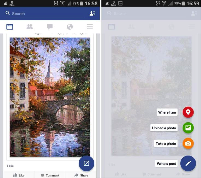
Facebook recently began testing a Material Design overhaul of their Android app. Additions include a floating action button commonly found on Lollipop apps. The design on the whole has a more cohesive digital world adhering to Material Design principals.

“Not only does the app look better, but it’s also going to make the app easier to use for Lollipop users who are now becoming accustomed to that floating action button.” Writes Killian Bell of Techno Buffalo.

Check out this picture of the Beta app (via Techno Buffalo)

Material Design Facebook

If Facebook’s Material Design app looks slick. If it proves to be functionally efficient, it’s reasonable to assume they could utilize some of the same design techniques to update their iOS app.

Facebook’s Android app redesign is reminiscent of the Gmail Inbox app. Considered one of the premier Material Design apps on the market, Inbox was developed by Google and provides a perfect showcase for Material Design aesthetics. Depth plays a major role in all the gestures. When the user swipes an email to mark it done, it reveals a green checkmark underneath the top layer as the email disappears off screen.

Check out his awesome promo video by Google which explains how Inbox works:

Inbox was created to manage mass volumes of emails. Larry Dignan over at ZDNet reviewed Inbox by forwarding his 700 or so work emails per day to the app to see how it handled organizing bulk emails. Inbox passed the test, allowing the user to create bundles of emails in order to better organize incoming messages.

With futurists predicting the downfall of email, the question becomes: Could the same Material Design techniques which the Inbox app uses to organize bulk emails and save screen space be applied to an encompassing Facebook social feed which replaces email?

The main problem inhibiting Material Design from catching on in a major way for the Android platform is device fragmentation. As of March, only 3.3% of Android devices are running the latest OS: Lollipop. 40% of Android devices are running KitKat and 20% are still using Jelly Bean.

Despite the obstacle of device fragmentation, as the next Android OS is released, Lollipop and Material Design are sure to become more and more prevalent. What makes Material Design so crucial is its role in connecting the Android device ecosystem. With more and more devices coming into the fray, Apple has been doing their part to push for Device Continuity, allowing for seamless transition between devices. Android may have to battle to overcome device fragmentation, but as Material Design gains momentum, their hardware and software will at least have aesthetic continuity.

The future of Material Design extends beyond the smartphone and the tablet. With the wearable revolution impending upon Apple Watch’s April 24th release date, it’s reasonable to assume Material Design will find outlets beyond traditional mobile devices as Android increases it’s wearable repertoire. If Google Glass had lasted, no doubt it would have utilized Material Design in its updates. Regardless, Android has several products in the pipeline that are sure to boast Material Design, including Android TV and Android Auto.

For now, Material Design is an Android-exclusive technique still vying for mainstream adoption. However, Facebook’s adoption of the design technique for their upcoming Android app is a good sign. As we look to a device-interconnected world, it seems inevitable the principles of Material Design will continue to evolve and shape the future of Android design aesthetics, and potentially expand to influence web and iOS aesthetics as well.

At Mystic Media, we’re constantly engaged in various app design projects. Our expertise reaches across all facets of the industry, be it iOS designAndroid designweb designstrategic marketing and more. Contact us today by clicking here or by phone at 801.994.6815

Mobile Game Developers Rejoice: Apple Increases App Store Size Limit to 4 GB

Apple recently announced they would increase the size limit of mobile app packages on the Apple App Store from 2 GB to 4 GB.

They experimented first by releasing Disney Infinity: Toy Box 2.0 for free in late January. Disney Infinity Toy Box 2.0 is a gaming app developed using Metal. The app is similar to Minecraft in the way it allows players to create their own world using pre-made characters. It weighs in at a massive 3.8 GB when downloaded from the App Store. The additional space is utilized in the expansion of their cast of characters. Disney Infinity Toy Box 2.0 features not only Disney characters, but many superheroes from the Marvel universe, Guardians of the Galaxy, and The Incredibles.

Check out this awesome iOS preview of the game:

https://www.youtube.com/watch?v=sm7iF5l-ZcA

Although the app is available for free on iTunes, in-app purchases start at $0.99 and reach as high as $59.99. Only three characters are available for free. These free characters rotate, giving users a taste of what they are missing, as well as reason to keep checking the app. The rest of the characters can be purchased in stores like Best Buy, Walmart, etc. It is sure to be a profitable endeavor given the pre-existing fan-bases of the many characters in the mobile game.

The Apple App Store’s increased app size limit will most certainly bring about an influx of large-scale apps like the Disney Infinity Toy Box, although one thing hasn’t changed: apps which are being downloaded by a cellular network still have a 100 MB size limit. Apps above 100 MB must be downloaded using a Wi-Fi network.

While there are obvious advantages to giving users the ability to download an app wherever they have cellular service, large-scale apps are often less dependent on impulse downloads. Many developers will no doubt be excited to put the new limit to work via higher quality graphics and longer games.

The move seems consistent with Apple’s strategy of making the development process easier for app developers. Last year, Apple released Swift (for information on Swift, check out our previous post: Swift Execution: Apple’s New Programming Language Shakes Up Tech Community) and  Metal, a low-level, low-overhead graphics API which we wrote about when it debuted with iOS 8 in our post Bite the Apple: Maximize iOS 8 to Vanquish Your Competition. Both releases, along with the increased app size limit, seem to be power moves dedicated to drawing more developers to the iOS platform.

As we detailed in App Store Optimization Part 5: Key Differences Between Apple Vs. Google Play App Stores, the main difference between the Apple App Store and Google Play is Apple’s emphasis on curation. Although good ASO processes for the Apple App Store are shrouded in secrecy, it’s known that Apple focuses on promoting discovery through curation. Apple requires all apps to be approved by their team of curators before allowing them to be displayed in the App Store. Increasing the app size limit gives developers the freedom to create more intricate, high-production value games for the Apple App Store curators to promote.

If there’s one broad conclusion to be drawn from the move, it’s that mobile gaming is evolving, and Apple wants to spearhead the movement.

Mystic Media is an iOS and Android app development, web design, and strategic marketing firm based in Salt Lake City, Utah. Contact us today by clicking here or by phone at 801.994.6815

Samsung and Microsoft Team Up for Galaxy S6–What It Means for Apple, Android, and Windows

Samsung is looking to step up its smartphone game.

Recently, there have been reports that the Samsung Galaxy S6 and S6 Edge devices will come pre-packaged with Microsoft apps despite running on the Android OS. Coming only a few weeks after the two tech titans settled a royalty dispute out of court, the move is sure to raise eyebrows–especially those at Android.

At the Mobile World Congress, Samsung revealed the Galaxy S6 and S6 Edge will come bundled with Skype, OneDrive, and OneNote applications preinstalled in a “Microsoft Apps” folder. The Galaxy S6 also comes with 115GB of free OneDrive storage for two years as part of a new partnership with Microsoft. It’s possible Samsung may also include Microsoft Office mobile with their phones, but they did not reveal this during the demo.

Windows Central alleges Samsung is looking to make more phones on the Windows OS in 2015. They have had limited success doing so in the past, but perhaps the reputation for efficiency of the Windows OS is drawing them to expand their repertoire, or perhaps they intend to create more affordable hardware on Windows.

Samsung has been attempting to reduce their reliance on the Android OS for some time now. They created Tizen, their own operating system, back in with the intent of competing with Android, iOS, and Windows. After several delays, Samsung recently launched their first smartphone utilizing Tizen: Samsung Z1, to middling results.

For Apple, the move certainly increases stock in Samsung’s direct iPhone 6 and 6 Plus competitor, but regardless, there’s no denying Samsung is shamelessly playing catch-up. The S6 features an updated fingerprint scanner and Samsung has recently announced their Apple Pay competitor: Samsung Pay.

For Microsoft, this is a huge win. The move represents Microsoft’s first time striking a deal with a non-Windows phone to preload any of its apps.

If you’re an Android fanboy, this cannot be pleasing. Although plenty of iPhones receive installs of Google Maps and other Google apps, they do not come prepackaged. Microsoft effectively poached a major Android device, and there’s virtually nothing Google can do about it.

Of course, we won’t know the ultimate impact until the Galaxy S6 and S6 Edge are released in April. Until then, we’ll chock it up to a win for Microsoft.

Mystic Media is an app development, web design, and strategic marketing firm located in Salt Lake City, Utah. Contact us today by clicking here or by phone at 801.994.6815

5 Trendy Web Design Techniques to Modernize Your Website

In the age of digital commerce, it’s vital to have a spiffy website. Even if a business does sell its products online, the first impression customers have of a brand often stems from the website. A messy website brings to mind a messy product. In this post, we will examine how 2015’s upcoming web design trends present ways in which to improve websites to make them look modern.

1.    Nail Your Landing Page

The landing page is the first impression a visitor has of a website, thus it’s a great opportunity to dazzle the viewer. Many websites have landing pages which are not only physically big, with imagery and design taking up most of the screen, but also large in metaphorical scale. Check out the website of Born Group, a creative media company with an extremely ambitious landing page.

Born sells something intangible—creative services. Their product is the ability to provoke emotion. As a creative agency, it’s vital for them to establish that they produce emotionally riveting content. The image of the ape is not only beautifully photographed, it’s powerful. If a prospective customer were on the verge of hiring Born Group, they would indubitably be swayed in the right direction from the moment they hit the landing page.

2.    Video Rules

For some companies, going for a message as big as Born would come off as overly self-involved. Born has an intangible product and sells B2B (Business-to-Business). They need to sell an idea and if they bring in a single project, it will pay for a big-budget investment in their site.

For smaller companies with tangible products, it’s important to put the product itself front-and-center. One way of doing this is to embed a video on the landing page of your site. For example, check out the salivating video on the landing page of Dunwell Donuts, a vegan Brooklyn donut shop.

The video succeeds on nearly every level. It makes the viewer crave donuts, artfully portrays the product, and tells the story of the founders of the business in an extremely intimate manner.

3.    Tell Your Story

The primary accomplishment of the Dunwell video is in the arena of storytelling. The Dunwell video tells the story of the company brand in an intimate way. By the end of the video, the viewer feels like they have a good sense of who runs Dunwell Donuts and what donuts mean to them.

A video is a cost-effective way of telling the personal story of a brand. Storytelling is a powerful medium because it creates an emotional connection between the viewer and the subject when executed effectively. For a business (especially a small business), this translates directly to brand loyalty. We’ve detailed other ways in which one can tell the personal story of a brand in our Parallax Scrolling article.

4.    Flat Design

Minimal web design is in. Apple’s design technique, flat design, is defined as “a style of interface design which removes any stylistic choices that give the illusion of three-dimensions (such as drop shadows, gradients, textures, or other tools that add depth) and is focused on a minimalist use of simple elements, typography and flat colors.”

Flat design is visually sleek and virtually inexpensive way of displaying one’s brand in a modern way. Check out some of the best flat design websites on the internet here.

5.    KISS (Keep It Simple Stupid)

A really well-designed landing page with minimal content looks much better than a lot of redundant, visually lacking pages. For an alternate approach to the donut vertical, check out the site for Elsie’s Donut Shop. It’s flat, minimal, sleek and to the point, stressing the products.

With the internet working more and more as a gatekeeper for customers to select which businesses they choose to solicit, modern aesthetics have a direct impact on business. Equipping a business with a sleek, modernized website puts them in the best position to excel in the marketplace.

Mystic Media is a web design and application development company based in Salt Lake City, Utah. For more information, click here or contact us by phone at 801.994.6815.

Not Too Pushy: 5 Rules for Pushing App Notifications Without Annoying the User

An application can do great things for a business. It’s a gateway into a digital experience catered to a brand, an opportunity to ingrain a brand into the user’s daily life. Push notifications allow applications to send messages with pertinent information to the user. Some are silent and simply light up the phone screen with a notification, while others vibrate to physically notify the user of more important, time-sensitive information.

The problem is: push notifications are… well… pushy. They can be annoying. It takes a mere Twitter search to prove that when users get annoyed, they take to social media, which is bad for business.

And yet, studies show when push notifications are turned on, they average 88% more launches than those with push notifications disabled. Some studies show up to a 540% increase in daily app opens.

Thus the conundrum becomes: how does one balance between being overly pushy, and not pushy enough? Although each case is subjective, we put together some guidelines for app developers and businesses looking to boost app usage without alienating customers.

1. Make Them Customizable

This is easily the cardinal rule. Do not push your push notifications on the user. Allow them to choose both whether and which push notifications to receive. Give the user options for how frequently they wish to receive notifications and/or what prompts them. There’s no excuse for an overly pushy app and it will be uninstalled.

2. Silent Notifications Work Too

Silent push notifications light up the phone screen with neither a sound nor a vibration. They are great for games, a tempting little offer which may catch the user’s eye when it lights up and lingers on the screen until the smartphone is next unlocked. Diversifying your notifications only makes for a more tolerable digital experience.

3. Analyze Customer Data

App developers have a host of awesome data at their disposal which ought to be utilized in tweaking their apps. If you notice customers often opting out of certain types of notifications, do them a favor and get rid of them. Or make them sign-up for them rather than giving them the work of having to opt-out. As they say, the customer is always right.

4. Geo Detection Is Your Friend

Geo Detection technology allows retailers to detect when a customer last visited their store or when a customer is nearby. Retailers can use Geo Detection technology to put out blasts to all customers in the area of special offers and coupons. For more information on Geo Detection notifications, check out this awesome article.

5. Offer Value

Seamless and GrubHub offer silent push notifications which, when swiped, give the user a discount on their order. Customers are more likely to read push notifications if they know there’s something in it for them. Push notifications are your friend, make sure they are your customer’s too.

Mystic Media is a web and software development company with expertise in iOS and Android application development and strategic marketing. Follow us today on Twitter (@mysticmediasoft), like us on Facebook, and contact us with any questions by clicking here or by phone at 801.994.6815

Shaken Not Stirred: Apple Watch’s Anticipated Impact on Wearable Platform

Last year was huge for Apple products. The company announced and released a number of very important advancements, including iPhone 6, iOS 8, OS Yosemite, and Swift. The one product Apple announced but didn’t release could prove to have the most significant impact: Apple Watch.

Wearables are the next big platform for app development. While they’ve already caught on in Toronto, wearables aren’t predicted to receive mass adoption in the US until Apple Watch begins shipping in April. The function of wearables in the user’s daily life isn’t widely understood by the public. As with tablets, until consumers have the opportunity to use the devices and experience first-hand what the fuss is about, they will remain skeptical and the technological and market potential of wearables will remain untapped.

With the release and impact of Apple Watch looming, a surge in relevancy for wearable devices is imminent. As an app developer, wearables present a major opportunity upon which to capitalize: a brand new platform with new rules and plenty of room for innovation.

While the iPad acted as a bridge between the laptop and the smartphone, Apple Watch will have the smallest screen, functional for receiving information and sending out responses via voice memo and dictated text. The screen-size and lack of keyboard mean the controls are extremely simple. One would imagine very few practical applications which would work, however, this summary of the Apple Watch announcement shows how much app developers can do within the simple control scheme: The Verge Apple Watch Announcement in 6 minutes

The Honeywell application allows you to control the temperature of your home. Lutron allows you to control the lighting. Keep up to date on the latest sports scores, check text messages on the go without losing your train of thought. One of the cliche jokes about smartphones revolves around how we use them to avoid eye-contact. They disintegrate our social interactions because we’re constantly getting pulled away from conversations and sucked into the digital world. Apple Watch represents an intermediary device which will allows us to complete the bare essentials of digital communication without losing a step. The user can subtly process information sent to them without appearing rude for pulling out his/her phone.

The simplicity of Apple Watch weeds out overly-complicated unproductive applications to emphasize ways in which technology can aid the user in their day-to-day. The purpose of a watch is to help its owner have a better sense of time and time management. Apple Watch will no doubt see a host of new productivity apps released exclusive to the platform. The ability to set reminders with subtle notifications will allow professionals with busy schedules to stay focused on the task at hand without missing a beat.

Apple Watch presents a potential breakthrough for healthcare apps. Fitness tracks your daily movements and Workout allows users the ability to set goals for themselves and change their habits. Apple Watch will track glucose levels for diabetics. The ability to track heart-rate and movement also offers a host of uses for clinical applications detailed in this report.

About 35 million people reportedly want to buy an Apple Watch within a year of its release, according to Business Insider. It’s expected to be the biggest Apple release of the year and will likely initiate the widespread adoption of wearable devices. With its release looming, we can only speculate and await anxiously the future of wearable devices.

Mystic Media is an app development, web design, and strategic marketing firm located in Salt Lake City, Utah. Contact us today by clicking here or by phone at 801.994.6815

Apple Vs. Google: Who Will Win 2015?

With 2015 off to the races, we take a look ahead at what’s in store for the top tech companies this year.

APPLE

They say it’s not over until it’s over, however, Apple, the biggest tech powerhouse in the world, is unmerciful. Apple announced the first week of January broke their record for weekly billings with over half a billion dollars spent in the App Store on apps and in-app purchases.

2014 was a huge year for Apple. They released the iPhone 6, iOS 8, OS Yosemite, and, perhaps most important when we look forward at the coming year, Swift, a programming language designed specifically for iOS.

As we detailed previously in our article Swift Execution, Swift is the most beginner-friendly programming language and, as is custom with Apple products, received widespread adoption both by developers and tech curriculums. 2015 will be the year we see the beginnings of Swift’s impact and what developers are capable of doing using the language.

On the hardware side of things, there are rumors Apple will release a larger-screened iPad, a retina-displayed MacBook Air, and even potentially a new model of iPhone; however, one product is for sure: Apple Watch.

Apple Watch represents the first new Apple product since the iPad. It’s their first foray into wearables, along with the first wearable device expected to receive widespread adoption. We will cover this subject in-depth next week when we explore wearables. For now, what matters is that surveys say 18% of iPhone 6 owners will definitely buy the Apple Watch when it’s released, a number which will grow when the functionality of the device is better known. Shipments were recently announced to begin in April.

If any of this is any indication, 2015 will be a great year for Apple. It’s going to be tough for the competition to keep up.

GOOGLE

Google has its work cut out for them. Expect the release of a new OS, however, it’s more likely it will be an update for Lollipop than a major upgrade considering the impact of material design.

One of the big projects Google has coming in some form in 2015 is Project Ara, a product development concept in which the owner of a smartphone can upgrade specific parts of the phone, such as the camera, or processor. PC Advisor likens it to Legos. Although there’s no set release date, Google has said they plan on introducing in some stage in 2015.

Google recently announced they are pulling Google Glass from the market in its current form. While many are trying to spin this into a failure (specifically this hilarious C-NET article), Google insists the withdrawal is actually the next step of the Google Glass program. They have held steady Google Glass was in a beta stage are still developing the product. One cannot deny the potential impact of a year’s worth of usage on the research process. Though no official date has been released, the new product will likely compete with the Apple Watch either later this year, or early next year.

Aside from Project Ara and Google Glass, expect new Android TV, Android Auto, and Android Wear. Android TV, announced last year at Google I/O, will bring all the apps connected to Android smartphones and tablets and bring them to the TV platform.

Android Wear will likely expand to support more devices and become more widely-adopted when Apple Watch releases.

Overall, unless the Apple Watch release proves to be a major failure, it’s unlikely Google will overcome Apple in the mobile hardware and software department. With widespread adoption of wearables looming, it’s going to be a very exciting year for technology.

Mystic Media is an iOS and Android application development, web design, and strategic marketing firm. Please take a moment to follow us on Twitter and like us on Facebook. Contact us today by clicking here, or by phone at 801.994.6815

Top Productivity Apps and How They Can Change Your Business

Productivity Apps are on the rise. They represent a growing vertical which reaps profit off of creating apps which enhance technology use to ensure one gets the most out of their devices. Entrepreneurial app developers are looking to capitalize. Here’s a list of the market trends and some the best productivity apps within each niche.

EMAIL APPS

Hundreds, sometimes thousands of unnecessary emails make it difficult to decipher which emails are important and which still need responses. A bevy of productivity apps are aimed at helping users organize their inboxes, as well as redefining the way we collaborate.

Mailbox is designed by the makers of Orchestra To-Do, the 2011 Productivity App of the Year, in collaboration with Dropbox. Mailbox allows you to prioritize emails and tasks, instantly snooze them, and reminds you later of their existence while you focus on what’s important.

Check out this awesome video to see Mailbox in action:

http://vimeo.com/54553882

Similar to Mailbox, Boomerang works with Gmail to allow users to draft messages and schedule them to be sent later. It reminds the user if they don’t hear back from important emails. It also allows the user to temporarily clear out distracting emails and return to them later.

TIME MANAGEMENT APPS

One of the big sectors of opportunity for productivity apps is time management. The importance of a daily routine has been well-documented by a plethora of innovators. A large portion of productivity apps are dedicated toward maximizing one’s time through calendar integration.

Eternity Time Log gives users the ability to completely record and time their activities. It allows them to create a hierarchy in their priorities, to review their daily logs, analyze reports and understand where they may be losing time.

Timeful is a calendar app which learns how the user gets things done and helps to hone their habits by suggesting how to build new habits and work more efficiently.

Sunrise is a free app which streamlines activities—it can automatically dial-in to scheduled conference calls, as well as import photos of your contacts from social media.

COLLABORATION APPS

Some apps are dedicated to making for collaboration seamless no matter the distance between collaborators. Quip, created by Facebook’s former CTO, allows users to create documents, spreadsheets, and presentations and allows them to collaborate easily on blog posts, projects, or even with one’s family on grocery lists.

Slack eliminates the need for an internal email system with a streamlined communications app designed specifically for professionals.

Yammer is a private social network designed specifically for the office. It not only allows employees to share information faster and more efficiently, it makes that information easily accessible to the people who need it who might not necessarily be CC’d on the thread. Yammer also integrates with Microsoft Office 365 to further enhance the work integration and collaboration experience.

MISCELLANEOUS APPS

A number of productivity apps defy traditional labels in their unique quest to maximize one’s time.

Networking is a major part of any business. Humin acts as a digital butler which remembers details about how and where you meet your business connections.

Noisli generates background sounds and colors based on the user’s activity designed to improve focus, whether you’re working or relaxing.

f.lux automatically adjusts the colors of the user’s phone or computer backlight to the time of day. If it’s late, the app filters out blue light which is known to disrupt sleep patterns, replacing it with an amber glow, making for a more efficient sleep.

Productivity apps represent an opportunity to dramatically improve the efficiency of one’s daily routine through technology. With the right app developer, finding a niche in which an app could potentially make life easier and more productive will result in not only a positive human contribution, but a profitable one as well.

At Mystic Media, we’re always looking for the next big vertical. Our experience in both iOS and Android app development as well as strategic marketing gives us the know-how to execute application development projects and shepherd them to success. Learn more by clicking here or contacting us by phone at 801.994.6815

Parallax Scrolling: How the Latest Cutting Edge Web Design Can Increase Business

Web design trends are constantly changing. The latest and greatest today is Parallax Scrolling.

Parallax Scrolling websites are generally large one-page sites. As one scrolls down, the background images move by the camera slower than the foreground images, creating the illusion of depth. Oftentimes different animations are launched during the course of scrolling which generally cover different topics. It’s like having multiple pages in one stream-of-consciousness scroll.

Here’s a basic example of a Parallax Scrolling website.

There are many benefits to Parallax Scrolling websites. For one, they are aesthetically pleasing. The user experience is no doubt greater than any other common form of web design. Instead of forcing the user to explore the site, they need only scroll down to take in the information at the pace the web designers desire.  When creating a website for a single product, Parallax Scrolling sites can be very useful because they allow the designer to show off all the different features of the product without having to create separate pages.

Here’s a great example of a parallax website utilized to display all the different angles and functions of a single product.

Parallax Scrolling also allows the web designer to create a story and control the way in which the user experiences the narrative. Parallax Scrolling gives the designer unparalleled control over the pace at which the user takes in information. Again, the user only has to scroll down, they are much more likely to see the animations created by scrolling down than to have to click around different pages and explore to find information.

Check out this awesome example of how to tell the story of your brand through a Parallax Scrolling website.

Parallax Scrolling can also have a positive effect on Search Engine Optimization. Having a one-page-site means a reduced the bounce rate, the number of visitors who move to another page without exploring, which is beneficial for SEO.

Another benefit is the increased mobile and tablet user experience. Traditional websites involve several pages which all need to be customized for mobile and tablet devices. The time it takes to redirect on a mobile or tablet device can be tedious. Parallax Scrolling utilizes one-page, reducing the redirection time for smartphone and tablet users. If created with responsive HTML (Check out our post Responsive Web Design Is the New Web Design), you’re guaranteed good mobile and tablet user experience, so long as the user’s device isn’t outdated.

Due to the emphasis on cool, crisp visual presentation, Parallax Scrolling sites are more likely to attract social sharing, and thus will attract greater traffic. If the design is crisp enough, a parallax scrolling site could land itself on one of these best of lists.

Parallax Scrolling websites are generally created using HTML5 and CSS3. Although they are high-tech, they also come with their share of cons. For one, due to the heavy use of animations, Parallax Scrolling sites can take longer to load. They also may not function smoothly across all web browsers. Because the designer is in control of the pace of the scrolling, it can also be frustrating to users who want to consume information faster, or confounding to less tech-saavy users who are confused by the set-up.

Overall, Parallax Scrolling is the most visually-pleasing, high-tech aesthetic one can choose for their website. Although it’s pricey and complicated to create, it’s the most dynamic form of web design used today, and, when designed effectively, the most engaging way to lure traffic to a web page.

Mystic Media is a web design and application development company based in Salt Lake City, Utah. For more information, click here or contact us by phone at 801.994.6815.

Apple Pay Shakes Up eCommerce

One of the major features which defined iOS 8 as a success was Apple Pay. Combined with Touch ID, Apple Pay allows users to make purchases on their iPhone using finger-print scanning technology equipped on iPhone 5 and 6. Apple Pay has aroused its fair share of controversy from the banks, who claim Apple, in addition to Google and Paypal, is infringing on one of their core revenue streams. This post will explore the ins and outs of Apple Pay, it’s potential impact on eCommerce, and what it has to offer your business.

Let’s start with the basics. Apple Pay is a mobile payment system and digital wallet designed to make both in-store and online purchasing easier for the user. When purchasing items on a smartphone from iTunes, the App Store, or third-party apps, Apple Pay uses Touch ID for instant check-out. When purchasing items in-store, Apple Pay utilizes near-field communications so that, like in the digital world, all it takes is a fingerprint scan for a seamless check-out experience.

Apple Pay is not the first of it’s kind. Google Wallet, launched in 2011, was the first major mobile payment system. Google Wallet also utilized near field communications, bu Google Wallet, unlike Apple Pay, did not catch on in any big way. In fact, the recent surge in Apple Pay use has actually caused a resurgence in Google Wallet use.

One of the main differences between the two platforms is Apple Pay’s insistence on protecting the user’s private information. “We are not in the business of collecting your data,” said Apple’s Senior Vice President of Internet Software and Services Eddy Cue at the Apple Pay announcement in September. “So when you go to a physical business and use Apple Pay, Apple doesn’t know what you bought, where you bought it, or how much you paid for it. The transaction is between you, the merchant, and your bank.”

When you add a card with Apple Pay, it only stores a portion of your credit card information, along with a device-specific Device Account Number, but all of your personal information is encrypted. Apple Pay demonstrates it’s not only possible to have secure in-store mobile transactions on your iPhone, but  these transactions are actually even more secure than physical ones.

Apple Pay has been expanding rapidly. It launched with the support of McDonalds, Whole Foods, Nike, and Uber. Recently, ten more banks, including SunTrust, TD Bank North, and Commerce Bank all agreed to use the service. Apple says in a recent New York Times article it supports the cards of 90% of the credit card purchase volume in the US.

Statistics on Apple Pay point to staggering potential. According to MarketingLand, in September 2014, 49.7% of online shopping done on a mobile phone was on an iPhone. 81.6% of tablet e-commerce transactions are done on iPads.

So what does Apple Pay mean for eCommerce? For one, it makes secure purchasing easier than ever for consumers. There’s hope that given the increased competition in payment options, retailers could see decreased fees and improved profit margins.

Alex Martins, chief executive of the Orlando Magic, recently said to the New York Times: “One of the biggest pieces of feedback we get from our fans is that the food and beverage lines are too long… It keeps them from going to the concession stand because they don’t want to miss the action. This, and technologies like Apple Pay, will speed up our service.”

Retailers are also hoping for opportunities to team up with Apple Pay for promotions, however, this would require Apple to keep transaction data in their database, which Apple is currently opposed to for security reasons. As the service refines, it seems inevitable there will be exclusive Apple Pay deals and more of an effort to push consumers to utilize the service. The question is whether Apple Pay will eventually be able to take the next step and replace physical credit cards. Only time will tell.

Mystic Media is an app development and strategic marketing firm providing a host of services to clients, from Android and iOS Development, eCommerce, Web Design, and more. Contact us today by clicking here, or by phone at 801.994.6815