Tag Archives: Technique

Game Design Techniques: Significantly Increase Ad Revenue with a Sharp Core Loop

Due to the budgetary, software and hardware limitations of mobile games, developers must hook audiences with a well-built game incorporating layers of psychological strategy. The core of any mobile game is the Core Loop. The Core Loop is the main facet of gameplay. It’s the beating heart upon which all progress is precipitated. In sports games, it’s the matches. In Angry Birds, it’s launching the birds to destroy the pigs. In Candy Crush, it’s the levels. The Core Loop is the obstacle that users willingly take on with the intention of overcoming in exchange for a feeling of accomplishment. While retention techniques can reinforce that feeling and can add to the experience, no game can survive a poor Core Loop. In some cases, a great Core Loop doesn’t need any sort of extravagant retention technique. Flappy Bird, which took 3 hours to make, can accrue $50,000 a day in ad revenue purely off the Core Loop.

THE BASICS

A good Core Loop for a mobile game generally entails a simple, enjoyable, repetitive action which triggers a reward when executed properly. This reward is something in-game which triggers a dopamine rush for the user. The rewards can be anything from gaining points, getting lives, advancing levels, power-ups, unlocking characters and items, and so forth. These rewards are tiered and the dopamine rush should vary depending on the level of accomplishment. For instance, the main action of Fruit Ninja is slicing fruit. Slicing one fruit triggers a dopamine rush, but clearing a level of fruit triggers a larger dopamine rush, and getting on the high score list triggers yet a larger one, etc. Retention tactics can dictate how these rushes are tiered, but the action which produces the rush is the most important thing: the Core Loop.

LOOPING

Rule number one of the Core Loop for mobile games is to actually loop. After one loop completes, another loop begins. The user completes a level and begins at the next level with their score intact, or they fail to complete the level and begin at the start of the same level with their score reset. Even rewards apps for retail stores rely on Core Loop to hook users. Console games are monetized through retail, so they can craft larger budget, more intimate single-player experiences, but mobile games are generally monetized through the Freemium model, which means ad-revenues will make up the bulk of their profits. Ads come at the end of the Core Loop, so the more loops per user, the better. Thus, mobile developers generally invest in simple but rewarding, well-crafted, repetitive gameplay systems.

PROGRESSION AND REPETITION

Pac Man Level 1 Vs. Level 2 via GitHub

While a Core Loop must loop, it also must instill a sense of progression. If the user doesn’t feel like they’re making progress, they will likely quit. Users want the satisfaction of accomplishment, and both satisfaction and accomplishment require a sense of finality. Arcade games are popular on mobile devices because they thrive on repetition. Level 2 of Pac-Man is not much different from Level 1, but it is different, and that minor difference instills a sense of progression; the sense that a new challenge must be conquered with skills accrued in past gameplay experience. Memories unconsciously become technique. In games like the aforementioned Flappy Bird, the goal is simply to get a high score. There are no levels, but a sense of progression is still built purely through how one’s high score builds. If the high score weren’t displayed, Flappy Bird would still have a Core Loop, but nobody would play it since one couldn’t measure one’s progress. It wouldn’t feel like a game. The beauty of high scores is they represent a single player game with a social release, which is also great for social media promotion.

SESSION LENGTH

Session length is a vital aspect of the Core Loop. The Starbucks Test entails that the user should be able to have a meaningful experience with the game in the time it takes the barista to make them coffee. A concise session length will get users coming back often in the empty pockets of their day.

DUAL LOOP

The Dual Loop is an advanced game development technique that can deeply enhance gameplay. At the end of the first loop, the Dual Loop technique offers the user the option to stop their session and enter into a mini-loop which enhances the next loop, which is a continuation of the first. When you play Clash of Clans, you can battle, which is the main loop, but you can also collect resources or build and train your army in between battles. The dual allows the user to add quick 30-second interactions which pass the Starbucks Test and increase their investment in the competition.

One of the best ways to enhance your ability to develop a Core Loop is to play and analyze other games. A well-designed Core Loop can lead to mobile gaming success on minimal budgets, and massive success on larger budgets.

Mobile Game Monetization Methods for Bartle Types: Make Bank off Killer Gameplay

The Mystic Media Blog is currently engaged in a series of articles examining each of the Bartle types and how to acquire, retain and monetize them according to their desires. Check out last week’s article on Explorers.

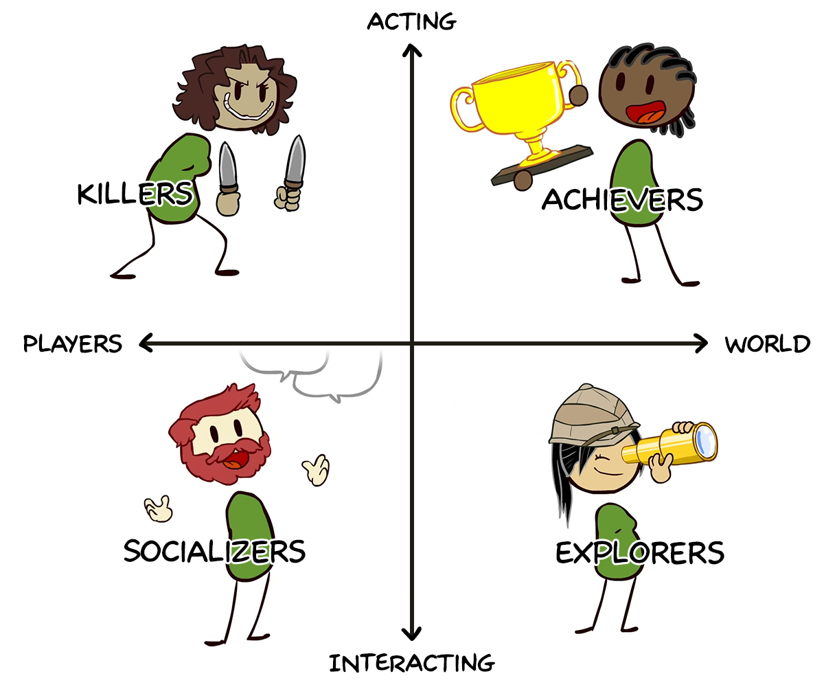
Bartle Types Taxonomy Via Extra Credits

The Killer is the wild card of the Bartle Types. While both Achievers and Killers are competitive,  Achievers compete with/through the game, whereas Killers compete with anyone or anything in their immediate vicinity. The Achiever wants to act upon the game according to the rules of gameplay, while the Killer just wants an immediate thrill. They derive pleasure from interfering with the functioning of the gameplay and/or the experience of other players. Like Internet “trolls”, Killers gleefully enact subversive behavior under the guise of their game persona. They aren’t interested in winning, socializing or exploring – they just want to provoke and impose themselves on the virtual world and its inhabitants.

Killers thrive on the experience of disrupting gameplay. Achievers represent the ultimate target since they are most antagonized by being killed. As a result, in multiplayer games, the more Achievers you have, the more Killers you’ll have, which may lead to a decrease in Achievers and overflow of Killers depending on the level of engagement of the gameplay. Explorers also represent easy prey for Killers, and if there are too many high level Killers, it may become hard for Explorers to explore. Socializers also make an appealing target for Killers in multiplayer games. Like Socializers, Killers are interested in interaction and influence. Some of the same retention tactics apply to both Bartle Types.

The best way to retain Killers is to give them opportunities to disrupt other players or the world of the game. In MMORPGs and shooters, it’s easy for them to find other players to kill. The challenge in single player games (especially single player mobile games) is how to appeal to a Bartle type that thrives on interaction. For one, Killers aren’t just into killing. Interfering with elements of the world will also appeal to them. For instance, if there are elements of the game world, such as crates or trees, which the user can crash into and destroy, it offers the same immediate thrill of interference as player elimination.

Games get creative to offer opportunities for world interaction. In The Legend of Zelda, beyond combat with enemies, Link can also famously antogonize “cuccos”, an element of the world. In Grand Theft Auto V, the ultimate game/franchise for Killers, users can not only kill civilians, but can bump into them for a humorous disruption. Offering cheat codes in single player games represents an opportunity for the Killer to expose and modify the game engine on the game developer’s terms. Pokemon GO employs battles in Pokegyms. Games like Candy Crush give Killers the thrill of destroying parts of the world. Killers love explosions. Giving them a tangible goal, like specific collectibles or targets that generate explosive reactions, will go a long way in retaining their interest.

In order for a Killer to spend money on a game, they must be engaged by the gameplay. Killers are looking for a specific type of satisfaction, a kind of schadenfreude. Retention methods are key since if a Killer doesn’t get satisfaction, they’ll move on quickly to something more immediate. Offering alternate game modes, such as low-gravity or disco mode, may entice Killers’ desire to subvert the game world. In multi-player games, extra weapons, stealth and any advantage in the killing department may tempt Killers to purchase if they are invested in the game.

As with appealing to any Bartle Type, everything begins with engaging gameplay. Thinking of these player types during the process of development will enrich your techniques and ultimately your final product.

Next week, in the final article of our series on Bartle Types, we’ll take a look at Socializers and the best methods for attaining, retaining and monetizing them.

Facebook Champions Material Design: Why You Should Too

In the past year, material design has been rising in prominence as both an app and a web design aesthetic. As we’ve detailed in our past article How Material Design Redefined Android App Aesthetics, Material Design has the potential to catch on in a major way.  In this post, we take a look at the bright future ahead for the platform.

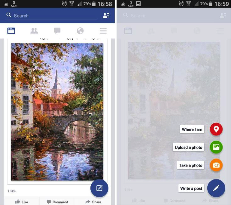
Facebook recently began testing a Material Design overhaul of their Android app. Additions include a floating action button commonly found on Lollipop apps. The design on the whole has a more cohesive digital world adhering to Material Design principals.

“Not only does the app look better, but it’s also going to make the app easier to use for Lollipop users who are now becoming accustomed to that floating action button.” Writes Killian Bell of Techno Buffalo.

Check out this picture of the Beta app (via Techno Buffalo)

Material Design Facebook

If Facebook’s Material Design app looks slick. If it proves to be functionally efficient, it’s reasonable to assume they could utilize some of the same design techniques to update their iOS app.

Facebook’s Android app redesign is reminiscent of the Gmail Inbox app. Considered one of the premier Material Design apps on the market, Inbox was developed by Google and provides a perfect showcase for Material Design aesthetics. Depth plays a major role in all the gestures. When the user swipes an email to mark it done, it reveals a green checkmark underneath the top layer as the email disappears off screen.

Check out his awesome promo video by Google which explains how Inbox works:

Inbox was created to manage mass volumes of emails. Larry Dignan over at ZDNet reviewed Inbox by forwarding his 700 or so work emails per day to the app to see how it handled organizing bulk emails. Inbox passed the test, allowing the user to create bundles of emails in order to better organize incoming messages.

With futurists predicting the downfall of email, the question becomes: Could the same Material Design techniques which the Inbox app uses to organize bulk emails and save screen space be applied to an encompassing Facebook social feed which replaces email?

The main problem inhibiting Material Design from catching on in a major way for the Android platform is device fragmentation. As of March, only 3.3% of Android devices are running the latest OS: Lollipop. 40% of Android devices are running KitKat and 20% are still using Jelly Bean.

Despite the obstacle of device fragmentation, as the next Android OS is released, Lollipop and Material Design are sure to become more and more prevalent. What makes Material Design so crucial is its role in connecting the Android device ecosystem. With more and more devices coming into the fray, Apple has been doing their part to push for Device Continuity, allowing for seamless transition between devices. Android may have to battle to overcome device fragmentation, but as Material Design gains momentum, their hardware and software will at least have aesthetic continuity.

The future of Material Design extends beyond the smartphone and the tablet. With the wearable revolution impending upon Apple Watch’s April 24th release date, it’s reasonable to assume Material Design will find outlets beyond traditional mobile devices as Android increases it’s wearable repertoire. If Google Glass had lasted, no doubt it would have utilized Material Design in its updates. Regardless, Android has several products in the pipeline that are sure to boast Material Design, including Android TV and Android Auto.

For now, Material Design is an Android-exclusive technique still vying for mainstream adoption. However, Facebook’s adoption of the design technique for their upcoming Android app is a good sign. As we look to a device-interconnected world, it seems inevitable the principles of Material Design will continue to evolve and shape the future of Android design aesthetics, and potentially expand to influence web and iOS aesthetics as well.

At Mystic Media, we’re constantly engaged in various app design projects. Our expertise reaches across all facets of the industry, be it iOS designAndroid designweb designstrategic marketing and more. Contact us today by clicking here or by phone at 801.994.6815

Not Too Pushy: 5 Rules for Pushing App Notifications Without Annoying the User

An application can do great things for a business. It’s a gateway into a digital experience catered to a brand, an opportunity to ingrain a brand into the user’s daily life. Push notifications allow applications to send messages with pertinent information to the user. Some are silent and simply light up the phone screen with a notification, while others vibrate to physically notify the user of more important, time-sensitive information.

The problem is: push notifications are… well… pushy. They can be annoying. It takes a mere Twitter search to prove that when users get annoyed, they take to social media, which is bad for business.

And yet, studies show when push notifications are turned on, they average 88% more launches than those with push notifications disabled. Some studies show up to a 540% increase in daily app opens.

Thus the conundrum becomes: how does one balance between being overly pushy, and not pushy enough? Although each case is subjective, we put together some guidelines for app developers and businesses looking to boost app usage without alienating customers.

1. Make Them Customizable

This is easily the cardinal rule. Do not push your push notifications on the user. Allow them to choose both whether and which push notifications to receive. Give the user options for how frequently they wish to receive notifications and/or what prompts them. There’s no excuse for an overly pushy app and it will be uninstalled.

2. Silent Notifications Work Too

Silent push notifications light up the phone screen with neither a sound nor a vibration. They are great for games, a tempting little offer which may catch the user’s eye when it lights up and lingers on the screen until the smartphone is next unlocked. Diversifying your notifications only makes for a more tolerable digital experience.

3. Analyze Customer Data

App developers have a host of awesome data at their disposal which ought to be utilized in tweaking their apps. If you notice customers often opting out of certain types of notifications, do them a favor and get rid of them. Or make them sign-up for them rather than giving them the work of having to opt-out. As they say, the customer is always right.

4. Geo Detection Is Your Friend

Geo Detection technology allows retailers to detect when a customer last visited their store or when a customer is nearby. Retailers can use Geo Detection technology to put out blasts to all customers in the area of special offers and coupons. For more information on Geo Detection notifications, check out this awesome article.

5. Offer Value

Seamless and GrubHub offer silent push notifications which, when swiped, give the user a discount on their order. Customers are more likely to read push notifications if they know there’s something in it for them. Push notifications are your friend, make sure they are your customer’s too.

Mystic Media is a web and software development company with expertise in iOS and Android application development and strategic marketing. Follow us today on Twitter (@mysticmediasoft), like us on Facebook, and contact us with any questions by clicking here or by phone at 801.994.6815

A Guide to Promotional Writing Part 4: Attract Traffic With Compelling Website Copy

The Mystic Media Blog will be devoting our expertise into a five-part series of articles detailing the ins and outs of Promotional Writing. The series will cover several topics, including general techniques, suggested processespress releases, , website copy writing, and social media. Last week, we covered how to generate publicity by writing an effective press release.

Website copywriting is perhaps the most common form of promotional writing. The internet is an international hub for both information and e-commerce. Websites are created everyday to advertise and offer services, products, and information. They can be created for businesses, blogs, applications, social media, contests, specific products, and more. All websites share one common goal: attract the target audience. Whether a website is attempting to sell something or simply relay valuable information, the goal is to attract as many relevant viewers to the site as possible and entice them with effective copy writing. In this article, we will detail techniques for achieving this goal.

Know the Ideal Reader

As with any piece of promotional writing, it’s crucial to know the target audience before starting. The ideal reader should feel the copywriting was crafted specifically for them. Make an outline describing the ideal reader. Will the content of the site appeal specifically to men or women? What industry might this person work in? What is their socio-economic class? What degree of education did they receive? What brought them to the site?

Once all these questions are answered, elaborate on the relevance. A person’s line of business would affect the type of humor you’d consider writing into the copy. Their level of education would affect whether the writing is designed to appease a standard for intelligent writing, or to simply be clear and understandable to the common man.

Upon becoming familiar with the Ideal Reader, outline the Desired Action Response. Would the ideal response be an immediate purchase? Would it be to inquire more about the services outlined in the copy? Is the copy intended to lead the reader elsewhere on the site, perhaps to the services section or pricing?

Every sentence should be contribute to generating the Desired Action Response. At the end of any given page should be a Call-to-Action making the Desired Action Response one click away.

Detail Features and Translate to Benefits

If the copy is advertising a product or service, the main purpose of the piece will be to accurately detail the features of the product or service and translate them into benefits. Before writing, finalize the research and create a full list of features and specifications regarding the product or service.

We touched upon the process of translating features to benefits in Part 2 of our Promotional Writing Series: Perfecting the Method, but it’s too important to skip over in this article. Once you’ve written out the features, it’s vital to translate them into benefits.

Readers are selfish. People don’t read web pages out of consideration for the writer, they read things they think will be relevant to them. Instead of simply listing the features of a product or service, explicitly link them to benefits which make it easy for the reader to imagine how the product or service could enrich their lives.

The research is often the meat and bones of the piece. Once all necessary information is detailed, the rest is easy.

Avoid Hyperbolic Description

One of the most commonly made mistakes in copywriting is overselling. Copywriters will dress up the product or service they are representing with an abundance of hyperbolic adjectives. Writers are eager to refer to a product as “innovative,” “cutting-edge,” or a “breakthrough” because it makes their job easier. Readers today are too smart to be persuaded by hyperbolic description. They want the facts. If you save them time by giving it to them straight, they are more likely to believe in what is written about the product.

Check out this great article on avoiding meaningless marketing jargon.

Optimize for Google

Google is a direct path to information. On average, Google processes over 40,000 search queries every second, 3.5 billion searches per day, and 1.2 trillion searches per year. Optimizing copy for Google is vital to attracting visitors searching for the product, solution, or information offered on your website.

The first step toward SEO is to identify keywords pertaining to the subject of the copy. The best way to find keywords is to rely on your intuition and search what anyone would search if they were looking for the subject of your copy. Through Google searching, anyone can also find the top competitors and identify what keywords they are using to attract visitors. Once the key search terms have been identified, ensure they are sprinkled in throughout the copy. Remember, it’s not worth it to sacrifice the integrity of the copy with keyword stacking. As with most aspects of life, a healthy balance is crucial.

Keywords aren’t the only factor which goes into SEO. It’s also important to write an attention-grabbing headline and effective meta data. More than anything, the writer must ensure that the content itself is relevant and informative to the ideal reader.

For more on SEO, check out this great informative article.

Presentation Is King

Short, concise paragraphs with direct points entice readers. Consider ways of spacing out copy to make writing as consumable as possible. Readers love lists and paragraph headings because they allow them the privilege of deciphering what is relevant to them and choosing what to read.

Next week, we’ll conclude our Promotional Writing series with an entry on writing for Social Media. Stay tuned!

At Mystic Media, our vast experience in strategic marketing and application development has given us expertise on all formats of promotional writing: from copy writing, search engine optimization, social media marketing, web design, and more. Learn more by clicking here or contacting us by phone at 801.994.6815

A Guide to Promotional Writing Part 2: Perfecting the Method

The Mystic Media Blog will be devoting our expertise into a five-part series of articles detailing the ins and outs of Promotional Writing. The series will cover several topics, including general techniques, suggested processes, press releases, website copy writing, and social media.

Last week, we tackled an overview of Promotional Writing and covered some general techniques for writing engaging copy. This week, we’re going in-depth into the processes you can use to ensure the smooth creation of compelling copy.

WRITING AN ENGAGING TITLE

Where to begin is often the hardest part of writing.

When competing with an overload of content aimed at drawing attention (be it emails, newsletters, website copy, advertisements, or what have you), it’s vital to begin by capturing the audience’s attention. The title of any piece will determine if the reader will continue to read it. The key is to connect with your audience immediately by ensuring them that the piece is relevant to them.

Instead of titling a piece with a factual statement on the subject, propose a problem. By proposing a common, easily relatable problem, you’re much more likely to connect with the reader. If the opening message connects with the reader, they will continue to read.

Say you’re working for an application development firm writing a newsletter or advertisement about a business intelligence app.

Instead of opening with: “New App Makes Business Intelligence Easy”,

Ask the viewer: “Trouble Keeping Up with Your Workflow?”

Whereas the first example incites a reaction in which the reader may immediately reject the notion of a new app, the second incites empathy. Most people have occasional trouble with their workflow, thus the headline is directly relevant to them. It’s a problem they need to solve. There’s no risk in reading on, but failure to read may prevent the audience from enriching their life with a solution.

Check out this informative article over at Author’s Den on promotional writing which offers four formulas for writing a good title.

ESTABLISH THE DESIRED ACTION RESPONSE

Unlike an essay, the goal of promotional writing is not to demonstrate a thesis, but to persuade the reader to take action.

The Desired Action Response is whatever the writer intends for the reader to do after they finish the piece. It could be to buy something. It could be to click something. It could be to ingrain the brand in your brain. In the case of a blog, it could be to engage the reader with an opinion and prove your expertise. Before  diving into a piece, it’s vital to phrase the Desired Action Response into a single statement and move forward based on generating the action.

For more on the Desired Action Response, check out this “formula” for good promotional writing.

OUTLINE BASED ON STIMULATING ACTION

Once you’ve established the Desired Action Response, every sentence in a promotional piece must contribute to the goal of triggering it. The process of outlining offers the opportunity to design a piece to induce a specific train of thought which could potentially cause the reader to take action. The process of outlining will strengthen the argument and improve the flow of the writing.

Before writing, create a flow-chart of the streams of thought which would have to go through a consumer’s mind in order to act. Focus on both positive effects caused by the product or service, as well as the negative effects the product or service helps the consumer avoid. As you flesh out your thoughts, strengthen your argument by analyzing how a reluctant consumer might poke holes in your points and actively working to stay a step ahead of the curve by addressing potential pitfalls.

For more information on honing your arguments, check out this cool article over at Mind Tools about analyzing your relationship with your audience.

Upon completing a flow-chart, write an outline of the piece using sub-headings to specify the purpose of each paragraph. Create a logical structure based on how best to order the argument. Ensure that each paragraph pushes forward the ideas from the paragraph preceding it and/or sets-up the next paragraph. Once you’ve created a logical structure, flesh out your paragraphs with complete sentences, cap the piece off with a call-to-action and you will have a complete first draft!

RAVICE, RAVISE, REVISE

A first draft will sometimes suffice when it comes to copy writing, but most businesses hold their work up to a higher standard. For those interested improving their craft, the process of revision is crucial to not only understanding the medium, but to maximizing their skills.

If possible, it’s always helpful to get a proofread from a person who has distance from the piece. When a writer has been working on the same project for hours, it’s hard to get enough cognitive distance from the writing to accurately identify mistakes. An outside proofreader can read without context and therefore give unbiased opinions and observations.

If you don’t have anyone to proofread for you, spend a couple hours doing something else and come back to the piece. When you return, you should have the distance you need to objectively proofread.

During the proofreading process, be sure to consistently link features to benefits. A feature describes a product or service, whereas a benefit describes the positive effects the product or service has on the reader.

Instead of writing: “The new Macbooks come with Retina Display”,

Write: “The new Macbook’s Retina Display screen is easier on your eyes, creating unparalleled clarity in the viewing experience.”

The first statement describes a feature of the product, while the second directly links the feature to a positive effect on the consumer, making for more effective marketing .

The goal of revision is not simply to correct grammatical errors, but to hone what’s on the page and fully realize ideas. Once the benefits of the product or service have been effectively and efficiently communicated with the goal of provoking the desired action response, publish it and get started on the next one.

In the next entry of our Promotional Writing series, we’ll tackle how to write an effective press release. Stay tuned!

At Mystic Media, our vast experience in strategic marketing  and application development has given us expertise on the all formats of promotional writing: from copy writing, search engine optimization, social media marketing, web design, and more. Learn more by clicking here or by contacting us by phone at 801.994.6815