Tag Archives: Web

Web3: The Next Step in the Internet’s Evolution

Web3 has become an increasingly popular buzzword in tech circles. While some are fervent believers in its potential to change the internet as we know it, others are skeptical it holds the future. Still others have no clue what it is—and rightfully so. Web3 entails a set of online principles with potentially mammoth ramifications, but one of the major questions surrounding it is how will these principles take hold? Web3 could manifest in a variety of ways.

This week, we delve into how it may change the internet as we know it.

WHAT IS WEB3?

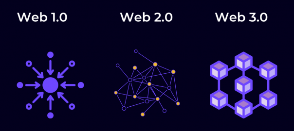
To answer this question, first we’ll explain the Web1 and Web2.

Web1 is the original version of the internet—think of it as a read-only version. In 1991, HTML and URLs allow users to navigate between static pages. After the millennium, the internet starts to become interactive. User-generated content gradually takes hold via MySpace and eventually Facebook, Twitter, and other social media platforms. This interactive version of the internet constitutes Web2, it’s a version of the internet in which users can both read and write via social media, Wikipedia, YouTube and more.

Tech conglomerates naturally turned Web2 into an era of centralization. Meta owns three of the four biggest social apps in the world. YouTube, the fourth biggest social network, is owned by Google, which accounts for around 90% of internet searches. Many question the ethics behind so much data in the hands of so few behemoths. Some have gone so far as to question whether the combination of big data and AI could diminish our capacity for free will, while other research shows that the targeted ad economy does not add much value and may in fact be a bubble.

In the face of these prescient concerns, the main thing that separates Web3 is the concept of decentralization.

DECENTRALIZED WEB

One of the main principles of Web3 is that it employs blockchain technology to decentralize data ownership and, in the words of Packy McCormick who helped popularize the term Web3, an “internet owned by the builders and users, orchestrated with tokens.”

The concept of digital decentralization gained massive traction since Satoshi Nakamoto created Bitcoin using the blockchain in 2009. Cryptocurrency has since become a household name and blockchain technology is finding adoption in a multitude of ways.

In Web3, centralized corporate platforms will be replaced with open protocols and community run networks, enabling the open infrastructure of Web1 with the user-participation of Web2. Everything is decentralized using the blockchain. Decentralization means that a distributed ledger manages financial transactions rather than a single server.

When going to a major social network like Instagram, rather than giving their data away for free, users could monetize their data and receive cryptocurrency for creating interesting posts. Users could buy stakes in up-and-coming artists to become patrons in exchange for a percentage of their royalties. Axie Infinity is a popular Web3 video game which uses NFTs and Ethereum to reward users for achieving in-game objectives. Games with real-life rewards are known as Play to Earn or “P2E” games—a major new trend in game design. It follows the overall goal of Web3—to put power in the hands of users and creators rather than major corporations.

CRYPTOCURRENCY AND NFTS

Blockchain technologies enable an economy powered by NFTs and cryptocurrency. Users can use cryptocurrencies like Ethereum to purchase NFT versions of real-life moments, memes, emojis and more. For example, NBA: Top Shot was among the first NFT projects from a major brand. Fans could purchase “moments” in NBA history, such as Jordan’s famous shot in Game 5 of the 1989 NBA playoffs first round, and trade them as if they were trading cards. It creates a community for fans using digital assets.

The digital art contained within NFTs can be copied but original ownership cannot be duplicated. It’s similar to owning an original Picasso—other people may have copies of the same art, but there is only one original.

Bored Ape Yacht Club may be the most successful NFT project—offering access to real-life parties and online spaces in exchange for purchasing their NFTs.

Another blockchain-powered phenomenon is Decentralized Autonomous Organizations or DAOs. DAOs are organizations that raise and spend money, but all decisions are voted on by members and executed using rules encoded in the blockchain. Famously, a DAO recently raised $47 million in a failed attempt to buy a copy of the constitution.

WHAT TYPE OF WEB3 WILL EMERGE?

With so much up in the air, it’s unclear what type of Web3 will emerge. Although decentralization promises to diminish the power of major corporations, these conglomerates still hold such endless resources that it’s hard to imagine them not finding a way to capitalize and maintain relevance.

Remaking the web won’t happen overnight. There are still major technical and regulatory hurdles which need to be overcome before Web3 becomes the golden standard.

Although we can’t predict how all this will shake out and affect your daily online experience, one thing is for sure—the internet is evolving.

SEO Pro Tips: Best Practices for Meta Descriptions

Last week, we explored the art of perfecting title tags for SEO dominance. This week, we’ll explore another vital meta tag: the meta description.

The meta description is the text that appears below the link in SERPs, as below:

via Word Stream

Meta descriptions should be about 135 – 160 characters long, although Google has tested longer snippets. Any time quotes are used in the meta description, Google cuts the text off. To prevent meta descriptions from being cut off, it’s best to remove all non-alphanumeric characters.

Google uses meta descriptions to pull preview snippets on SERPs and return results when searchers use advanced search operators to match meta tag content, but unlike title tags, meta descriptions do not directly influence Google’s ranking algorithms for normal web search since meta description keywords are not ranked.

While meta descriptions do not directly affect SEO, they do indirectly impact it. The prominence of meta descriptions in SERPs makes them a very valuable UX component and a tool for enticing searchers. While keywords do not affect ranking, they are bolded in the meta-description, which attracts the eye and can help influence a searcher’s decision to click. Thus the use of keywords in meta descriptions can be beneficial to increasing Click Through Rate (CTR). The Click-Through-Rate is the ratio of searchers who click on a page compared to how many searchers see it. CTR is highly valued in search rankings. Since meta descriptions are one of the first things that a searcher will see, they can influence them to click, increasing CTR and boosting SEO.

The ideal meta description articulates the value proposition which a company or web page offers in a precise way while taking into consideration the competition that the page is up against in SERPs. It assumes an active voice and includes a call to action. Web developers can enrich a meta description by using schema markups like star ratings, customer ratings, or product information, to increase the appeal. See below for example:

Image via Google Support

Sometimes meta descriptions are unnecessary. Moz advises if a page is targeting between one and three high volume search terms or phrases, it’s best to write a meta description targeting users performing those searches. If the web page is targeting long-tail traffic (three or more keywords, like a blog with hundreds of entries), it may be best to let the search engines extract the relevant text from the site since they will pull text specifically targeting the user’s search. A blog might be targeting one audience in their keywords, but have content on so many topics, they can be found through any number of search terms. A meta description specified for a page with a lot of content may detract from the relevance that the search engine can create organically by pulling a text description from the page which is relevant to the specific search.

Like title tags, repeating meta descriptions or making them incomprehensible will result in penalization from Google. Meta descriptions can be tricky since they are longer and a bad meta description can be worse than none at all. With the right title tags and website content, meta descriptions can be a major UX tool to drive traffic to a web page.

SEO Pro Tips: Perfecting the Title Tag

Over 100 billion searches per month are made on Google worldwide. Search Engine Optimization (or SEO) has become one of the top marketing disciplines for anyone trying to drive web page traffic and digital revenue.

Title tags are one of the most important facets of SEO. Title tags are the titles of web pages that display in search engine results pages (SERPs) and as the clickable headline for a given result. They are the most obvious element in a search result and are pulled to the forefront of SERPs (Search Engine Result Pages). They display as below:

via BecomeGeek.com

Social networks use title tags to determine what to display in the link preview when you share a page:

Via Search Engine Watch

Title tags are extremely important for SEO, social sharing, and UX. They are one of the major on-page SEO elements. Keywords in title tags will factor heavily into a web page’s rank in any keyword-based search query.

Below find some of the best practices for crafting the perfect title tag.

KEYWORD EFFECTIVELY: Since title tags have a direct affect on SEO, effective keywording is crucial. Putting important keywords in the front of the title tag will increase SEO rankings, while keywords and search phrases at the end of the title tag will be less of a factor. For this very reason, it is best to put a company or website name at the end of the title tag, unless that name is an important keyword phrase. Keyword stuffing, or overloading keywords without making sense, will result in penalization. Ultimately, keywording effectively means writing clearly to an intended audience while factoring in important search phrases.

OPTIMIZING LENGTH: Title tags are not measured by length, but by a 600-pixel limit. Pixels do not equate to characters since certain letters require more pixels to compose than others. 600 pixels generally equate to about 50-60 characters. Measuring pixels can be made easy with this pixel length measurement tool by Search Wilderness.

RESEARCH, RESEARCH, RESEARCH: Statistics show 48% of marketers worldwide identified keyword/phrase research as the most effective SEO tactic. Effective research means honing in on your audience and enacting relevant keyword searches to observe the organic search competition. It is also important to note the inorganic competition: promoted ads for web pages that are boosted to the top of searches by Google AdWords.

Having a solid understanding of what a web page is up against in search engines helps web developers optimize their pages to stand out in the face of the competition. Since the competition and search rankings are constantly changing, research is an ongoing process. 34% of marketers cite frequent website updates as a key to their success.

PIPES “|”: Pipes can be used to punctuate and divide sentiments while minimizing punctuation and word count. See below for an example:

As with any copywriting, writing for an audience is crucial. Since the Title Tag is often the first thing a search user will see about your website, it is ultimately very important that it clearly communicates the subject of the web page and entices the intended searcher. Effective title tags are the first step on the way to SEO dominance.

Stay tuned for next time when we explore how to write an effective meta description!

How Mobile Commerce Is Changing Retail Sales

Smartphones have brought about unparalleled convenience in our daily lives. We are constantly connected to our rolodex of contacts with a variety of methods of communication. We can access all the information available on the world wide web anytime. Consumers looking to make purchases on the go can find the nearest store with ease. For businesses, the mobile platform represents not only a major avenue for advertising, but an opportunity to give customers the ultimate convenience when purchasing products.

According to Internet Retailer, mobile commerce represents 30% of all US e-commerce and rose by 38.7% from 2014 to 2015. Mobile commerce drives sales, and businesses lacking a mobile strategy are missing out on a major opportunity to increase revenue. Here are the top mobile commerce trends for 2016:

INTEGRATING PHYSICAL WITH DIGITAL

Although the digital world is virtually omnipresent in households, the appeal of immediately receiving one’s purchases by shopping in store remains attractive. Retailers are increasingly offering a variety of online + in-store options to capitalize on the convenience of digital and the immediacy of making a physical purchase.

Apps like Curbside have partnered with Target & Kroger’s to enable customers to reserve their purchases and skip the line when picking up products.

Beacon-enabled features like geo-targeted offers and loyalty rewards are becoming more and more popular. Geo-targeted offers can drive in-store traffic when delivered effectively. According to Target Marketing Magazine, 85 of the top 100 retailers are planning to adopt beacon technology by the end of 2016. Business Insider has predicted beacons will directly influence over $44 billion in US retail sales in 2016.

PERSONALIZED MOBILE PAYMENTS DRIVE LOYALTY

Although services such as Apple Pay and Android Pay were once hailed as the future, they have had a hard time receiving mass adoption. While mobile payment services haven’t gained popularity, the mobile wallet has made a major impact on commerce. Starbucks drives 16% of transactions through its mobile app. Walmart Pay arrived in December 2015, and now Target is next in line to develop their own payment app.

WEARABLES ON THE RISE

According to Arc, there will be a 61% growth in wearable ownership in 2016. App developers and retailers are still plotting on how to capitalize on wearables. Many anticipate a hands-free shopping experience in which one can simply walk out with their purchases and have automatic charges through wearable devices. Malls and large stores like Walmart may use wearables to make it easier for consumers to navigate stores. Wearables represent a major avenue for retailers to create innovative strategies and dictate trends to come.

THE MOBILE WEB DRIVES PURCHASES

While about 85% of time spent on mobile devices occurs in apps, the mobile web has actually proven to be a more successful in driving website traffic. While app usage is prevalent, consumers spend 80% of their app time on their top 3 apps. The mobile web drives twice the amount of site traffic than mobile apps. With 82% of smartphone users looking to their phones in stores when deciding what to buy, many anticipate the mobile web to surpass apps as the largest revenue driver in the next few years.

HOW CAN MOBILE COMMERCE HELP YOUR BUSINESS?

With technology in constant flux, the potential to drive revenue with a refined mobile strategy is constantly growing. Mobile strategies must be created, enacted and reevaluated with every new OS and device. Mobile is an ongoing investment. Understanding the value of a mobile strategy and how each device can enrich a customer’s interaction with your business will lead to long-term revenue growth.

Rise to the Top of Google SEO with Responsive Design

When designing a website, web developers have both practical and aesthetic concerns. From a practical standpoint, a website must reach and connect with its core audience. Due to the rise of mobile technology, it’s important for a site to have mobile functionality so that it can reach the multitudes surfing the web on their mobile devices. The most efficient, cost-effective & effective way is to develop a responsive website. Responsive design not only helps reach a mobile audience, it also increases overall SEO so that the website will rank higher in search engines.

For those unfamiliar with responsive design, check out this quick 60-second review:

When it comes to SEO, Google is king. As of October 2015, studies show the massive tech titan owns about 63.9% of the search engine market share. In February 2015, Google announced they will be emphasizing mobile-friendly search results. In their own words: “Starting April 21, we will be expanding our use of mobile-friendliness as a ranking signal.”

In accordance with their announcement, Google Adwords charges less for a keyword when the landing page is optimized for mobile. Responsive websites represent a major incentive for advertising on Google since responsive design guarantees presentation will accommodate the device regardless of whether it’s a mobile device or a computer.

Responsively designed sites offer a common landing page for all devices, consolidating the amount of links and improving the SEO. If a desktop or laptop user iMessages the link to an iPhone, they can click on it and immediately prompt the same web page rather than a different page optimized for mobile. Instead of duplicating content with separate sites for mobile and desktop mediums, responsive design ensures brand and information continuity with a singular master site.

According to Sociomantic, over half of online shoppers use more than one device. A responsive website not only ensures a consistent UI and brand experience, it eliminates maintenance cost by reducing the amount of websites one is required to maintain. The better a site is, the lower the bounce rate is, and the higher it will rank in Google. For businesses looking to succeed, responsive is almost always the best form of web design.

Mystic Media is a web design and application development company based in Salt Lake City, Utah and specializes in responsive design. For more information, click here or contact us by phone at 801.994.6815.

5 Trendy Web Design Techniques to Modernize Your Website

In the age of digital commerce, it’s vital to have a spiffy website. Even if a business does sell its products online, the first impression customers have of a brand often stems from the website. A messy website brings to mind a messy product. In this post, we will examine how 2015’s upcoming web design trends present ways in which to improve websites to make them look modern.

1.    Nail Your Landing Page

The landing page is the first impression a visitor has of a website, thus it’s a great opportunity to dazzle the viewer. Many websites have landing pages which are not only physically big, with imagery and design taking up most of the screen, but also large in metaphorical scale. Check out the website of Born Group, a creative media company with an extremely ambitious landing page.

Born sells something intangible—creative services. Their product is the ability to provoke emotion. As a creative agency, it’s vital for them to establish that they produce emotionally riveting content. The image of the ape is not only beautifully photographed, it’s powerful. If a prospective customer were on the verge of hiring Born Group, they would indubitably be swayed in the right direction from the moment they hit the landing page.

2.    Video Rules

For some companies, going for a message as big as Born would come off as overly self-involved. Born has an intangible product and sells B2B (Business-to-Business). They need to sell an idea and if they bring in a single project, it will pay for a big-budget investment in their site.

For smaller companies with tangible products, it’s important to put the product itself front-and-center. One way of doing this is to embed a video on the landing page of your site. For example, check out the salivating video on the landing page of Dunwell Donuts, a vegan Brooklyn donut shop.

The video succeeds on nearly every level. It makes the viewer crave donuts, artfully portrays the product, and tells the story of the founders of the business in an extremely intimate manner.

3.    Tell Your Story

The primary accomplishment of the Dunwell video is in the arena of storytelling. The Dunwell video tells the story of the company brand in an intimate way. By the end of the video, the viewer feels like they have a good sense of who runs Dunwell Donuts and what donuts mean to them.

A video is a cost-effective way of telling the personal story of a brand. Storytelling is a powerful medium because it creates an emotional connection between the viewer and the subject when executed effectively. For a business (especially a small business), this translates directly to brand loyalty. We’ve detailed other ways in which one can tell the personal story of a brand in our Parallax Scrolling article.

4.    Flat Design

Minimal web design is in. Apple’s design technique, flat design, is defined as “a style of interface design which removes any stylistic choices that give the illusion of three-dimensions (such as drop shadows, gradients, textures, or other tools that add depth) and is focused on a minimalist use of simple elements, typography and flat colors.”

Flat design is visually sleek and virtually inexpensive way of displaying one’s brand in a modern way. Check out some of the best flat design websites on the internet here.

5.    KISS (Keep It Simple Stupid)

A really well-designed landing page with minimal content looks much better than a lot of redundant, visually lacking pages. For an alternate approach to the donut vertical, check out the site for Elsie’s Donut Shop. It’s flat, minimal, sleek and to the point, stressing the products.

With the internet working more and more as a gatekeeper for customers to select which businesses they choose to solicit, modern aesthetics have a direct impact on business. Equipping a business with a sleek, modernized website puts them in the best position to excel in the marketplace.

Mystic Media is a web design and application development company based in Salt Lake City, Utah. For more information, click here or contact us by phone at 801.994.6815.

Parallax Scrolling: How the Latest Cutting Edge Web Design Can Increase Business

Web design trends are constantly changing. The latest and greatest today is Parallax Scrolling.

Parallax Scrolling websites are generally large one-page sites. As one scrolls down, the background images move by the camera slower than the foreground images, creating the illusion of depth. Oftentimes different animations are launched during the course of scrolling which generally cover different topics. It’s like having multiple pages in one stream-of-consciousness scroll.

Here’s a basic example of a Parallax Scrolling website.

There are many benefits to Parallax Scrolling websites. For one, they are aesthetically pleasing. The user experience is no doubt greater than any other common form of web design. Instead of forcing the user to explore the site, they need only scroll down to take in the information at the pace the web designers desire.  When creating a website for a single product, Parallax Scrolling sites can be very useful because they allow the designer to show off all the different features of the product without having to create separate pages.

Here’s a great example of a parallax website utilized to display all the different angles and functions of a single product.

Parallax Scrolling also allows the web designer to create a story and control the way in which the user experiences the narrative. Parallax Scrolling gives the designer unparalleled control over the pace at which the user takes in information. Again, the user only has to scroll down, they are much more likely to see the animations created by scrolling down than to have to click around different pages and explore to find information.

Check out this awesome example of how to tell the story of your brand through a Parallax Scrolling website.

Parallax Scrolling can also have a positive effect on Search Engine Optimization. Having a one-page-site means a reduced the bounce rate, the number of visitors who move to another page without exploring, which is beneficial for SEO.

Another benefit is the increased mobile and tablet user experience. Traditional websites involve several pages which all need to be customized for mobile and tablet devices. The time it takes to redirect on a mobile or tablet device can be tedious. Parallax Scrolling utilizes one-page, reducing the redirection time for smartphone and tablet users. If created with responsive HTML (Check out our post Responsive Web Design Is the New Web Design), you’re guaranteed good mobile and tablet user experience, so long as the user’s device isn’t outdated.

Due to the emphasis on cool, crisp visual presentation, Parallax Scrolling sites are more likely to attract social sharing, and thus will attract greater traffic. If the design is crisp enough, a parallax scrolling site could land itself on one of these best of lists.

Parallax Scrolling websites are generally created using HTML5 and CSS3. Although they are high-tech, they also come with their share of cons. For one, due to the heavy use of animations, Parallax Scrolling sites can take longer to load. They also may not function smoothly across all web browsers. Because the designer is in control of the pace of the scrolling, it can also be frustrating to users who want to consume information faster, or confounding to less tech-saavy users who are confused by the set-up.

Overall, Parallax Scrolling is the most visually-pleasing, high-tech aesthetic one can choose for their website. Although it’s pricey and complicated to create, it’s the most dynamic form of web design used today, and, when designed effectively, the most engaging way to lure traffic to a web page.

Mystic Media is a web design and application development company based in Salt Lake City, Utah. For more information, click here or contact us by phone at 801.994.6815.