Tag Archives: Market

Are You Cashing Out? Rule the Mobile Game Market with Top Monetization Strategies

The ultra-competitive world of mobile game development leaves many game developers in the red. Less than 1% of mobile game players contribute 48% of revenue to game publishers. With the rise of the Freemium model, many feel paid apps are essentially dead. Without a price to download, app publishers can no longer rely on a single method of monetization.

Here are some of the best methods for mobile game monetization:

SEGMENTATION

Segmentation, the division of profit streams, is key to any mobile game monetization plan. By understanding the many different ways in which one can create a revenue stream out of their game, developers are able to tactically decide which streams they want to pursue and how they want to pursue them.

App monetization revenues stem from three major categories: in-app purchases, subscription-based premium upgrades, and ad revenue. Highly-successful games can also bring in money through sponsorships, merchandise, and even big-budget Hollywood movies, but the bulk of app developers generate revenue from inside the phone. Experienced mobile game developers give individual attention to their apps, analyze what monetization streams will be the most effective, and design individual strategies for each stream.

REWARDED AD FORMAT

Ads and in-app purchases are both great assets to mobile game developers looking to monetize, but what if you could play them off each other to increase both sources of revenue? That’s the idea behind  the rewarded ad format. Games offer its users in-game rewards in exchange for watching full ads. The incentive increases video completion rate as well as ad revenue. By giving users a free in-app purchase, developers are not only able to increase ad revenue, they also preview the premium features, enticing more in-app purchases.

While the rewarded ad format can lead to a surge in both in-app purchases and ad revenue, it still requires strategy. Keeping the audience in mind by ensuring the user will find the ad interesting will increase completion rate. Considering the best time to show the ad also will affect whether the user is frustrated or eager to view the ad. Showing an ad after every level can be overkill and limiting the amount of rewarded ads can help strike a balance between user experience and monetization.

FREEMIUM

The popular Freemium monetization method entails a free download of the most basic form of the app to entice the user, then offering a price for premium services and features. Freemium apps can also profit through ads, but in order to be considered freemium, they must offer in-app purchases or premium versions for a subscription fee.

Apps like Tinder and Candy Crush have capitalized on acquiring a massive user base then enticing users to make in-app purchases and update to premium accounts. Candy Crush also intelligently uses social to allow users to receive premium features in exchange for sharing with their friends.

Candy Crush Social Share via BeatCandyCrushLevel.com

NATIVE ADS

Native ads are advertisements which are designed to match the form and function of their surroundings. Twitter, Facebook, Google, and Instagram all offer native ads and tools to help developers create and customize their ads. Native ad placement increases the chance of engagement by seamlessly blending the design of the ad in with the UI of the app. While many ads stand out in the context of a mobile app, native ads look like they are a part of the app rather than an advertisement. In 2013, Twitter upped their ante on mobile ads with the purchase of MoPub for $350 million.

The debate surrounding the morality of native ads is still ongoing. Some say they are unethical and deceptive, but few argue against the fact that they lead to better customer targeting and enhance content to reach more customers by blending in with surrounding content. The number one rule of native ads is to know your audience. While some will be bothered by the deceptiveness of native ads, if the developer can incorporate relevant content rather than ads for random products, native ads can appear to become more of an enhancement than an interruption.

Here is an example of a native ad by Google’s service AdMob:
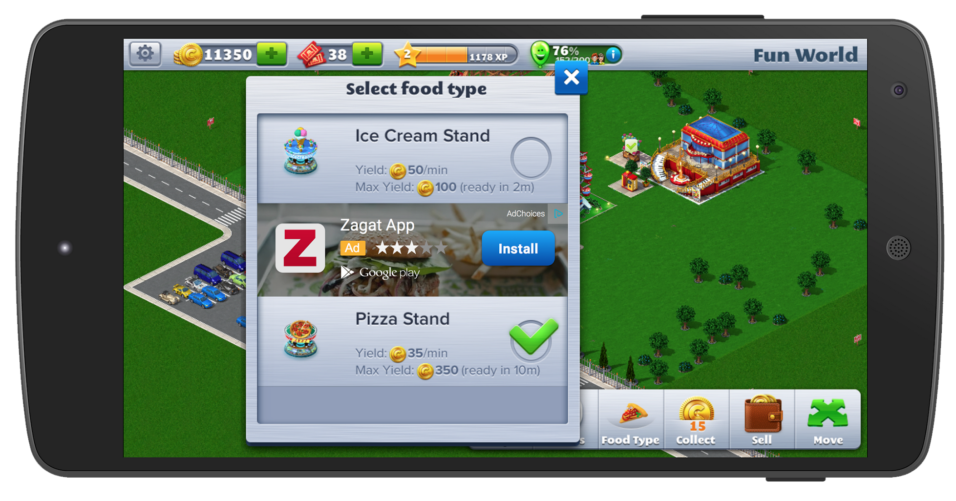
AdMob Native Ad via The Next Web

FEEDER APPS

Feeder apps are simple games with addicting gameplay which app developers utilize to spread brand awareness. Feeder apps often feature such simple gameplay, in-app purchases and ads would feel intrusive. Instead, push notifications and links in the main menu  redirect users to their company website or another one of their games in iTunes. Many mobile development companies develop a network of feeder apps as a part of their publication and monetization strategy.

By utilizing a well-integrated native ad for the company or the game the developer intends to monetize, developers can turn viral feeder apps into profits. This comprehensive article by Scientific Revenue offers a great example:

ZeptoLab cross-promotes their featured app King of Thieves through their feeder app Cut the Rope.

Succeeding in the world of mobile gaming requires the same intense flare for competition which fuels mobile gamers. Experienced game developers know the stakes and come out swinging, ready to capitalize on every strategy they can to create a revenue stream. With the right combination of smarts, app development, promotion and strategy, mobile game monetization can rake in the big bucks.

For help with your next monetization strategy, contact Mystic Media today by clicking here or by phone at 801.994.6815

5 Trendy Web Design Techniques to Modernize Your Website

In the age of digital commerce, it’s vital to have a spiffy website. Even if a business does sell its products online, the first impression customers have of a brand often stems from the website. A messy website brings to mind a messy product. In this post, we will examine how 2015’s upcoming web design trends present ways in which to improve websites to make them look modern.

1.    Nail Your Landing Page

The landing page is the first impression a visitor has of a website, thus it’s a great opportunity to dazzle the viewer. Many websites have landing pages which are not only physically big, with imagery and design taking up most of the screen, but also large in metaphorical scale. Check out the website of Born Group, a creative media company with an extremely ambitious landing page.

Born sells something intangible—creative services. Their product is the ability to provoke emotion. As a creative agency, it’s vital for them to establish that they produce emotionally riveting content. The image of the ape is not only beautifully photographed, it’s powerful. If a prospective customer were on the verge of hiring Born Group, they would indubitably be swayed in the right direction from the moment they hit the landing page.

2.    Video Rules

For some companies, going for a message as big as Born would come off as overly self-involved. Born has an intangible product and sells B2B (Business-to-Business). They need to sell an idea and if they bring in a single project, it will pay for a big-budget investment in their site.

For smaller companies with tangible products, it’s important to put the product itself front-and-center. One way of doing this is to embed a video on the landing page of your site. For example, check out the salivating video on the landing page of Dunwell Donuts, a vegan Brooklyn donut shop.

The video succeeds on nearly every level. It makes the viewer crave donuts, artfully portrays the product, and tells the story of the founders of the business in an extremely intimate manner.

3.    Tell Your Story

The primary accomplishment of the Dunwell video is in the arena of storytelling. The Dunwell video tells the story of the company brand in an intimate way. By the end of the video, the viewer feels like they have a good sense of who runs Dunwell Donuts and what donuts mean to them.

A video is a cost-effective way of telling the personal story of a brand. Storytelling is a powerful medium because it creates an emotional connection between the viewer and the subject when executed effectively. For a business (especially a small business), this translates directly to brand loyalty. We’ve detailed other ways in which one can tell the personal story of a brand in our Parallax Scrolling article.

4.    Flat Design

Minimal web design is in. Apple’s design technique, flat design, is defined as “a style of interface design which removes any stylistic choices that give the illusion of three-dimensions (such as drop shadows, gradients, textures, or other tools that add depth) and is focused on a minimalist use of simple elements, typography and flat colors.”

Flat design is visually sleek and virtually inexpensive way of displaying one’s brand in a modern way. Check out some of the best flat design websites on the internet here.

5.    KISS (Keep It Simple Stupid)

A really well-designed landing page with minimal content looks much better than a lot of redundant, visually lacking pages. For an alternate approach to the donut vertical, check out the site for Elsie’s Donut Shop. It’s flat, minimal, sleek and to the point, stressing the products.

With the internet working more and more as a gatekeeper for customers to select which businesses they choose to solicit, modern aesthetics have a direct impact on business. Equipping a business with a sleek, modernized website puts them in the best position to excel in the marketplace.

Mystic Media is a web design and application development company based in Salt Lake City, Utah. For more information, click here or contact us by phone at 801.994.6815.

App Store Optimization Part 5: Key Differences in Apple Vs. Google Play App Stores

In an effort to emphasize the importance of App Store Optimization, The Mystic Media Blog is applying its expertise into a six-part series on ASO. In our previous entry Maximize Your Exposure by Getting Featured on the App Store, we detailed techniques on how to get featured on an App Store landing page. This week, we will explore the differences in ASO for Google Play and  Apple App Store.

App Store curators look to surface the most relevant content for users. Although the ultimate goal may be the same for both Google and Apple, their approach to achieving their goals are different. The exact details of Apple’s processes are shrouded in secrecy as they promote discovery through curation, while Google focuses more on analytics and prioritizes transparency in their processes. Check out their recent I/O speech on Getting Discovered on Google Play for a bevy of useful information. While our ASO series thus far has focused on the common ground, this chapter will delve into the differences between the two app stores and what techniques can be used to optimize for either store.

GENERAL THEMES

Google Play favors bigger mobile-focused enterprises, while Apple favors independent developers. A recent study at MobileDevHQ found independent developers generally rank higher in the Apple App Store, while Google Play is more favorable toward mobile focused enterprises. MobileDevHQ recorded the top apps for each store and found that 65% of the top apps for iPhone were independently developed, while 90% of top apps in Google Play store were developed by mobile-focused enterprises.

Granted, out-of-context, the above statistic can be misconstrued. Big mobile-focused enterprises do better on Google Play because they have the brainpower and workforce to analyze the statistics which factor heavily into Google Play’s search algorithm. Google Play also does its part to give independent developers an opening through regional-specific results and Google+ recommendations. Apple’s App Store, on the other hand, relies on curation. The Mystic Media Blog previously discussed  how Android is considered more developer-friendly since they feature open-source coding and skip the process of approval Apple uses to filter bad apps from making it onto their App Store (review our post on Why Android Rules the Mobile Application Market). Apps receiving approval before making the the app store filters out sub-par entries, allowing Apple to curate more effectively. Every app on the Apple App Store, big or small, starts with an evaluation.

Apple’s App Store is much more volatile and reactive to trends than Google Play. Within the same seven day study at MobileDevHQ, the top ranking apps in Apple’s App Store fluctuated—no single app stayed in the same rank through all seven days—while of the top ten ranking apps on Google Play, five failed to change position once. In addition, no new apps broke into the top ten for Google Play.

DESCRIPTION

While it’s recommended developers include keywords in their app description, the Apple App Store barely weighs the description, unlike Google Play which weighs the keywords in app descriptions heavily. For more on keywording and app descriptions, review App Store Optimization Part 2: Master the Art of Writing a Catchy Title and Effective Keywords.

VIDEO

Google Play also allows developers to post a video preview of their app. The purpose of the video is to show the app in use, to preview the graphics, the sound, the UX, the function, etc. Google Play preview videos are hosted through Youtube, which creates a new avenue for app developers to market their product through Youtube SEO. For more on the topic, check out this cool article on How Youtube Videos are Ranked.

DISPLAY

Google’s recent talk about getting discovered on Google Play yielded a lot of great information concerning Google Play’s display strategy. Ankit Jain, Google Play’s Head of Search, Discovery & Store Infrastructure, explained how Google Play attempts to create a UX which is simultaneously personalized and personal.

Personalized, as it relates to Google Play, means the results are catered to the user based on their history of searches, purchases, what device the user is on (remember, unlike iOS, Android allows third-party companies to develop  devices on its OS), and what’s popular in their geographic region. The amalgamation of user history and geographic popularity factor heavily into Google Play’s search algorithms.

Personal means results are annotated by Google Play analytics with reasons why the user should download the app. This involves linking to the user’s Google+ account to allow the Google Play store to show if anyone in a person’s Google+ circles has given an app a +1.  Apps relevant to a search which are recommended by people in a user’s Google+ circles will surface high in the search results, thus targeting Google+ for social media campaigns pays off for developers releasing through Google Play.

CONCLUDING THOUGHTS

The goal of any app store is to effectively promote the top apps for the platform. Both Google and Apple look to share the apps which will best please the user and make the most of the technology of their respective platforms. When it comes to ASO, no keyword, app title, icon, or description will change anyone’s mind about a bad app. No curator will elevate the status of a bad app because it is well-marketed. Thus, it’s fitting remind you: the first step to optimizing any app for an app store is to create a great app. By observing the rules of each app store and excelling in each of the processes of ASO with intelligent strategy and an efficient external marketing campaign, a great app can catch the attention of app curators and rise to the top of any app store search. The rest, as they say, is search history.

Mystic Media is considered among the most versatile and capable web agencies in the US. Our workforce includes experts across a variety of fields including app development, strategic marketing, social media, web design, Search Engine Optimization, radio streaming, and more. We have the resources necessary to effectively develop and market applications for any platform. Contact us today by clicking here or calling 801.994.6815