Tag Archives: User

Web3: The Next Step in the Internet’s Evolution

Web3 has become an increasingly popular buzzword in tech circles. While some are fervent believers in its potential to change the internet as we know it, others are skeptical it holds the future. Still others have no clue what it is—and rightfully so. Web3 entails a set of online principles with potentially mammoth ramifications, but one of the major questions surrounding it is how will these principles take hold? Web3 could manifest in a variety of ways.

This week, we delve into how it may change the internet as we know it.

WHAT IS WEB3?

To answer this question, first we’ll explain the Web1 and Web2.

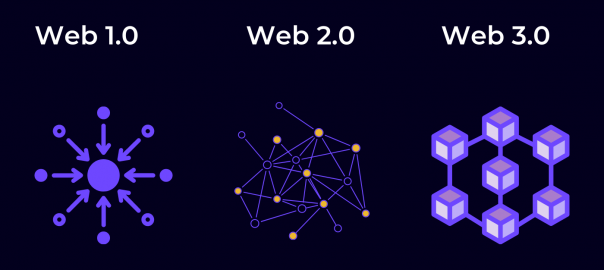
Web1 is the original version of the internet—think of it as a read-only version. In 1991, HTML and URLs allow users to navigate between static pages. After the millennium, the internet starts to become interactive. User-generated content gradually takes hold via MySpace and eventually Facebook, Twitter, and other social media platforms. This interactive version of the internet constitutes Web2, it’s a version of the internet in which users can both read and write via social media, Wikipedia, YouTube and more.

Tech conglomerates naturally turned Web2 into an era of centralization. Meta owns three of the four biggest social apps in the world. YouTube, the fourth biggest social network, is owned by Google, which accounts for around 90% of internet searches. Many question the ethics behind so much data in the hands of so few behemoths. Some have gone so far as to question whether the combination of big data and AI could diminish our capacity for free will, while other research shows that the targeted ad economy does not add much value and may in fact be a bubble.

In the face of these prescient concerns, the main thing that separates Web3 is the concept of decentralization.

DECENTRALIZED WEB

One of the main principles of Web3 is that it employs blockchain technology to decentralize data ownership and, in the words of Packy McCormick who helped popularize the term Web3, an “internet owned by the builders and users, orchestrated with tokens.”

The concept of digital decentralization gained massive traction since Satoshi Nakamoto created Bitcoin using the blockchain in 2009. Cryptocurrency has since become a household name and blockchain technology is finding adoption in a multitude of ways.

In Web3, centralized corporate platforms will be replaced with open protocols and community run networks, enabling the open infrastructure of Web1 with the user-participation of Web2. Everything is decentralized using the blockchain. Decentralization means that a distributed ledger manages financial transactions rather than a single server.

When going to a major social network like Instagram, rather than giving their data away for free, users could monetize their data and receive cryptocurrency for creating interesting posts. Users could buy stakes in up-and-coming artists to become patrons in exchange for a percentage of their royalties. Axie Infinity is a popular Web3 video game which uses NFTs and Ethereum to reward users for achieving in-game objectives. Games with real-life rewards are known as Play to Earn or “P2E” games—a major new trend in game design. It follows the overall goal of Web3—to put power in the hands of users and creators rather than major corporations.

CRYPTOCURRENCY AND NFTS

Blockchain technologies enable an economy powered by NFTs and cryptocurrency. Users can use cryptocurrencies like Ethereum to purchase NFT versions of real-life moments, memes, emojis and more. For example, NBA: Top Shot was among the first NFT projects from a major brand. Fans could purchase “moments” in NBA history, such as Jordan’s famous shot in Game 5 of the 1989 NBA playoffs first round, and trade them as if they were trading cards. It creates a community for fans using digital assets.

The digital art contained within NFTs can be copied but original ownership cannot be duplicated. It’s similar to owning an original Picasso—other people may have copies of the same art, but there is only one original.

Bored Ape Yacht Club may be the most successful NFT project—offering access to real-life parties and online spaces in exchange for purchasing their NFTs.

Another blockchain-powered phenomenon is Decentralized Autonomous Organizations or DAOs. DAOs are organizations that raise and spend money, but all decisions are voted on by members and executed using rules encoded in the blockchain. Famously, a DAO recently raised $47 million in a failed attempt to buy a copy of the constitution.

WHAT TYPE OF WEB3 WILL EMERGE?

With so much up in the air, it’s unclear what type of Web3 will emerge. Although decentralization promises to diminish the power of major corporations, these conglomerates still hold such endless resources that it’s hard to imagine them not finding a way to capitalize and maintain relevance.

Remaking the web won’t happen overnight. There are still major technical and regulatory hurdles which need to be overcome before Web3 becomes the golden standard.

Although we can’t predict how all this will shake out and affect your daily online experience, one thing is for sure—the internet is evolving.

Part 2: Optimize Onboarding with Gamification

How Gamification Can Boost Retention on Any App Part 2: Optimize Onboarding with Gamification

The Mystic Media Blog is currently endeavoring on a 3 part series on how gamification mechanics can boost retention on any app—not just gaming apps but utility apps, business apps and more. In this second entry, we explore how to refine and gamify your onboarding process to keep customers coming back.

ONBOARDING

Your app has been downloaded—a hard-fought battle in and of itself—but the war isn’t over; the onboarding process has just begun.

App onboarding is the first point of contact a user has within an application. It’s one of the most crucial parts of the user experience. Situating users in your application is the first step to ensuring they come back. Twenty-five percent of apps are only opened once after being downloaded. Many apps simply do not make it simple enough for users to understand the value and get the hang of the application—step one in your retention process.

Here are the top tips for smooth onboarding:

MINIMIZE REGISTRATION

A prolonged registration process can turn off new users. Users do not always have time to fill out extensive forms and can quickly become resentful of the pacing of your app. Keep registration to a minimum, minimize required fields, and get users going faster.

We recommend enabling user registration altogether with “Continue as Guest” functionality. Games typically employ this and it enables users to get hands on with the application before they undergo the tenuous account creation process. Hook them with your app, then let them handle the administrative aspects later. Account creation with Google, Facebook, or Twitter can also save quite a bit of time.

Gamification is all about rewarding the user. Offer users an incentive to create their account to positively reinforce the process and you will see more accounts created. If they haven’t created an account, make sure to send prompts to remind them of what the reward they are missing out on. As we detailed in our last entry, FOMO is a powerful force in gamification.

TUTORIAL BEST PRACTICES

When a user enters your application for the first time, they generally need a helping hand to understand how to use it. Many games incorporate interactive tutorials to guide the user through functionality—and business apps are wise to use it as well. However, an ineffective tutorial will only be a detriment to your application.

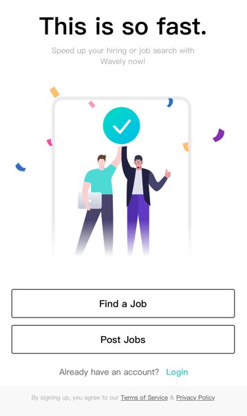
Pacing is key. A long tutorial will not only bog the onboarding process down, too much information will likely go in and out of the user’s brain. Space your tutorial out and break it into different sections introducing key mechanics as they become relevant. On-the-go tutorials like the four-screen carousel below by Wavely help acclimate users quickly and easily.

And don’t forget to offer a reward! Offer users some kind of reward or positive reinforcement upon completing tutorials to encourage them to continue using the application.

AVOID DEAD ENDS AND EMPTY STATES

An empty state is a place in an application that isn’t populated with any information. For example, favorites, order history, accomplishments, etc.—these pages require usage in order to be populated for information. New users will see these pages and become confused or discouraged. Many applications will offer self-evident statement such as “No Favorites Selected”. Or, in the case of UberEats below, no message is displayed.

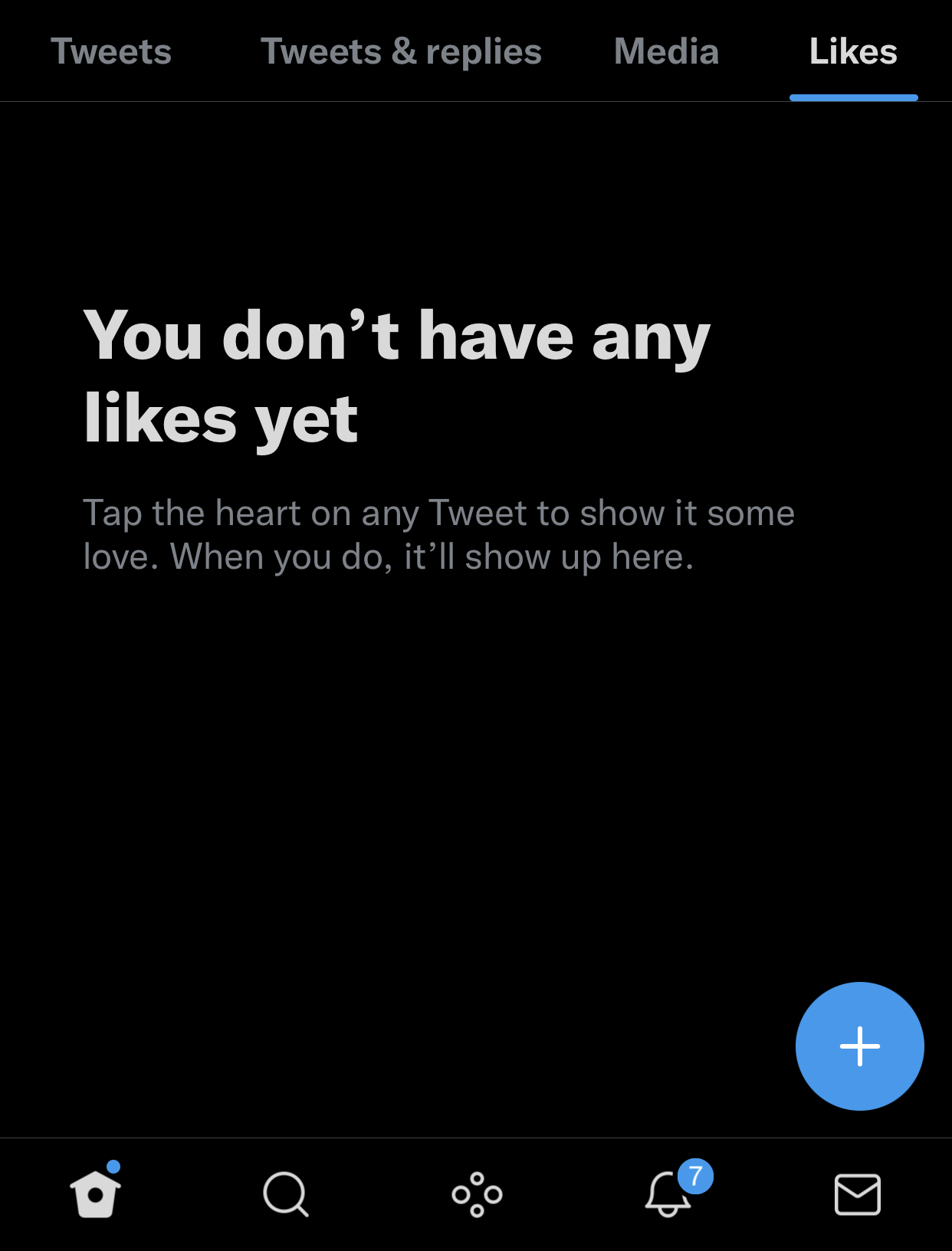
It’s confusing and discouraging for users to see these statements. Avoid discouraging your users by offering more information, for example: “Save your favorite restaurants and find them here.” Check out Twitter’s exemplary message for users who’ve yet to favorite a tweet below.

CONCLUSION

Onboarding is the first and most crucial step to building a relationship with your userbase. One of the major things business apps can learn from gaming apps is that time is of the essence when it comes to capturing a user’s attention. Keep it short, punchy, and to the point.

Five Mobile Ad Platforms You Need to Know in 2021

For most mobile app developers, the majority of revenue comes from advertising. We have written in the past about the prevalence of the Freemium model and what tactics maximize both the retention and profits of mobile games. Another major decision every app developer faces is what mobile advertising platform to choose.

Mobile advertising represents 72% of all U.S. digital ad spending. Publishers have a variety of ad platforms to choose from, each with individual pros and cons. Here are the top mobile advertising platforms to consider for 2021:

Google AdMob

google-admob

Acquired by Google in 2010, Google AdMob is the most popular mobile advertising network. AdMob integrates high-performing ad formats, native ads, banner ads, video, and interstitial ads into mobile apps.

AdMob shows over 40 billion mobile ads per month and is the biggest player in the mobile ad space. Some users criticize the platform for featuring revenues on the lower side of the chart; however, the platform also offers robust analytics to help publishers glean insights into ad performance.

Facebook Ads

facebook-ads-1024x426b-e1549322333899

Facebook’s Audience Network leverages the social media platform’s massive userbase toward offering publishers an ad network designed for user engagement and growth. Like AdMob, Facebook Ads offers a variety of ad types, including native, interstitial, banner, in-stream video, and rewarded video ads.

With over 1 billion users, Facebook has utilized their massive resources to build out their ad network. Facebook Ads provide state-of-the-art tools, support, and valuable insights to grow ad revenue. Facebook Ads sets itself apart by offering a highly focused level of targeting. Facebook collects a vast amount of data from its users, thus Facebook Ads enables app publishers to target based on a variety of factors (interests, behaviors, demographics and more) with a level of granularity deeper than any other platform.

InMobi

InMobi Logo

InMobi offers a different way of targeting users, which they have coined “Appographic targeting”. “Appographic targeting” analyzes the user’s existing and previous applications rather than traditional demographics. If a user is known to book flights via an app, then related ads, such as that of hotels and tourism will be shown.

The InMobi Mediation platform enables publishers to maximize their ad earnings with unified auction solutions and header bidding for mobile apps.

TapJoy

649px-Tapjoy_Logo.svg_

TapJoy has received increased consideration from mobile game developers since the platform integrates with in-app purchases. Studies show that mobile players will engage with advertisements if offered a reward. TapJoy has capitalized on this by introducing incentivized downloading, which provides mobile gamers with virtual currency through completing real world actions. For example, a user can earn virtual currency in the game they are playing by downloading a related game in the app store.

TapJoy provides premium content to over 20,000 games and works with major companies like Amazon, Adidas, Epic Games, and Gillette.

Unity Ads

Unity-ads-1

Unity, the popular mobile app development platform, launched Unity Ads in 2014. Since then, it’s become one of the premier mobile ad networks for mobile games. Unity Ads supports iOS and Android mobile platforms and offers a variety of ad formats. One of the major features is the ability to advertise In-App Purchases displayed in videos (both rewarded and unrewarded) to players.

On a targeting level, Unity Ads allows publishers to focus on players that are most likely to be interested in playing specific games based on their downloads and gameplay habits. Many of the leading mobile game companies use Unity to build their app and Unity Ads as their ad platform.

CONCLUSION

These are not the only mobile ad networks, but for app publishers looking to stay current, they are the premier platforms to research. Other platforms like media.net, Chartboost, Snapchat Ads, Twitter Ads, and AppLovin also merit consideration.

When it comes to advertising, every app and app publisher has different needs. Since advertising plays a massive role in generating revenue, mobile app developers set themselves up for success when they do the research, and can find what ad platforms are best suited to their product.

5 Essential Mobile Game Monetization Strategies to Keep Your Pockets Full

A recent study by Venture Beat showed that less than 1% of mobile game players contribute 48% of total revenue to game publishers. Inability to effectively capitalize upon this hyper-concentrated group of revenue drivers leaves many mobile game developers in the red. The rise of the Freemium model has essentially killed the paid gaming app, leaving many developers scratching their heads on how to turn a profit out of their passion. Here are some of the best methods for mobile game monetization:

1. SEGMENTATION Without a price to download, app publishers can no longer rely on a single method of monetization. Thus segmentation, the division of profit streams, is key to any mobile game monetization plan. App monetization revenues stem from three major categories: in-app purchases, subscription-based premium upgrades, and ad revenue. Highly-successful games can also bring in money through sponsorships, merchandise, and even big-budget Hollywood movies, but the bulk of app developers generate revenue from inside the phone. Experienced mobile game developers use their understanding of each of these revenue streams and how they relate to their target audience to leverage multiple revenue streams within their games.

2. REWARDED AD FORMAT Ads and in-app purchases are both great assets to mobile game developers looking to monetize, but what if you could play them off each other to increase both sources of revenue? That’s the idea behind the rewarded ad format. In exchange for watching full ads during breaks in gameplay, users receive in-game rewards, power-ups, lives, etc. The incentive increases video completion rate, as well as ad revenue, and preview premium features to entice more in-app purchases. While the rewarded ad format can lead to a surge in both in-app purchases and ad revenue, it still requires strategy. Keeping the audience in mind by ensuring the user base will find the content of the ad interesting will increase completion rate. Strategic rewarded ad placement is also key to keeping users engaged. Rewarded ad overkill will alienate users and prevent them from playing the game.

3. FREEMIUM The popular Freemium monetization method entails developers offering a free download of the most basic form of the app to entice the user, then premium services and features available for purchase or through a subscription fee. The Freemium model drives revenue through in-app purchases, premium features available through subscription fees, and ads. Apps like Tinder and Candy Crush have capitalized on their massive user base by enticing users to make in-app purchases and update to premium accounts. Candy Crush also uses social media to allow users to receive premium features in exchange for sharing with their friends.

4. NATIVE ADS Native ads are advertisements designed to match the form and function of their surroundings. TwitterFacebookGoogle, and Instagram all offer native ads and tools to help developers create and customize their ads. Native ad placement increases the chance of engagement by seamlessly blending the design of the ad in with the UI of the app. While many ads stand out in the context of a mobile app, native ads look like they are a part of the app rather than an advertisement. Some say native ads are unethical and deceptive, while others praise the improved customer targeting and enhanced content. Effective native ads blend seamlessly with the surrounding UI. The number one rule of native ads is to know your audience. If the developer can incorporate relevant content rather than ads for products that do not interest the user, native ads can appear to become more of an enhancement than an interruption.

5. FEEDER APPS Feeder apps are simple games with addicting gameplay which app developers utilize to spread brand awareness. Feeder apps often feature such simple gameplay, in-app purchases and ads would feel intrusive. Instead, push notifications and links in the main menu redirect users to their company website or another one of their games in iTunes. Many mobile development companies develop a network of feeder apps as a part of their publication and monetization strategy. By utilizing a well-integrated native ad for the company or game the developer intends to monetize, developers can turn viral feeder apps into profits. This comprehensive article by Scientific Revenue offers a great example of how feeder apps can function effectively. ZeptoLab cross-promotes their featured app King of Thieves through their feeder app Cut the Rope.

CONCLUSION Succeeding in the world of mobile gaming requires the same intense flare for competition which fuels mobile gamers. Experienced game developers know the stakes and come out swinging, ready to capitalize on every strategy they can to create a revenue stream. With the right combination of smarts, app developmentpromotion and strategy, mobile game developers can capitalize on their user base to rake in the big bucks.

Mobile Game Developers Rejoice: Apple Increases App Store Size Limit to 4 GB

Apple recently announced they would increase the size limit of mobile app packages on the Apple App Store from 2 GB to 4 GB.

They experimented first by releasing Disney Infinity: Toy Box 2.0 for free in late January. Disney Infinity Toy Box 2.0 is a gaming app developed using Metal. The app is similar to Minecraft in the way it allows players to create their own world using pre-made characters. It weighs in at a massive 3.8 GB when downloaded from the App Store. The additional space is utilized in the expansion of their cast of characters. Disney Infinity Toy Box 2.0 features not only Disney characters, but many superheroes from the Marvel universe, Guardians of the Galaxy, and The Incredibles.

Check out this awesome iOS preview of the game:

https://www.youtube.com/watch?v=sm7iF5l-ZcA

Although the app is available for free on iTunes, in-app purchases start at $0.99 and reach as high as $59.99. Only three characters are available for free. These free characters rotate, giving users a taste of what they are missing, as well as reason to keep checking the app. The rest of the characters can be purchased in stores like Best Buy, Walmart, etc. It is sure to be a profitable endeavor given the pre-existing fan-bases of the many characters in the mobile game.

The Apple App Store’s increased app size limit will most certainly bring about an influx of large-scale apps like the Disney Infinity Toy Box, although one thing hasn’t changed: apps which are being downloaded by a cellular network still have a 100 MB size limit. Apps above 100 MB must be downloaded using a Wi-Fi network.

While there are obvious advantages to giving users the ability to download an app wherever they have cellular service, large-scale apps are often less dependent on impulse downloads. Many developers will no doubt be excited to put the new limit to work via higher quality graphics and longer games.

The move seems consistent with Apple’s strategy of making the development process easier for app developers. Last year, Apple released Swift (for information on Swift, check out our previous post: Swift Execution: Apple’s New Programming Language Shakes Up Tech Community) and  Metal, a low-level, low-overhead graphics API which we wrote about when it debuted with iOS 8 in our post Bite the Apple: Maximize iOS 8 to Vanquish Your Competition. Both releases, along with the increased app size limit, seem to be power moves dedicated to drawing more developers to the iOS platform.

As we detailed in App Store Optimization Part 5: Key Differences Between Apple Vs. Google Play App Stores, the main difference between the Apple App Store and Google Play is Apple’s emphasis on curation. Although good ASO processes for the Apple App Store are shrouded in secrecy, it’s known that Apple focuses on promoting discovery through curation. Apple requires all apps to be approved by their team of curators before allowing them to be displayed in the App Store. Increasing the app size limit gives developers the freedom to create more intricate, high-production value games for the Apple App Store curators to promote.

If there’s one broad conclusion to be drawn from the move, it’s that mobile gaming is evolving, and Apple wants to spearhead the movement.

Mystic Media is an iOS and Android app development, web design, and strategic marketing firm based in Salt Lake City, Utah. Contact us today by clicking here or by phone at 801.994.6815

Not Too Pushy: 5 Rules for Pushing App Notifications Without Annoying the User

An application can do great things for a business. It’s a gateway into a digital experience catered to a brand, an opportunity to ingrain a brand into the user’s daily life. Push notifications allow applications to send messages with pertinent information to the user. Some are silent and simply light up the phone screen with a notification, while others vibrate to physically notify the user of more important, time-sensitive information.

The problem is: push notifications are… well… pushy. They can be annoying. It takes a mere Twitter search to prove that when users get annoyed, they take to social media, which is bad for business.

And yet, studies show when push notifications are turned on, they average 88% more launches than those with push notifications disabled. Some studies show up to a 540% increase in daily app opens.

Thus the conundrum becomes: how does one balance between being overly pushy, and not pushy enough? Although each case is subjective, we put together some guidelines for app developers and businesses looking to boost app usage without alienating customers.

1. Make Them Customizable

This is easily the cardinal rule. Do not push your push notifications on the user. Allow them to choose both whether and which push notifications to receive. Give the user options for how frequently they wish to receive notifications and/or what prompts them. There’s no excuse for an overly pushy app and it will be uninstalled.

2. Silent Notifications Work Too

Silent push notifications light up the phone screen with neither a sound nor a vibration. They are great for games, a tempting little offer which may catch the user’s eye when it lights up and lingers on the screen until the smartphone is next unlocked. Diversifying your notifications only makes for a more tolerable digital experience.

3. Analyze Customer Data

App developers have a host of awesome data at their disposal which ought to be utilized in tweaking their apps. If you notice customers often opting out of certain types of notifications, do them a favor and get rid of them. Or make them sign-up for them rather than giving them the work of having to opt-out. As they say, the customer is always right.

4. Geo Detection Is Your Friend

Geo Detection technology allows retailers to detect when a customer last visited their store or when a customer is nearby. Retailers can use Geo Detection technology to put out blasts to all customers in the area of special offers and coupons. For more information on Geo Detection notifications, check out this awesome article.

5. Offer Value

Seamless and GrubHub offer silent push notifications which, when swiped, give the user a discount on their order. Customers are more likely to read push notifications if they know there’s something in it for them. Push notifications are your friend, make sure they are your customer’s too.

Mystic Media is a web and software development company with expertise in iOS and Android application development and strategic marketing. Follow us today on Twitter (@mysticmediasoft), like us on Facebook, and contact us with any questions by clicking here or by phone at 801.994.6815

Parallax Scrolling: How the Latest Cutting Edge Web Design Can Increase Business

Web design trends are constantly changing. The latest and greatest today is Parallax Scrolling.

Parallax Scrolling websites are generally large one-page sites. As one scrolls down, the background images move by the camera slower than the foreground images, creating the illusion of depth. Oftentimes different animations are launched during the course of scrolling which generally cover different topics. It’s like having multiple pages in one stream-of-consciousness scroll.

Here’s a basic example of a Parallax Scrolling website.

There are many benefits to Parallax Scrolling websites. For one, they are aesthetically pleasing. The user experience is no doubt greater than any other common form of web design. Instead of forcing the user to explore the site, they need only scroll down to take in the information at the pace the web designers desire.  When creating a website for a single product, Parallax Scrolling sites can be very useful because they allow the designer to show off all the different features of the product without having to create separate pages.

Here’s a great example of a parallax website utilized to display all the different angles and functions of a single product.

Parallax Scrolling also allows the web designer to create a story and control the way in which the user experiences the narrative. Parallax Scrolling gives the designer unparalleled control over the pace at which the user takes in information. Again, the user only has to scroll down, they are much more likely to see the animations created by scrolling down than to have to click around different pages and explore to find information.

Check out this awesome example of how to tell the story of your brand through a Parallax Scrolling website.

Parallax Scrolling can also have a positive effect on Search Engine Optimization. Having a one-page-site means a reduced the bounce rate, the number of visitors who move to another page without exploring, which is beneficial for SEO.

Another benefit is the increased mobile and tablet user experience. Traditional websites involve several pages which all need to be customized for mobile and tablet devices. The time it takes to redirect on a mobile or tablet device can be tedious. Parallax Scrolling utilizes one-page, reducing the redirection time for smartphone and tablet users. If created with responsive HTML (Check out our post Responsive Web Design Is the New Web Design), you’re guaranteed good mobile and tablet user experience, so long as the user’s device isn’t outdated.

Due to the emphasis on cool, crisp visual presentation, Parallax Scrolling sites are more likely to attract social sharing, and thus will attract greater traffic. If the design is crisp enough, a parallax scrolling site could land itself on one of these best of lists.

Parallax Scrolling websites are generally created using HTML5 and CSS3. Although they are high-tech, they also come with their share of cons. For one, due to the heavy use of animations, Parallax Scrolling sites can take longer to load. They also may not function smoothly across all web browsers. Because the designer is in control of the pace of the scrolling, it can also be frustrating to users who want to consume information faster, or confounding to less tech-saavy users who are confused by the set-up.

Overall, Parallax Scrolling is the most visually-pleasing, high-tech aesthetic one can choose for their website. Although it’s pricey and complicated to create, it’s the most dynamic form of web design used today, and, when designed effectively, the most engaging way to lure traffic to a web page.

Mystic Media is a web design and application development company based in Salt Lake City, Utah. For more information, click here or contact us by phone at 801.994.6815.

A Guide to Promotional Writing Part 5: Marketing Effectively Through Social Media

The Mystic Media Blog has devoted our expertise into a five-part series of articles detailing the ins and outs of Promotional Writing, concluding with this post on writing for social media. The series covered several topics, including general techniques, suggested processes, press releases, and website copy writing.

The advent of social media had a dramatic affect on culture and society. The entire world became interconnected at the click of a button. Suddenly, everyone’s favorite brands and artists were available for communication anywhere, anytime using your smartphone. The newspaper became even more irrelevant to the younger generation as they could receive news updates directly from their favorite artists and brands, skipping the middleman.

All brands should have their marketing team running multiple social media accounts. It’s the cheapest and most direct route to consumers who want to hear what you have to say; who show by the act of following/liking the brand that they desire information and communication.

In honor of social media, we’ve gathered tips for writing for social media and structured them with the succinct, direct quips fitting of the format.

“BREVITY IS THE SOUL OF WIT”

Most scholars agree Shakespeare would have killed the social media game. This famous quote from Hamlet rings true across all writing, especially social media. Rather than overloading followers with an abundance of wordy content, keep it simple, concise, and witty.

RESPOND/REACT QUICKLY

In order to engage consumers, it’s vital to reply and interact promptly with followers on social media accounts (especially Twitter!). Remember: direct replies don’t overload your Twitter followers’ feed, making them a great, more intimate way to communicate with consumers.

A favorite, retweet, or follow back can also engage a follower as much as a reply.

CROSS-PROMOTE

Tweet “Follow us on Facebook for more updates.” Post “Check out our Twitter page!” on Facebook. Tweet Instagram photos. Grow your fan-base and keep them aware of the multiple platforms of communication by cross-promoting accounts. As in all forms of promotional writing, the call-to-action is among the integral parts of posting to social media.

PLAY IT SAFE

Perhaps this should be the number one rule: don’t make people furious. Play it safe when it comes to topical events. Be respectful of tragedies and don’t post anything politically incorrect. A single tweet can have huge repercussions.

Be extra careful when attempting to create a trend through hashtagging. This McDonald’s horror story serves as a moral tale of how important it is to be conscious of potential reactions to a brand before posting.

BUT DON’T BE AFRAID TO GET CHEEKY

Followers want to see a little personality out of the social media accounts they follow. Although you don’t want to offend anyone, you also won’t get any real response from boring posts. Try to keep it cheeky and create humorous posts. Analyze what connects most to your audience, take notes, and refine techniques over time.

MEME IT UP!

Memes are a great, modern way of effectively promoting a product while imparting humor. Check out this awesome article on memes for marketers.

FIND AN EFFECTIVE SOCIAL MEDIA MANAGEMENT TOOL

Social Media accounts require around the clock management. When you have separate accounts on Facebook, Twitter, Instagram, Pinterest, LinkedIn, Tumblr, and Google+, it’s difficult to keep track of each account everyday. Social Media Management tools like Hootsuite, Buffer, and more can be vital not only in managing accounts, but researching your followers and what posts are most effective.

INTERACT WITH CELEBRITIES

Cross-branding can raise awareness of a company and allow them to find their consumers in creative places. Interacting with select celebrities with compatible brands is a great way to attain exposure, gain access to new followers, and grow brand awareness.

DON’T UNDERESTIMATE TUMBLR

Tumblr is among the leading social media platforms underutilized by marketing teams. Tumblr hosts over 130.5 million blogs, while WordPress only has 70 million. Tumblr users average 12 minutes of use per day on the network–1.5 minutes more than what’s spent on Facebook.

For more information on Tumblr, check out this article over at Social Media Marketing.

CONTESTS

Social Media, specifically Facebook, is an ideal place to host contests. Any and all action the user takes toward entering a competition through Facebook will be publicized to their friends and followers on their newsfeed. Facebook recently banned Likegating, which certainly represents a roadblock, as well as an opportunity for more innovative approaches to social media contests.

KNOW YOUR AUDIENCE

This has been the theme of our promotional writing series, so it’s fitting close this conclusive article with the most important part of all promotional writing: know your audience. With regard to social media, it’s vital to understand what will connect with those who consume and who may desire the brand being represented. Know the lingo. Know the humor. Know what your audience is reading and redirect them to cool articles.

The goal of promotional social media is not exclusively to attain sales, but to cultivate followers who will pause and consider what you write. Engage and expand your fanbase, give them what they want, and be consistent.

At Mystic Media, our vast experience in strategic marketing and application development for both iOS and Android gives us expertise on the all formats of promotional writing: from social media, to search engine optimization, copy writing, web design, and more. Learn more by clicking here or by contacting us by phone at 801.994.6815

Android Lollipop Vs. iOS 8: The Battle of the Operating Systems

It’s been a good year for operating systems.

Back in June, Google announced their new operating system “Android L,” which has since been dubbed Android Lollipop. In our post  Android L Beta Preview: First Impressions of the Latest OS, we covered what we knew about the OS based on the announcement at the Google I/O 2014.

On the iOS side of the equation, this year saw Apple release iOS 8, which Apple hailed as the biggest iOS release ever. iOS 8 didn’t reinvent iOS aesthetics, rather it pushed forth the flat design introduced with iOS 7 and added a host of new features, including Apple Pay, Touch ID, and Device Continuity.

Both platforms represent dramatic technological advancements. The question now becomes: iOS 8 or Lollipop?

AESTHETICS

Steve Jobs majored in calligraphy at Reed College before dropping out. Jobs always held aesthetic design to be among the top priorities in his vision of Apple products, and Apple has always held a strong edge over Android in the aesthetic department.

iOS 7 saw Apple straying from Jobs’ skeuomorphic ideology in favor of Flat Design: a more stylized, minimal, bright look. iOS 8 refines Flat Design with more consistent iconography and UI. It also makes better use of gestures including swiping left to go back and double tapping the home screen to slide the screen down, allowing for better reachability on the large screens of the iPhone 6 and 6 Plus.

While Apple refined their current look, Android elected to enact a complete aesthetic overhaul. They may have shaken up the OS aesthetic game with Material Design.

Material Design is not an easy concept to grasp and can better be explored in practice. The idea is that the digital world should have its own intuitive physical rules. Buttons must react specifically to the touch, there must be multiple easily decipherable UI layers, animations must trigger and unfold in a specific, consistent manner. All Material Design aesthetics are in favor of creating the most intuitive, easily understood experience for the user.

Material Design is much more intricate than Flat Design. It’s both showier and more practical. It’s a more evolved, complex version of Flat Design. Thus, Android has taken the crown with regard to aesthetics. It’s likely Apple will follow suit and copy Material Design aesthetics for their next iOS overhaul.

Check out this video demonstrating the ideas of Material Design posted by Google Developers Youtube account.

FEATURES

Both Lollipop and iOS 8 offer new features, in addition to minor UI tweaks, for their devices. Most of these features either mirror their competitor’s counterpart, or replicate a past feature of their competitor.

Lollipop and iOS 8 both push to integrate with cars with Android Auto and Apple CarPlay. Both offer integrated navigation systems, hands-free calling and texting, and control of entertainment; however, neither will have a major impact until they are adopted by a greater number of cars.

Lollipop and iOS 8 both feature health apps (Google Fit and Health respectively). Both function similarly with certain apps offering exclusive partnerships. The big factor could be whether/which major health apps make the commitment to either Lollipop or iOS 8. The anticipated forthcoming popularity surge in wearables could be a game-changing variable in health apps. At the moment, neither app has a major edge over the other.

iOS 8 now offers Apple Pay combined with Touch ID, a replication of Google Wallet which was introduced in 2011. While Google Wallet is the older system, Apple Pay currently has the momentum. Both offer touch payments via Near Field Communications, but Apple Pay refuses to store physical credit card details, making it the safer system. The popularity of Pay could cause a resurgence of Google Wallet, but at the moment, Apple Pay has a definite edge.

Aside from the aesthetics, perhaps the biggest differentiator between iOS 8 and Lollipop is Apple’s push for the concept of device continuity embodied in Handoff. We covered device continuity in both Climbing Yosemite and Bite the Apple: Maximize iOS 8 to Vanquish Your Competition. Handoff allows the user to easily complete tasks while transitioning  between Apple devices seamlessly. Instant Hotspot, one of the coolest features of iOS 8, allows users to connect to their iPhone’s cellular network when no other Wi-Fi networks are available. Lollipop comes up empty in this department and Android will surely be playing catch-up when they release their next OS.

BATTERY

iOS bolsters a reputation for retaining a more efficient battery than Android. With Project Volta, Android has made a strong attempt to optimize their OS to defeat this notion.

Lollipop features a built-in task manager designed to prevent unnecessary operations from waking the phone up, running app house-cleaning necessities in batches when plugged in, and preventing network requests from Android and third party apps in spots without network connectivity. Lollipop also has “Battery Historian,” an analytics tool designed to track and tweak battery consumption.

iOS 8 did not make any dramatic attempts to improve it’s battery life, but still competes with Android with an extremely efficient standby mode: leaving an iPhone 6 or 6 plus unplugged overnight will only lose 1-2% charge.

Overall, the OS battery competition is fairly neck-and-neck, which is a big improvement for Android considering in the past they have gotten smoked in this department.

Check out this video Introduction to Project Volta from Google I/O 2014 for more information.

AVAILABILITY

One of the major factors which elevates iOS 8 over Lollipop is the limited availability of the OS due to device fragmentation.

Google allows third-party developers to build hardware for the Android OS. This causes device fragmentation, in which the variety of hardware makes it harder to optimize software for each device. As a result, different devices will have access to Lollipop at different times. Lollipop is currently available on Google’s Nexus 6 and Nexus 9 phones with a staggered launch planned for other Android phones.

Device fragmentation is also troublesome for app developers as it means there’s no way to optimize directly for all the hardware considering the diversity.

iOS’s iPhone exclusivity means it runs well across devices and updates are immediately accessible on Apple hardware. The user is guaranteed at least three years of upgrades. App developers can optimize for each platform which remains relevant.

BOTTOM LINE

Overall, iOS 8 is the more practical operating system. While Material Design represents an exciting leap forward in software aesthetics, iOS 8’s device continuity features trump all of Lollipop’s functional additions. The widespread availability of iOS 8 and lack of device fragmentation makes it the better optimized package.

While iOS 8 wins this battle, it will be exciting to see how the platforms influence one another in the next round of OS updates. Expect Apple to adopt Material Design aesthetics and Android to begin a push for their own version of device continuity.

At Mystic Media, we’re constantly engaged in various app design projects. Our expertise reaches across all facets of the industry, be it iOS design, Android design, web design, strategic marketing and beyond. Contact us today by clicking here or by phone at 801.994.6815

Climbing Yosemite: Apple’s New OS Reaches New Heights

Apple recently released the long awaited OS X Yosemite. In Bite the Apple: Maximize iOS 8 to Vanquish Your Competition  and Tilting the Playing Field: iPhone 6 Technology Expands Possibilities for iOS App Developers, we covered  some of the highly-anticipated features in Yosemite, including a host of opportunities for cross-device Continuity. This week, we take an in-depth look at OS X  Yosemite and what it means for developers.

AESTHETICS

You shouldn’t judge a book by it’s cover, but when it comes to operating systems, aesthetics matter (check out our article Impervious Appeal: How to Design Jaw-Dropping iOS Apps). Yosemite’s UI remains consistent with Apple aesthetics and makes an effort to push the concept of flat design further. It’s even more minimal; the icons are flatter; the windows are more translucent. A great example of the evolution from Mavericks to Yosemite is a comparison between their Calendar icons:

Yosemite Calendar Icon

Mavericks Calender Icon


(left is Yosemite, right is Mavericks)

via Apple Developer Library

Whereas Mavericks had a more skeuomorphic design on its Calendar icon, Yosemite is flat. The texture seems impossibly smooth. There’s a minor depth and shadow, but no effort to enumerate the pages, nor a two-hole binder holding the pages together. The Yosemite icon represents the calendar as a digital block. The colors are brighter and the text is crisper and more symmetrical throughout the Yosemite UI. The font is an optimized version of Helvetica Neue used throughout Yosemite, a big switch over from Lucida Grande of the past. Developers, take note and utilize these aesthetics to create apps which integrate seamlessly into the Yosemite environment.

SWIFT

iOS 8 and the iPhone 6 arrived with Metal, a graphics layer for iOS development. Yosemite launches with Swift, a multi-paradigm, compiled programming language optimized for iOS 8 and OS X Yosemite app design. Swift has been in development over the past four years and may replace Objective-C as the main language for app design on Apple’s OS X and iOS platforms. Several apps have already been built with Swift, including LinkedIn and Yahoo Weather.

Programmers, learn more about Swift over at The Guardian.

CONTINUITY

OS X Yosemite begins Apple’s push toward complete device Continuity. The concept of Continuity entails one should be able to switch devices and complete the same tasks on any Apple device without hassle. So if I’m writing an email on my MacBook, I should be able to go into another room and seamlessly finish it on my iPad without having to save or close the message. One of the simpler, but more effective ways in which Apple introduces this concept is allowing users to answer calls on their MacBooks when their phones are within a certain radius.

Another major push for Continuity in Yosemite is the Instant Hotspot feature. Instant Hotspot allows MacBooks to connect with the cellular network on their iPhones when no other Wi-Fi network is available. It also conveniently shuts down inactive iPhones when in-use. The big advancement for Continuity, however, is the application Handoff.

Handoff is among the most exciting new features of Yosemite and the major aspect of Apple’s push for Continuity. Once you get through the confusing set-up, Handoff proves to be a practical application of the concept. When you’re working on a task on your MacBook, an icon appears on your iPhone/iPad lock screen which allows you to immediately pick up whatever task you were working on using the MacBook without losing a beat. It also works the other way, with the Handoff icon appearing to the left of the Dock on your MacBook when you’re switching over from an iPhone/iPad. With Continuity, devices are constantly communicating to better serve the user. Continuity represents a major advancement designed to get users completely consumed in the world of Apple devices. Although Handoff has its kinks, it effectively executes the Continuity concept and ultimately proves to be the biggest, most exciting advancement in OS X Yosemite.

CONCLUSION

Overall, OS X Yosemite is a major step forward for Apple products and aesthetics. It retains a cool look, intuitive functionality, and its steps toward complete device Continuity are clearly indicative of technology of the future. Apple has already put together a featured list on their App Store of Great Apps for OS X Yosemite, it will be exciting to see how app developers follow Apple’s lead and take advantage of the latest OS to enhance their apps.

Mystic Media is an app development and marketing firm specializing in both iOS & Android development, and more. Learn more by clicking here or by phone at 801.994.6815.