Tag Archives: Platform

Five Mobile Ad Platforms You Need to Know in 2021

For most mobile app developers, the majority of revenue comes from advertising. We have written in the past about the prevalence of the Freemium model and what tactics maximize both the retention and profits of mobile games. Another major decision every app developer faces is what mobile advertising platform to choose.

Mobile advertising represents 72% of all U.S. digital ad spending. Publishers have a variety of ad platforms to choose from, each with individual pros and cons. Here are the top mobile advertising platforms to consider for 2021:

Google AdMob

google-admob

Acquired by Google in 2010, Google AdMob is the most popular mobile advertising network. AdMob integrates high-performing ad formats, native ads, banner ads, video, and interstitial ads into mobile apps.

AdMob shows over 40 billion mobile ads per month and is the biggest player in the mobile ad space. Some users criticize the platform for featuring revenues on the lower side of the chart; however, the platform also offers robust analytics to help publishers glean insights into ad performance.

Facebook Ads

facebook-ads-1024x426b-e1549322333899

Facebook’s Audience Network leverages the social media platform’s massive userbase toward offering publishers an ad network designed for user engagement and growth. Like AdMob, Facebook Ads offers a variety of ad types, including native, interstitial, banner, in-stream video, and rewarded video ads.

With over 1 billion users, Facebook has utilized their massive resources to build out their ad network. Facebook Ads provide state-of-the-art tools, support, and valuable insights to grow ad revenue. Facebook Ads sets itself apart by offering a highly focused level of targeting. Facebook collects a vast amount of data from its users, thus Facebook Ads enables app publishers to target based on a variety of factors (interests, behaviors, demographics and more) with a level of granularity deeper than any other platform.

InMobi

InMobi Logo

InMobi offers a different way of targeting users, which they have coined “Appographic targeting”. “Appographic targeting” analyzes the user’s existing and previous applications rather than traditional demographics. If a user is known to book flights via an app, then related ads, such as that of hotels and tourism will be shown.

The InMobi Mediation platform enables publishers to maximize their ad earnings with unified auction solutions and header bidding for mobile apps.

TapJoy

649px-Tapjoy_Logo.svg_

TapJoy has received increased consideration from mobile game developers since the platform integrates with in-app purchases. Studies show that mobile players will engage with advertisements if offered a reward. TapJoy has capitalized on this by introducing incentivized downloading, which provides mobile gamers with virtual currency through completing real world actions. For example, a user can earn virtual currency in the game they are playing by downloading a related game in the app store.

TapJoy provides premium content to over 20,000 games and works with major companies like Amazon, Adidas, Epic Games, and Gillette.

Unity Ads

Unity-ads-1

Unity, the popular mobile app development platform, launched Unity Ads in 2014. Since then, it’s become one of the premier mobile ad networks for mobile games. Unity Ads supports iOS and Android mobile platforms and offers a variety of ad formats. One of the major features is the ability to advertise In-App Purchases displayed in videos (both rewarded and unrewarded) to players.

On a targeting level, Unity Ads allows publishers to focus on players that are most likely to be interested in playing specific games based on their downloads and gameplay habits. Many of the leading mobile game companies use Unity to build their app and Unity Ads as their ad platform.

CONCLUSION

These are not the only mobile ad networks, but for app publishers looking to stay current, they are the premier platforms to research. Other platforms like media.net, Chartboost, Snapchat Ads, Twitter Ads, and AppLovin also merit consideration.

When it comes to advertising, every app and app publisher has different needs. Since advertising plays a massive role in generating revenue, mobile app developers set themselves up for success when they do the research, and can find what ad platforms are best suited to their product.

How to Craft the Perfect Instagram Story Strategy to Promote Your Business

Instagram introduced the Story function to their platform in August 2016. Replicating Snapchat, the Instagram Story offers ephemeral visual content that disappears 24 hours after posting it.

As with the introduction of any new tool on social media, the first question a business must ask itself is: How can we leverage this new platform to promote our company, product or services?

Here are some tips to help you craft the perfect Instagram Story strategy:

GIVE A BEHIND-THE-SCENES LOOK

Instagram users expect the most touched-up and polished visual content to show up on the feed. Part of the appeal of the Instagram Story is that it offers a deeper, less polished look into the day-to-day life of the account.

Musicians take advantage of Instagram Stories by previewing snippets of new music on their stories. The fact that these stories will disappear activates a fan’s FOMO (Fear Of Missing Out). If they see one of their favorite artists post to their story, they feel obligated to watch it or else they will miss out on exclusive music, otherwise they may have to wait months for an official release. Thus, it both offers a behind the scenes look and incites users to return to view more stories.

FOMO

FOMO, or Fear of Missing Out, is a form of anxiety triggered by missing an opportunity. For example, when considering whether to go to an office party or a concert, one may be more driven to go because one doesn’t want to miss out on fun than wanting to enjoy the experience.

The ephemeral nature of the Instagram Story makes FOMO a major psychological factor determining whether a user elects to watch a story or not. If the user does not watch the story, they will never see the content. Businesses want to offer exclusive deals and content through their story that are not available anywhere else. Consumers who watch stories with exclusive deals and content are thereby rewarded and are more likely to watch them in the future to get more deals.

Incorporating exclusive deals will draw more users to watch your business’s Story because—well, it’ll make them afraid of missing out. Check out Psychology Today’s deep dive into FOMO.

KEEP IT FUN, KEEP IT LIGHT, KEEP IT MOVING

Take your Instagram Story on the road. Vary up the locations where you post and it will create more excitement as users will know to expect the unexpected when they view your story. Keep it light, give it some humor. Your Instagram Story should contain content that lightens the mood and makes viewers want to return.

MAKE IT A REAL STORY

Stories have a beginning, middle and end. Instagram Stories can conform to that structure as well! If an employee is going to a convention, have them document it in their story with an introduction post explaining their agenda for the day (beginning), videos of the most salient moments of the convention (middle), and a final post that wraps everything up and summarizes what they’ve gleaned (end).

Using storytelling techniques will keep users engaged in your feed and help Stories retain viewers from beginning to end.

ANALYTICS

Reviewing analytics and evaluating the metrics is a key process in evaluating your Story’s success. Use the Insights tab to see how many views your story received, how many shares, replies, profile visits, and how long users are watching your story to evaluate its success.

One of the key analytics is Completion Rate: what percentage of users watched your story from beginning to end? Evaluating completion rate, as well as Taps Forward, which shows when users tapped forward on a slide to see the next image, will help you determine whether your ideal posts per day are 2 or 12.

BE CONSISTENT

Consistency is key in social media. It takes time to develop a voice and even more time and effort to develop an audience. With a combination of a good strategy, solid content, and consistency, your business can leverage Instagram Stories to entice your customers and expand its reach.

Shaken Not Stirred: Apple Watch’s Anticipated Impact on Wearable Platform

Last year was huge for Apple products. The company announced and released a number of very important advancements, including iPhone 6, iOS 8, OS Yosemite, and Swift. The one product Apple announced but didn’t release could prove to have the most significant impact: Apple Watch.

Wearables are the next big platform for app development. While they’ve already caught on in Toronto, wearables aren’t predicted to receive mass adoption in the US until Apple Watch begins shipping in April. The function of wearables in the user’s daily life isn’t widely understood by the public. As with tablets, until consumers have the opportunity to use the devices and experience first-hand what the fuss is about, they will remain skeptical and the technological and market potential of wearables will remain untapped.

With the release and impact of Apple Watch looming, a surge in relevancy for wearable devices is imminent. As an app developer, wearables present a major opportunity upon which to capitalize: a brand new platform with new rules and plenty of room for innovation.

While the iPad acted as a bridge between the laptop and the smartphone, Apple Watch will have the smallest screen, functional for receiving information and sending out responses via voice memo and dictated text. The screen-size and lack of keyboard mean the controls are extremely simple. One would imagine very few practical applications which would work, however, this summary of the Apple Watch announcement shows how much app developers can do within the simple control scheme: The Verge Apple Watch Announcement in 6 minutes

The Honeywell application allows you to control the temperature of your home. Lutron allows you to control the lighting. Keep up to date on the latest sports scores, check text messages on the go without losing your train of thought. One of the cliche jokes about smartphones revolves around how we use them to avoid eye-contact. They disintegrate our social interactions because we’re constantly getting pulled away from conversations and sucked into the digital world. Apple Watch represents an intermediary device which will allows us to complete the bare essentials of digital communication without losing a step. The user can subtly process information sent to them without appearing rude for pulling out his/her phone.

The simplicity of Apple Watch weeds out overly-complicated unproductive applications to emphasize ways in which technology can aid the user in their day-to-day. The purpose of a watch is to help its owner have a better sense of time and time management. Apple Watch will no doubt see a host of new productivity apps released exclusive to the platform. The ability to set reminders with subtle notifications will allow professionals with busy schedules to stay focused on the task at hand without missing a beat.

Apple Watch presents a potential breakthrough for healthcare apps. Fitness tracks your daily movements and Workout allows users the ability to set goals for themselves and change their habits. Apple Watch will track glucose levels for diabetics. The ability to track heart-rate and movement also offers a host of uses for clinical applications detailed in this report.

About 35 million people reportedly want to buy an Apple Watch within a year of its release, according to Business Insider. It’s expected to be the biggest Apple release of the year and will likely initiate the widespread adoption of wearable devices. With its release looming, we can only speculate and await anxiously the future of wearable devices.

Mystic Media is an app development, web design, and strategic marketing firm located in Salt Lake City, Utah. Contact us today by clicking here or by phone at 801.994.6815

Android L Beta Preview: First Impressions of the Latest OS

As the year winds down, the developer community can look forward to new operating systems from Apple, Android, and Microsoft. We’ve covered the forthcoming IOS 8 upgrade and Windows has taken a different approach, updating their Windows 8.1 consistently without renaming the OS. This leaves the upcoming Android L. Android recently released the Android L Developer preview, a sneak peak at the latest version of the OS, available for the Nexus 5 and the 2013 Wi-Fi Nexus 7. We took a look to assess the ins and outs of the platform.

The biggest development in the Android L is an aesthetic: the shift from the recommended Holo visual theme to Material Design. Like flat design, Material Design involves a simple, vibrant, non-skeuomorphic visual scheme. Unlike flat design, Material Design is about creating a realistic cyber universe. Material is a metaphor. The idea of space within the user interface which is “inspired by the study of paper and ink yet technology advanced and open to imagination and magic.” (via Google) In other words, it’s an interface which is realistic and has intuitive rules within its own world, but still makes things easier when it can with creative gestures and transitions. The key to creating a realistic digital-space is to have consistent, fundamental rules of light, surface and movement. For more on Material Design, check out Google’s introduction to the concept.

The notification tray received a major renovation. Rather than keeping two trays for alerts and quick settings, the two are now presented in one unified notification tray. Dragging down from the top of the screen pulls out notifications, then dragging down on the notifications screen reveals a layer of quick settings.

The lock screen also received an update, displaying notifications front and center, allowing easy access directly from the lock screen. The updated lock screen also makes access to functions easier through gesture:  a swipe up unlocks the device, a swipe left opens the camera, a swipe right (on phones) opens the dialer.

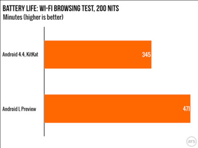
Android’s Project Volta was designed to optimize the OS’s performance on smartphones to improve battery life. Project Volta follows a pattern of projects run by Google focused on addressing weaknesses of the previous platform, such as Project Butter, which aimed to make Android’s UI animations run at 60 fps, and Project Svelte, an effort to get the OS to run on 512MB of RAM. In previous versions, when the OS is engaged in a process for one second, it burns two minutes of standby time. To address this, Project Volta includes the development of a “JobScheduler” API which allows the OS to batch unimportant app requests, and gives developers the option to delay housekeeping functions on their apps until the device is plugged in. ArsTechnica did a study of the Android L Preview battery life versus Android 4.4 KitKat and found that Android L Preview had 36% more battery life.

 androidL

Via Ars Technica

Another major move in the Android L Preview is the transition of the default run-time from Dalvik to ART, which aims to save battery life and yield a faster, more efficient performance. Animations and scrolling felt both faster and smoother, but there were some bugs with the multitasking view and notification tray which one can imagine will be fixed in the final version of the OS.

App compatibility with the new OS fluctuates, some work fine in the Android L Beta, while others don’t work at all, including Twitter, Dropbox, and Google Docs. Of course, we expect much of this to be ironed out in the final version of the OS. The bottom line for Android developers is that Android L represents a major improvement in battery life, aesthetics and performance, which is good for business.

At Mystic Media, we’re highly experienced in the Android app development field, with a thorough and continually evolving perspective on the ins and outs of the platform. Contact us today by clicking here or by phone at 801.994.6815