Tag Archives: Aesthetics

5 Trendy Web Design Techniques to Modernize Your Website

In the age of digital commerce, it’s vital to have a spiffy website. Even if a business does sell its products online, the first impression customers have of a brand often stems from the website. A messy website brings to mind a messy product. In this post, we will examine how 2015’s upcoming web design trends present ways in which to improve websites to make them look modern.

1.    Nail Your Landing Page

The landing page is the first impression a visitor has of a website, thus it’s a great opportunity to dazzle the viewer. Many websites have landing pages which are not only physically big, with imagery and design taking up most of the screen, but also large in metaphorical scale. Check out the website of Born Group, a creative media company with an extremely ambitious landing page.

Born sells something intangible—creative services. Their product is the ability to provoke emotion. As a creative agency, it’s vital for them to establish that they produce emotionally riveting content. The image of the ape is not only beautifully photographed, it’s powerful. If a prospective customer were on the verge of hiring Born Group, they would indubitably be swayed in the right direction from the moment they hit the landing page.

2.    Video Rules

For some companies, going for a message as big as Born would come off as overly self-involved. Born has an intangible product and sells B2B (Business-to-Business). They need to sell an idea and if they bring in a single project, it will pay for a big-budget investment in their site.

For smaller companies with tangible products, it’s important to put the product itself front-and-center. One way of doing this is to embed a video on the landing page of your site. For example, check out the salivating video on the landing page of Dunwell Donuts, a vegan Brooklyn donut shop.

The video succeeds on nearly every level. It makes the viewer crave donuts, artfully portrays the product, and tells the story of the founders of the business in an extremely intimate manner.

3.    Tell Your Story

The primary accomplishment of the Dunwell video is in the arena of storytelling. The Dunwell video tells the story of the company brand in an intimate way. By the end of the video, the viewer feels like they have a good sense of who runs Dunwell Donuts and what donuts mean to them.

A video is a cost-effective way of telling the personal story of a brand. Storytelling is a powerful medium because it creates an emotional connection between the viewer and the subject when executed effectively. For a business (especially a small business), this translates directly to brand loyalty. We’ve detailed other ways in which one can tell the personal story of a brand in our Parallax Scrolling article.

4.    Flat Design

Minimal web design is in. Apple’s design technique, flat design, is defined as “a style of interface design which removes any stylistic choices that give the illusion of three-dimensions (such as drop shadows, gradients, textures, or other tools that add depth) and is focused on a minimalist use of simple elements, typography and flat colors.”

Flat design is visually sleek and virtually inexpensive way of displaying one’s brand in a modern way. Check out some of the best flat design websites on the internet here.

5.    KISS (Keep It Simple Stupid)

A really well-designed landing page with minimal content looks much better than a lot of redundant, visually lacking pages. For an alternate approach to the donut vertical, check out the site for Elsie’s Donut Shop. It’s flat, minimal, sleek and to the point, stressing the products.

With the internet working more and more as a gatekeeper for customers to select which businesses they choose to solicit, modern aesthetics have a direct impact on business. Equipping a business with a sleek, modernized website puts them in the best position to excel in the marketplace.

Mystic Media is a web design and application development company based in Salt Lake City, Utah. For more information, click here or contact us by phone at 801.994.6815.

How Material Design Redefined Android App Aesthetics

In the ongoing war of the operating systems, the front-runners are undeniably iOS and Android. As we detailed in our Android L Vs. iOS 8 article, Apple took the latest battle; however, Android Lollipop represents a major step forward for the platform as it introduced the aesthetic concept of Material Design. We’ve covered the principles of flat design in Impervious Appeal: How to Design Jaw-Dropping iOS Apps, but we’ve never gone in-depth on Material Design because it’s fairly complicated. In this article, we’ll detail what Material Design is and why it represents a huge step forward for app design aesthetics.

What is Material Design? It defies a simple explanation. It is similar to flat design in that it emphasizes negative space, bright color schemes, and an emphasis on intuitive UI. Material Design differs from flat design in the way in which it evolves the concept.

Material Design takes the visual aesthetic of flat design and asks the developer to create a realistic digital world with physical rules within the UI. Material Design offers designers the help of two skeuomorphic concepts: depth and shadow.

Depth and shadow both play a big part in how the user interprets what’s clickable and what’s not. The buttons themselves interact with the touch. The whole concept plays off our ability as humans to recognize depth and perceive information hierarchies organized in the dimension of depth.

Below is a great video featuring Material Design in practice.

UI designers love Material Design because the addition of depth and shadow gives them more tools to convey purpose, meaning and order. It effectively evolves the concept of flat design. Grace LaRosa, senior experience designer at R/GA, said to VentureBeat:

“What’s newest and most of note, in my opinion, is how well documented and systematic the language is. After a long era of designers and developers creating Android experiences that often feel renegade or pieced together, Google have undoubtedly stepped up their efforts to standardize and improve the UI and UX across their app ecosystem.”

The problem with Material Design lies not to its aesthetic concepts, but the practicality of executing it within the Android platform. Android allows third-party companies to create hardware based in the OS, which creates device fragmentation. Not all Android devices run on the latest OS (Lollipop), in fact, some devices go back as far as four previous versions of the Android OS. Due to this vast discontinuity in Android devices, the adoption of material design will likely be a gradual, unlike the nearly instantaneous switch to the latest OS and OS aesthetics for iOS users.

As Grace LaRosa said above, Material Design does set-up a standardized UI/UX for Android developers to use across the app ecosystem, which will hopefully bring about more unity on the platform. Material Design is thus only a part of the solution to the problem which will ultimately limit its impact. It is designed to make for more consistent UI/UX across Android apps, but it won’t be adopted uniformly and thus won’t  single-handedly be able to transcend the device inconsistency in order to solve the unity problem.

Jon Wiley, one of the creators of Material Design, recently said in an AMA:

“I think a big challenge with Google Search in terms of experience is that it has often felt like a series of jump cuts in what is actually continuous. Material design gives us a framework we can use to do something closer to a scene change in a play, continuously moving from one state to the next. This can make it feel much faster and can also provide cues as to what happened when you touched something in the UI. It’s another step towards removing any speed bumps along the way to getting a good answer.”

Interesting to note that both iOS and Android seem to be striving for a more fluid sense of continuity in improving their platforms. For iOS, it’s functional device continuity, for Android, it’s aesthetic UX continuity.

Ultimately, it seems likely Apple will leapfrog past Android by building upon (or conforming to) the Material Design aesthetics in an upcoming iOS, which will then receive mass adoption as is the precedent with Apple OS’s.

For more information on Material Design, check out these awesome, in-depth videos from Google I/O 2014: Material Witness: How Android Material Applications Work and Material Design in Google Play.

At Mystic Media, we’re constantly engaged in various app design projects. Our expertise reaches across all facets of the industry, be it iOS design, Android design, web design, strategic marketing and more. Contact us today by clicking here or by phone at 801.994.6815

Climbing Yosemite: Apple’s New OS Reaches New Heights

Apple recently released the long awaited OS X Yosemite. In Bite the Apple: Maximize iOS 8 to Vanquish Your Competition  and Tilting the Playing Field: iPhone 6 Technology Expands Possibilities for iOS App Developers, we covered  some of the highly-anticipated features in Yosemite, including a host of opportunities for cross-device Continuity. This week, we take an in-depth look at OS X  Yosemite and what it means for developers.

AESTHETICS

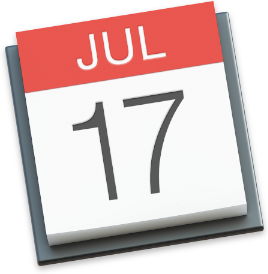
You shouldn’t judge a book by it’s cover, but when it comes to operating systems, aesthetics matter (check out our article Impervious Appeal: How to Design Jaw-Dropping iOS Apps). Yosemite’s UI remains consistent with Apple aesthetics and makes an effort to push the concept of flat design further. It’s even more minimal; the icons are flatter; the windows are more translucent. A great example of the evolution from Mavericks to Yosemite is a comparison between their Calendar icons:

Yosemite Calendar Icon

Mavericks Calender Icon


(left is Yosemite, right is Mavericks)

via Apple Developer Library

Whereas Mavericks had a more skeuomorphic design on its Calendar icon, Yosemite is flat. The texture seems impossibly smooth. There’s a minor depth and shadow, but no effort to enumerate the pages, nor a two-hole binder holding the pages together. The Yosemite icon represents the calendar as a digital block. The colors are brighter and the text is crisper and more symmetrical throughout the Yosemite UI. The font is an optimized version of Helvetica Neue used throughout Yosemite, a big switch over from Lucida Grande of the past. Developers, take note and utilize these aesthetics to create apps which integrate seamlessly into the Yosemite environment.

SWIFT

iOS 8 and the iPhone 6 arrived with Metal, a graphics layer for iOS development. Yosemite launches with Swift, a multi-paradigm, compiled programming language optimized for iOS 8 and OS X Yosemite app design. Swift has been in development over the past four years and may replace Objective-C as the main language for app design on Apple’s OS X and iOS platforms. Several apps have already been built with Swift, including LinkedIn and Yahoo Weather.

Programmers, learn more about Swift over at The Guardian.

CONTINUITY

OS X Yosemite begins Apple’s push toward complete device Continuity. The concept of Continuity entails one should be able to switch devices and complete the same tasks on any Apple device without hassle. So if I’m writing an email on my MacBook, I should be able to go into another room and seamlessly finish it on my iPad without having to save or close the message. One of the simpler, but more effective ways in which Apple introduces this concept is allowing users to answer calls on their MacBooks when their phones are within a certain radius.

Another major push for Continuity in Yosemite is the Instant Hotspot feature. Instant Hotspot allows MacBooks to connect with the cellular network on their iPhones when no other Wi-Fi network is available. It also conveniently shuts down inactive iPhones when in-use. The big advancement for Continuity, however, is the application Handoff.

Handoff is among the most exciting new features of Yosemite and the major aspect of Apple’s push for Continuity. Once you get through the confusing set-up, Handoff proves to be a practical application of the concept. When you’re working on a task on your MacBook, an icon appears on your iPhone/iPad lock screen which allows you to immediately pick up whatever task you were working on using the MacBook without losing a beat. It also works the other way, with the Handoff icon appearing to the left of the Dock on your MacBook when you’re switching over from an iPhone/iPad. With Continuity, devices are constantly communicating to better serve the user. Continuity represents a major advancement designed to get users completely consumed in the world of Apple devices. Although Handoff has its kinks, it effectively executes the Continuity concept and ultimately proves to be the biggest, most exciting advancement in OS X Yosemite.

CONCLUSION

Overall, OS X Yosemite is a major step forward for Apple products and aesthetics. It retains a cool look, intuitive functionality, and its steps toward complete device Continuity are clearly indicative of technology of the future. Apple has already put together a featured list on their App Store of Great Apps for OS X Yosemite, it will be exciting to see how app developers follow Apple’s lead and take advantage of the latest OS to enhance their apps.

Mystic Media is an app development and marketing firm specializing in both iOS & Android development, and more. Learn more by clicking here or by phone at 801.994.6815.