How Gamification Can Boost Retention on Any App Part 2: Optimize Onboarding with Gamification
The Mystic Media Blog is currently endeavoring on a 3 part series on how gamification mechanics can boost retention on any app—not just gaming apps but utility apps, business apps and more. In this second entry, we explore how to refine and gamify your onboarding process to keep customers coming back.
ONBOARDING
Your app has been downloaded—a hard-fought battle in and of itself—but the war isn’t over; the onboarding process has just begun.
App onboarding is the first point of contact a user has within an application. It’s one of the most crucial parts of the user experience. Situating users in your application is the first step to ensuring they come back. Twenty-five percent of apps are only opened once after being downloaded. Many apps simply do not make it simple enough for users to understand the value and get the hang of the application—step one in your retention process.
Here are the top tips for smooth onboarding:
MINIMIZE REGISTRATION
A prolonged registration process can turn off new users. Users do not always have time to fill out extensive forms and can quickly become resentful of the pacing of your app. Keep registration to a minimum, minimize required fields, and get users going faster.
We recommend enabling user registration altogether with “Continue as Guest” functionality. Games typically employ this and it enables users to get hands on with the application before they undergo the tenuous account creation process. Hook them with your app, then let them handle the administrative aspects later. Account creation with Google, Facebook, or Twitter can also save quite a bit of time.
Gamification is all about rewarding the user. Offer users an incentive to create their account to positively reinforce the process and you will see more accounts created. If they haven’t created an account, make sure to send prompts to remind them of what the reward they are missing out on. As we detailed in our last entry, FOMO is a powerful force in gamification.
TUTORIAL BEST PRACTICES
When a user enters your application for the first time, they generally need a helping hand to understand how to use it. Many games incorporate interactive tutorials to guide the user through functionality—and business apps are wise to use it as well. However, an ineffective tutorial will only be a detriment to your application.
Pacing is key. A long tutorial will not only bog the onboarding process down, too much information will likely go in and out of the user’s brain. Space your tutorial out and break it into different sections introducing key mechanics as they become relevant. On-the-go tutorials like the four-screen carousel below by Wavely help acclimate users quickly and easily.
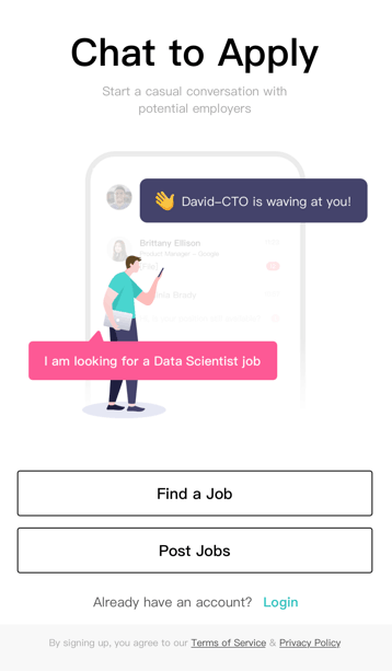
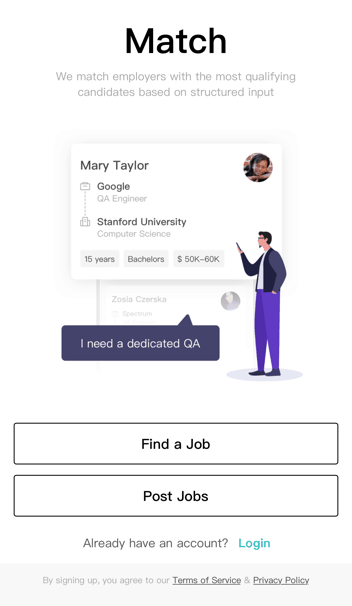
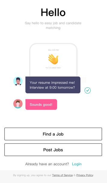
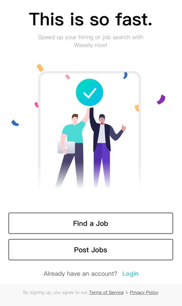
And don’t forget to offer a reward! Offer users some kind of reward or positive reinforcement upon completing tutorials to encourage them to continue using the application.
AVOID DEAD ENDS AND EMPTY STATES
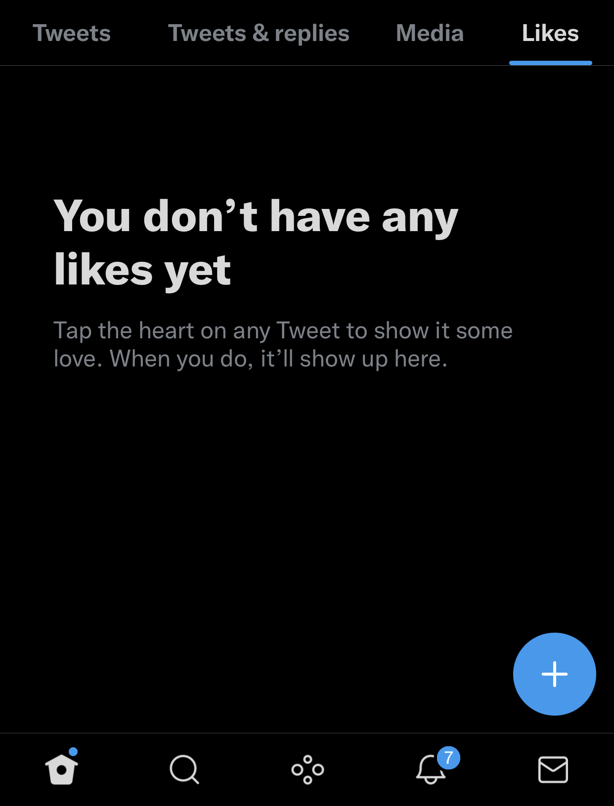
An empty state is a place in an application that isn’t populated with any information. For example, favorites, order history, accomplishments, etc.—these pages require usage in order to be populated for information. New users will see these pages and become confused or discouraged. Many applications will offer self-evident statement such as “No Favorites Selected”. Or, in the case of UberEats below, no message is displayed.

It’s confusing and discouraging for users to see these statements. Avoid discouraging your users by offering more information, for example: “Save your favorite restaurants and find them here.” Check out Twitter’s exemplary message for users who’ve yet to favorite a tweet below.
CONCLUSION
Onboarding is the first and most crucial step to building a relationship with your userbase. One of the major things business apps can learn from gaming apps is that time is of the essence when it comes to capturing a user’s attention. Keep it short, punchy, and to the point.

