Tag Archives: Material

Facebook Champions Material Design: Why You Should Too

In the past year, material design has been rising in prominence as both an app and a web design aesthetic. As we’ve detailed in our past article How Material Design Redefined Android App Aesthetics, Material Design has the potential to catch on in a major way.  In this post, we take a look at the bright future ahead for the platform.

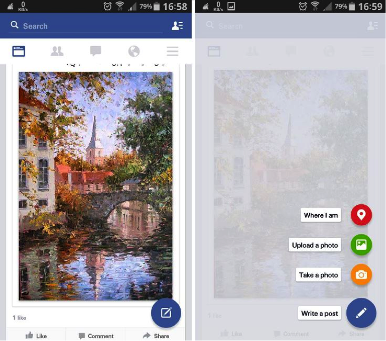
Facebook recently began testing a Material Design overhaul of their Android app. Additions include a floating action button commonly found on Lollipop apps. The design on the whole has a more cohesive digital world adhering to Material Design principals.

“Not only does the app look better, but it’s also going to make the app easier to use for Lollipop users who are now becoming accustomed to that floating action button.” Writes Killian Bell of Techno Buffalo.

Check out this picture of the Beta app (via Techno Buffalo)

Material Design Facebook

If Facebook’s Material Design app looks slick. If it proves to be functionally efficient, it’s reasonable to assume they could utilize some of the same design techniques to update their iOS app.

Facebook’s Android app redesign is reminiscent of the Gmail Inbox app. Considered one of the premier Material Design apps on the market, Inbox was developed by Google and provides a perfect showcase for Material Design aesthetics. Depth plays a major role in all the gestures. When the user swipes an email to mark it done, it reveals a green checkmark underneath the top layer as the email disappears off screen.

Check out his awesome promo video by Google which explains how Inbox works:

Inbox was created to manage mass volumes of emails. Larry Dignan over at ZDNet reviewed Inbox by forwarding his 700 or so work emails per day to the app to see how it handled organizing bulk emails. Inbox passed the test, allowing the user to create bundles of emails in order to better organize incoming messages.

With futurists predicting the downfall of email, the question becomes: Could the same Material Design techniques which the Inbox app uses to organize bulk emails and save screen space be applied to an encompassing Facebook social feed which replaces email?

The main problem inhibiting Material Design from catching on in a major way for the Android platform is device fragmentation. As of March, only 3.3% of Android devices are running the latest OS: Lollipop. 40% of Android devices are running KitKat and 20% are still using Jelly Bean.

Despite the obstacle of device fragmentation, as the next Android OS is released, Lollipop and Material Design are sure to become more and more prevalent. What makes Material Design so crucial is its role in connecting the Android device ecosystem. With more and more devices coming into the fray, Apple has been doing their part to push for Device Continuity, allowing for seamless transition between devices. Android may have to battle to overcome device fragmentation, but as Material Design gains momentum, their hardware and software will at least have aesthetic continuity.

The future of Material Design extends beyond the smartphone and the tablet. With the wearable revolution impending upon Apple Watch’s April 24th release date, it’s reasonable to assume Material Design will find outlets beyond traditional mobile devices as Android increases it’s wearable repertoire. If Google Glass had lasted, no doubt it would have utilized Material Design in its updates. Regardless, Android has several products in the pipeline that are sure to boast Material Design, including Android TV and Android Auto.

For now, Material Design is an Android-exclusive technique still vying for mainstream adoption. However, Facebook’s adoption of the design technique for their upcoming Android app is a good sign. As we look to a device-interconnected world, it seems inevitable the principles of Material Design will continue to evolve and shape the future of Android design aesthetics, and potentially expand to influence web and iOS aesthetics as well.

At Mystic Media, we’re constantly engaged in various app design projects. Our expertise reaches across all facets of the industry, be it iOS designAndroid designweb designstrategic marketing and more. Contact us today by clicking here or by phone at 801.994.6815

How Material Design Redefined Android App Aesthetics

In the ongoing war of the operating systems, the front-runners are undeniably iOS and Android. As we detailed in our Android L Vs. iOS 8 article, Apple took the latest battle; however, Android Lollipop represents a major step forward for the platform as it introduced the aesthetic concept of Material Design. We’ve covered the principles of flat design in Impervious Appeal: How to Design Jaw-Dropping iOS Apps, but we’ve never gone in-depth on Material Design because it’s fairly complicated. In this article, we’ll detail what Material Design is and why it represents a huge step forward for app design aesthetics.

What is Material Design? It defies a simple explanation. It is similar to flat design in that it emphasizes negative space, bright color schemes, and an emphasis on intuitive UI. Material Design differs from flat design in the way in which it evolves the concept.

Material Design takes the visual aesthetic of flat design and asks the developer to create a realistic digital world with physical rules within the UI. Material Design offers designers the help of two skeuomorphic concepts: depth and shadow.

Depth and shadow both play a big part in how the user interprets what’s clickable and what’s not. The buttons themselves interact with the touch. The whole concept plays off our ability as humans to recognize depth and perceive information hierarchies organized in the dimension of depth.

Below is a great video featuring Material Design in practice.

UI designers love Material Design because the addition of depth and shadow gives them more tools to convey purpose, meaning and order. It effectively evolves the concept of flat design. Grace LaRosa, senior experience designer at R/GA, said to VentureBeat:

“What’s newest and most of note, in my opinion, is how well documented and systematic the language is. After a long era of designers and developers creating Android experiences that often feel renegade or pieced together, Google have undoubtedly stepped up their efforts to standardize and improve the UI and UX across their app ecosystem.”

The problem with Material Design lies not to its aesthetic concepts, but the practicality of executing it within the Android platform. Android allows third-party companies to create hardware based in the OS, which creates device fragmentation. Not all Android devices run on the latest OS (Lollipop), in fact, some devices go back as far as four previous versions of the Android OS. Due to this vast discontinuity in Android devices, the adoption of material design will likely be a gradual, unlike the nearly instantaneous switch to the latest OS and OS aesthetics for iOS users.

As Grace LaRosa said above, Material Design does set-up a standardized UI/UX for Android developers to use across the app ecosystem, which will hopefully bring about more unity on the platform. Material Design is thus only a part of the solution to the problem which will ultimately limit its impact. It is designed to make for more consistent UI/UX across Android apps, but it won’t be adopted uniformly and thus won’t  single-handedly be able to transcend the device inconsistency in order to solve the unity problem.

Jon Wiley, one of the creators of Material Design, recently said in an AMA:

“I think a big challenge with Google Search in terms of experience is that it has often felt like a series of jump cuts in what is actually continuous. Material design gives us a framework we can use to do something closer to a scene change in a play, continuously moving from one state to the next. This can make it feel much faster and can also provide cues as to what happened when you touched something in the UI. It’s another step towards removing any speed bumps along the way to getting a good answer.”

Interesting to note that both iOS and Android seem to be striving for a more fluid sense of continuity in improving their platforms. For iOS, it’s functional device continuity, for Android, it’s aesthetic UX continuity.

Ultimately, it seems likely Apple will leapfrog past Android by building upon (or conforming to) the Material Design aesthetics in an upcoming iOS, which will then receive mass adoption as is the precedent with Apple OS’s.

For more information on Material Design, check out these awesome, in-depth videos from Google I/O 2014: Material Witness: How Android Material Applications Work and Material Design in Google Play.

At Mystic Media, we’re constantly engaged in various app design projects. Our expertise reaches across all facets of the industry, be it iOS design, Android design, web design, strategic marketing and more. Contact us today by clicking here or by phone at 801.994.6815

Android Lollipop Vs. iOS 8: The Battle of the Operating Systems

It’s been a good year for operating systems.

Back in June, Google announced their new operating system “Android L,” which has since been dubbed Android Lollipop. In our post  Android L Beta Preview: First Impressions of the Latest OS, we covered what we knew about the OS based on the announcement at the Google I/O 2014.

On the iOS side of the equation, this year saw Apple release iOS 8, which Apple hailed as the biggest iOS release ever. iOS 8 didn’t reinvent iOS aesthetics, rather it pushed forth the flat design introduced with iOS 7 and added a host of new features, including Apple Pay, Touch ID, and Device Continuity.

Both platforms represent dramatic technological advancements. The question now becomes: iOS 8 or Lollipop?

AESTHETICS

Steve Jobs majored in calligraphy at Reed College before dropping out. Jobs always held aesthetic design to be among the top priorities in his vision of Apple products, and Apple has always held a strong edge over Android in the aesthetic department.

iOS 7 saw Apple straying from Jobs’ skeuomorphic ideology in favor of Flat Design: a more stylized, minimal, bright look. iOS 8 refines Flat Design with more consistent iconography and UI. It also makes better use of gestures including swiping left to go back and double tapping the home screen to slide the screen down, allowing for better reachability on the large screens of the iPhone 6 and 6 Plus.

While Apple refined their current look, Android elected to enact a complete aesthetic overhaul. They may have shaken up the OS aesthetic game with Material Design.

Material Design is not an easy concept to grasp and can better be explored in practice. The idea is that the digital world should have its own intuitive physical rules. Buttons must react specifically to the touch, there must be multiple easily decipherable UI layers, animations must trigger and unfold in a specific, consistent manner. All Material Design aesthetics are in favor of creating the most intuitive, easily understood experience for the user.

Material Design is much more intricate than Flat Design. It’s both showier and more practical. It’s a more evolved, complex version of Flat Design. Thus, Android has taken the crown with regard to aesthetics. It’s likely Apple will follow suit and copy Material Design aesthetics for their next iOS overhaul.

Check out this video demonstrating the ideas of Material Design posted by Google Developers Youtube account.

FEATURES

Both Lollipop and iOS 8 offer new features, in addition to minor UI tweaks, for their devices. Most of these features either mirror their competitor’s counterpart, or replicate a past feature of their competitor.

Lollipop and iOS 8 both push to integrate with cars with Android Auto and Apple CarPlay. Both offer integrated navigation systems, hands-free calling and texting, and control of entertainment; however, neither will have a major impact until they are adopted by a greater number of cars.

Lollipop and iOS 8 both feature health apps (Google Fit and Health respectively). Both function similarly with certain apps offering exclusive partnerships. The big factor could be whether/which major health apps make the commitment to either Lollipop or iOS 8. The anticipated forthcoming popularity surge in wearables could be a game-changing variable in health apps. At the moment, neither app has a major edge over the other.

iOS 8 now offers Apple Pay combined with Touch ID, a replication of Google Wallet which was introduced in 2011. While Google Wallet is the older system, Apple Pay currently has the momentum. Both offer touch payments via Near Field Communications, but Apple Pay refuses to store physical credit card details, making it the safer system. The popularity of Pay could cause a resurgence of Google Wallet, but at the moment, Apple Pay has a definite edge.

Aside from the aesthetics, perhaps the biggest differentiator between iOS 8 and Lollipop is Apple’s push for the concept of device continuity embodied in Handoff. We covered device continuity in both Climbing Yosemite and Bite the Apple: Maximize iOS 8 to Vanquish Your Competition. Handoff allows the user to easily complete tasks while transitioning  between Apple devices seamlessly. Instant Hotspot, one of the coolest features of iOS 8, allows users to connect to their iPhone’s cellular network when no other Wi-Fi networks are available. Lollipop comes up empty in this department and Android will surely be playing catch-up when they release their next OS.

BATTERY

iOS bolsters a reputation for retaining a more efficient battery than Android. With Project Volta, Android has made a strong attempt to optimize their OS to defeat this notion.

Lollipop features a built-in task manager designed to prevent unnecessary operations from waking the phone up, running app house-cleaning necessities in batches when plugged in, and preventing network requests from Android and third party apps in spots without network connectivity. Lollipop also has “Battery Historian,” an analytics tool designed to track and tweak battery consumption.

iOS 8 did not make any dramatic attempts to improve it’s battery life, but still competes with Android with an extremely efficient standby mode: leaving an iPhone 6 or 6 plus unplugged overnight will only lose 1-2% charge.

Overall, the OS battery competition is fairly neck-and-neck, which is a big improvement for Android considering in the past they have gotten smoked in this department.

Check out this video Introduction to Project Volta from Google I/O 2014 for more information.

AVAILABILITY

One of the major factors which elevates iOS 8 over Lollipop is the limited availability of the OS due to device fragmentation.

Google allows third-party developers to build hardware for the Android OS. This causes device fragmentation, in which the variety of hardware makes it harder to optimize software for each device. As a result, different devices will have access to Lollipop at different times. Lollipop is currently available on Google’s Nexus 6 and Nexus 9 phones with a staggered launch planned for other Android phones.

Device fragmentation is also troublesome for app developers as it means there’s no way to optimize directly for all the hardware considering the diversity.

iOS’s iPhone exclusivity means it runs well across devices and updates are immediately accessible on Apple hardware. The user is guaranteed at least three years of upgrades. App developers can optimize for each platform which remains relevant.

BOTTOM LINE

Overall, iOS 8 is the more practical operating system. While Material Design represents an exciting leap forward in software aesthetics, iOS 8’s device continuity features trump all of Lollipop’s functional additions. The widespread availability of iOS 8 and lack of device fragmentation makes it the better optimized package.

While iOS 8 wins this battle, it will be exciting to see how the platforms influence one another in the next round of OS updates. Expect Apple to adopt Material Design aesthetics and Android to begin a push for their own version of device continuity.

At Mystic Media, we’re constantly engaged in various app design projects. Our expertise reaches across all facets of the industry, be it iOS design, Android design, web design, strategic marketing and beyond. Contact us today by clicking here or by phone at 801.994.6815