Tag Archives: Mystic Media

Impervious Appeal: How to Design Jaw-Dropping IOS Apps

Renowned as the first major update to both the visual outlook and the feel of Apple products in the post-Steve Jobs era, IOS 7 broke down the door for elite, sleek app design. In designing apps for the IOS 7, you have a lot of aesthetic options. iPhones are gourmet smartphones; IOS users have high expectations with regard to UX design and if your app appears amateur, it will sink the perception of your business and you will lose both money and respect. The look and feel to your app is as important as its functionality. You must cater to UX trends to appear on the cutting edge. Here’s what’s popular today:

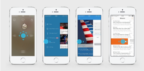
Although one would expect two dimensions when utilizing “flat” design, the trend is quite the contrary. One of the major futuristic visual flairs of IOS 7 apps is the use of depth. Depth can be achieved in a number of ways. For example, instead of dividing lines, soft blur is often used to create a sense of depth and emphasize the urgency of the element in use. When interacting with a different element, the focus shifts as necessary. The lack of dividing lines emphasizes functionality, reduces clutter, and feels freer. The sense of depth creates the illusion of seemingly endless functionality. Your business will look like a highly-capable enterprise.

Screen Shot 2014-06-17 at 8.38.06 AM

Making use of the swipe gesture is another major trend in IOS 7 apps. Swipe not only allows for easy navigation between functions, swiping to unlock another screen in the app, but also can be used to contribute to the depth. Swiping an element within a page can reveal either functions (such as deleting emails) or elements beneath. The ease of swiping requires only one thumb, making it an incredibly convenient gesture.

Screen Shot 2014-06-17 at 8.38.24 AM


The swipe is not only convenient, it’s more fun than simply pushing a button and gives the user a sense of space, making your customers happy.

Convenience being central to the goal of any app’s functionality, IOS 7 apps are often utilizing simple color schemes to simplify the equation. Rather than bombard the user with a rainbow, IOS 7 apps often utilize a white backdrop for negative space, along with simple, vibrant color scheme emphasizing functionality. Red means no. Green means yes. Icons in use often are filled with white while inactive icons are translucent. The simplification of fonts goes hand in hand with the coloring, focusing more on texture and weight than style.

While minimal seems to be the keyword with regard to IOS 7 app design, one trend breaks the mold with regard to mobile web design: Parallax Scrolling. Parallax Scrolling is a design technique in which as the user scrolls down the web page, the graphics move with the scroller, creating a story. Examples of Parallax Scrolling can be found here.

While there’s no given formula for success in IOS app design, by staying on top of the trends, you can assure your business is being reflected in the most positive light. With the speed of the playing field at an all-time high, it’s vital that you are in the know of current trends.

The Use of Color In Your IOS App

As our interactions happen increasingly in the digital realm, color psychology has become entrenched in the way we experience the world.

Apple’s IOS 7 recognizes this and allows users to customize the colors of their apps. In designing your app or website, you want total control in how the user experiences your brand. The color scheme will subconsciously affect users. It’s no mistake Facebook and Twitter, two of the biggest social media websites in the world, utilize blue as their key color. Blue is calming. Blue makes you think of the sky or the ocean, those serene moments you have to appreciate the beauty of the world. The use of blue, in either case, makes you want to return, creating a soothing effect. In situations of boredom or social awkwardness, we want to return to the social tranquility of Twitter and Facebook, where the user has total control of to whom, what and when he/she responds.

Whether or not you are synesthetic, any given color triggers a specific response, on which a UX web/app designer must capitalize.

Synesthesia is the neurological phenomenon in which one sense triggers another. For example, when musicians like Kanye West explain how they are able to SEE sounds in colors, thus the way they experience creating music feels to them more like painting, a “sonic landscape”. Synesthesia is a philosophically mind-bending piece of evidence toward the interconnected manner in which we experience the world–our five senses interpreting different aspects of the same information in service of creating a physical truth. It’s also vital to your app design.

As with all aspects of UX app and web design, use of color serves two purposes: aesthetic, and functionality. Aesthetically, you want to use color create the proper emotional response to your brand. IOS 7 recognizes current color trends and capitalizes on the emotional landscape to benefit the user. With the recession and political landscape, U.S. consumers are gravitating toward brighter, more radiant colors for comfort. IOS 7 allows users to customize their color palate, leaning toward nuanced, joyous colors such as lighter blues and purples, as well as red-tinged oranges.

In creating your app, you must take into account the association users have with the colors you use to create the best possible user experience. Green, like blue, is associated with nature, as well as intelligence, and wealth. Purple is regal, lavish, as well as feminine. Pink is ultra-feminine, but also stylish. Red is an alarming and stimulating color. It’s attention-grabbing, stressful and threatening, but also confident. Stop signs and red lights are obvious uses red’s potential. Yellow is equally stimulating, though less obnoxious. Yellow is known to increase concentration. Also vital is the use of white, black, and grey to create negative space. A color overload seems unprofessional, it’s important to focus on two or three main colors in your scheme. The right color scheme for your brand depends entirely on your corporate identity.  At Mystic Media, we’re confident we can put our finger to the pulse of your company or application idea to create the best possible digital reflection.

With regard to functionality, color is vital to separating the various sections of your application or website to increase usability. Skeumorphism is officially old-fashioned. In the era of flat design, users will decipher the functions of buttons and links based on color. Users utilize color more than they do text in exploring the digital world, thus its important to color-code the different sections of your app or website based on theme. USA Today recently redesigned their website, color-coding each of the sections and drifting away from the idea of making the digital reading experience mimic the print. The IOS 7 separates apps based on colors customized by the user. Although you could allow users to customize your color scheme, at Mystic Media, we believe it’s more confident to establish your brand through a tactical color scheme.

Ultimately, the color scheme is a reflection of the personality of your company. It’s important to trust your instincts. Or trust ours at Mystic Media. We’re dedicated collaborators confident in both taking direction and creating aesthetics to maximize the potential of your app or website.

Contact us today at https://www.mysticmediasoft.com/ or by phone at 801.994.6815

Responsive Web Design Is The New Web Design

Ultimately, a website serves two functions. As an advertisement of the website’s brand, reflecting the values of the company through the color scheme and visual outlook, and as a functional website, requiring usability for users to navigate, understand, and utilize the information and tools provided. Combined, these two factors create the aesthetic through which online visitors judge a company. By staying up to date on the latest trends, the website owner can maximize the quality of its internet visibility, boosting the perception of the company.

The web design landscape is constantly changing as technology continuously upgrades. With the emergence of smartphones came expectations for companies and websites to set-up a mobile presence equally as functional as their desktop site. If your company expects to stay current, you must keep up with current trends. At Mystic Media , we specialize in Responsive Design and recommend it for all of our clients.

Companies utilize a number of tactics for their mobile presence. Some choose to design a mobile app link to website  which acts as a mobile website. Others design a whole other mobile site acclimated for easy browsing on mobile devices. Without adaptation, websites which perform slowly on mobile platforms are left in the past. The most common trend in web design confronting this problem is “Responsive Design”.

Responsive design entails a website which readjusts itself depending on what platform it’s being viewed on, be it desktop, mobile, or tablet. Responsive design has become the new norm in the web design field, about 8/10 websites on the internet are of responsive design. Whether or not a client specifies they are seeking a responsive site, they generally expect it.

Responsive design saves money on development with a one-size-fits-all model. Instead of developing a separate site or application for mobile users, the main website serves all screens, from desktop, tablet, and mobile, thus maximizing functionality. The consistency also solidifies your brand continuity.

Responsive design has been around for about five years. During that time, has emerged as the mainstream favorite visual aesthetic for web design. Flat design can actually work concurrently with responsive design, as flat design is primarily a visual aesthetic utilizing vibrant colors, simple shapes, and more white space with large typography, increasing the ease of usability in browsing layouts.

Gaining popularity when Microsoft  unveiled its “Metro” interface with Windows 8, flat design has the most modern, futuristic look, disregarding the notion of skeumorphism, a design term meaning digital graphics which reflect the physical object, (for instance a digital calculator which looks like a physical calculator). By abandoning traditional physical design, one can maximize the functionality of the digital tool. For example, it seems archaic to navigate between the buttons off the calculator with the mouse when one can just type them.

Combining the functionality of responsive design with the visual aesthetic of flat design generally yields the most futuristic, impressive web layout in the current online climate. A poorly constructed or outdated website gives off the same unprofessional impression as a dilapidated office. Don’t let an antiquated design scheme drag your brand down, stay up to date using responsive design with a flat aesthetic.

Mystic Media is a leader in responsive web design and can help your company save time and money. Contact us to learn more.